There’s a still-mysterious tower in Lovecraft’s favourite ‘visiting town’ of Newport, Rhode Island.
Lovecraft would have been aware of several theories about the tower: that it was a simple colonial stone windmill modelled on a British example (possibly originally built as an astronomical observatory, interestingly); or was part of a colony of shipwrecked medieval Portuguese sailors; perhaps it was built by Irish or Welsh sailors prior to later colonists; or was actually part of a late Viking colony in what the Vikings called Vinland the Good (an idea first elaborated in Antiquitates Americanae, 1837). The latter was the more romantic notion and caught the public’s imagination, as one can see from this postcard…
‘Built by the Norsemen’
Early Viking visitors to America were not proven by hard evidence in Lovecraft’s time, though many sought hard evidence for them and sometimes fabricated it. Nevertheless the Viking theory was taken seriously into the 1940s, evidenced by the book The Newport Tower: Norse Church or Stone-Built Windmill? (1942). Today there is incontrovertible hard evidence of both Viking logging and a settlement, albeit much further north along the coast than New England. The climate being more favourable back then, at the end of what is generally known as the ‘Medieval Warm Period’.
There might appear to be mention of the Newport tower in a letter by Lovecraft. Since in a stream of consciousness riff for Morton (Selected Letters III) we have…
sheep on the hills behind Newport … the Gothick tower …
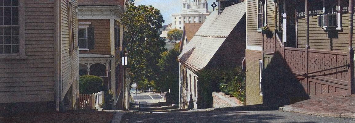
However this was not the tower in question. Rather it was the imposing and lovely gothic tower of St. George’s Chapel at Newport, able to be seen from a great distance in and around the town and one of the architectural highlights of the place. Lovecraft wrote about this tower in a poem, see page 307 of The Ancient Track (2nd Ed.) He was thus not talking about the mysterious ‘old’ tower, by then set in a placid park where Lovecraft liked to sit and write letters.
But one can suggest that Newport’s ‘old’ tower, a key antiquarian attraction of a town that Lovecraft visited many times in the mid 1930s, proved to be a stimulus for his imagination. For instance, the story-idea from circa the mid 1930s known as “The Tower”…
S. of Arkham is cylindrical tower of stone with conical roof — perhaps 12 feet across & 20 ft. high. There has been a great arched opening quarter way up, but it is sealed
with masonry. […] Tales of fate of persons climbing into tower before opening was sealed. Indian legends speak of it as existing as long as they could remember — supposed to be older than mankind. Legend that it was built by Old Ones (shapeless & gigantic amphibia) & that it was once under water. Dressed stone masonry shew odd & unknown technique. Geometrical designs on large stone above sealed opening utterly baffling.
This could well have been inspired by his musing on the Newport Tower.
His latter sentence “Geometrical designs on large stone above sealed opening utterly baffling” is interesting, since in 1946 investigators found…
a Swedish-Norwegian runic inscription on the west side of the [Newport] tower, 14 feet above the ground. The inscription included a date: 1010.
Most likely this was a slow-burning hoax by an antiquarian, as is said to be usually assumed. But it’s interesting that a decade before the discovery Lovecraft hints at something similar for his tower. One has a sudden vision of him sneaking up to the tower at dusk, with a step-ladder and a small hammer-and-chisel and a mischievous grin on his face. But probably not, even though he was fond of hoaxes.
His possibly related story-idea from the same period, known as “The Rose Window”, has a similar tower…
Very ancient house on Central Hill, Kingsport, inherited […] In back garden, ruins of a brick tower 12 ft in diameter. Rumours of evil annual use — lights — signalling — answered. Doorway now bricked up. Ivy-clad. Windowless — 30 ft standing — once 50 [ft] with windows and flat railed roof.
I’d suggest that a letter to Jonquil Leiber of November 1936 might help to date “The Rose Window”, as Lovecraft wrote…
I am greatly interested in your reference to your grandfather […] & his menacing cone-topped Devil-Tower — & the strange whistles blown by no human lips & doubtless designed as signals to the Dark Ones of Outer Space. […] I’d surely enjoy hearing of “Old Master Stebbins” daemon-chasing & other-world-communing in the Dark Tower!” (Writers of the Dark)
He later suggests an Ancient Roman stone near St. Michael’s Mount in Cornwall, as a good site for a tale inspired by her grandfather’s recollections…
not very far from your St. Michael’s Mount — at St. Hilary on the mainland — there is a stone with a Roman inscription […] dating from A.D. 307 & bringing the region vividly into the stream of classical history. Truly, a fitting locale for Adrian Stephens & his Devil-Tower! (Writers of the Dark)
As for the ‘old’ Newport Tower, Lovecraft would not have known about later theories suggested after his death: the wild claim that it was built by a massive Chinese fleet sailing around the world; the occultist claim it was built for Doctor Dee on a secret Elizabethan voyage to the New World; that it was a Templar temple; or rather more plausibly that it was built for astronomical observations by a local gentleman.
I’m no expert but so far as I can tell none of the evidence available is conclusive for any of the theories.
Further reading:
One can also find lone towers in Lovecraft’s poetry. See pages 41, 78, 96, 307 of The Ancient Track (2nd edition).


