Yesterday I at last firmly located the elusive “John’s”, the favourite Brooklyn spaghetti hang-out of H.P. Lovecraft and his circle.
Here again is the ad, from a 1925 radical magazine. “John’s” at “7 Willoughby”.

Who was John Pucciati (1885-1967), who ran John Pucciatti’s Spaghetti House (popularly known as “John’s”)? He was a quite a character in 1910s and 20s New York, and is still remembered to this day. Difficult to research via Google, though. Because for some reason Google Search dumbly insists on removing the quote marks from “John Pucciatti” after the first page of results. But thankfully there’s eTools, which has no such dumbness built in.
The basic details are:
“Established in 1908 by John Pucciatti, an immigrant from Umbria, its menu offered an appetizer, main dish, dessert, and cup of coffee for under a dollar.”
He was an early Italian anarchist. Lovecraft knew a few of these…
There’s nothing about ‘anarchists’ to be afraid of! … they are very harmless folk. … Despite their bold talk they are timid & ineffectual creatures, most of whom would not hurt a fly if they could. I know many of them … [such as Morton, and likely also Loveman in a rather closeted way.] [They are to be distinguished from the Greenwich Village ‘radicals’ who adopt] a slovenly insincerity & cheap posing habit, which merely uses the guise of radicalism as an easy way of attracting attention.” — H.P. Lovecraft, July 1929.
Pucciatti was perhaps of a different order than Morton or the posers at New York parties. Maybe more syndicalist, depending on how much experience he had of the dramatic and very sudden industrialisation of Italy, before leaving for America. Though we can’t be sure, since he doesn’t appear to have left any writings. On him Radical Gotham: Anarchism in New York City can only offer that his restaurant was one of…
… a multitude of Italian cafes and restaurants offered cheap meals and distraction, serving as important social and political centers. Founded in 1908 by John Pucciatti, an immigrant from Umbria, John’s on East 12th Street was legendarily known as “the favorite meeting place of free thinkers of all nationalities”. Other popular anarchist hangouts included Albasi’s grocery on East 106th Street and the Vesuvio restaurant on 3rd Avenue near 116th Street in East Harlem, where for one dollar radicals could enjoy a cheap meal while debating politics and socializing.
Another book, Making Italian America, has the same and adds a little more from a recent biography of the socialist labour-organiser and editor Tresca…
In the United States, the sovversivi’s most popular hangout was John’s Spaghetti House on East Twelfth Street in New York City (now simply John’s), which was commonly advertised in Italian radical newspapers as ‘the favorite meeting place of free thinkers of all nationalities’. Established in 1908 by John Pucciatti, an immigrant from Umbria, its menu offered an appetizer, main dish, dessert, and cup of coffee for under a dollar. Carlo Tresca, Arturo Giovannitti, and other famous sovversivi regularly ate there, often holding special radical banquets at John’s private apartment upstairs.
At the time he started his main branch, aka ‘John’s of 12th Street’, the Wild West was still wild and Butch Cassidy and the Sundance Kid were rooming just around the block. Pucciatti had at least one local artist fresco the walls, paid in free meals. The place was classy, a formal white-tablecloth Italian restaurant with apron-ed waiters. But by the early 1920s the place seems to have slipped over from idealistic tub-thumping 1910s Italian anarchism to illegal tub-brewed booze… and thus the first wave of U.S. gangster-ism. The slide being quite evident from 1922. John’s became a popular watering hole for proto-mafia gangsters such as Lucky Luciano. Who was not so ‘lucky’ one night as he left the place, being gunned down outside. At this time it…
also operated as a well-known speakeasy [i.e. illegal booze purveyor] during prohibition. The ground floor continued as a restaurant, while wine and whiskey were made in the basement and served in espresso cups on the second floor.
Entrance to the upstairs was via a hidden staircase. Head hooch-brewer Mama John had a candle lit in the window when the fresh booze was ready to be served. Any sign of the cops in the area, and the candle went out. One article states that John’s on 12th Street was “ground zero” for the subsequent growth of the Italian Mafia in the U.S. This may explain his low-profile as a business during prohibition, keeping out of directories and not advertising except in journals likely to bring the right type of clientele.
After the war the main John’s catered to off-Broadway actors and the theatre crowd, and continued to be considered one of the top Italian eateries in America. As shown by a tourist Guide Book…
John’s at the corner of 2nd Ave , and 12th St. (the heart of the off-B’way theatre area) has been satisfying the palates of folks for 50 years. Under the guidance of Dan and Ann Pucciatti, the north Italian hostelry…
The 2009 book Restaurant Startup & Growth magazine tells us that his son…
Danny Pucciatti, took over day-to-day management of the [main] restaurant in the 1950s when his parents retired. Eventually he sold the establishment to current owners Mike Alpert and Nick Sitnycky in 1973.
It’s still there today, and still a leading place to eat good food.
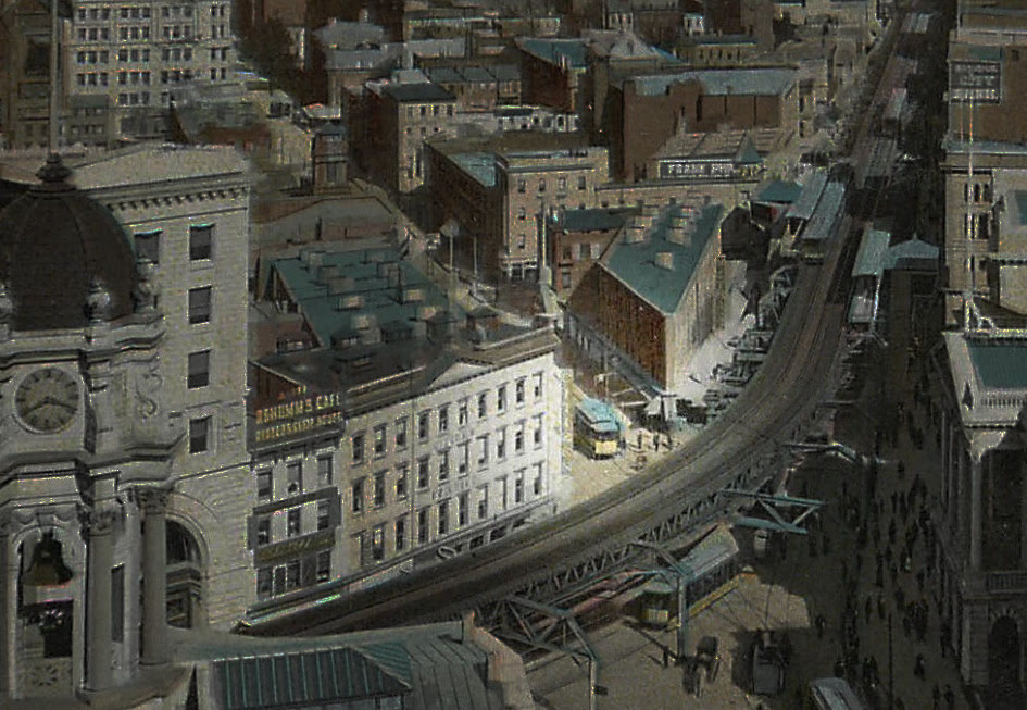
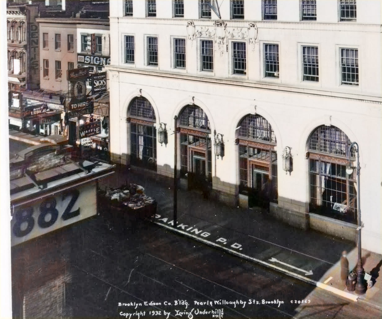
But what of Brooklyn? Nothing seems to have passed into New York restaurateur lore about the 1925-30(?) Brooklyn branch, which is presumably why it has eluded Lovecraftians until now. The opening of this branch can however be dated by the 24-month block of adverts which John took out in Worker’s Monthly. In March and April 1925 his first adverts appeared, but the Brooklyn branch was not advertised. “Indian” here is perhaps a typesetter’s mistake, later corrected to “Italian”?

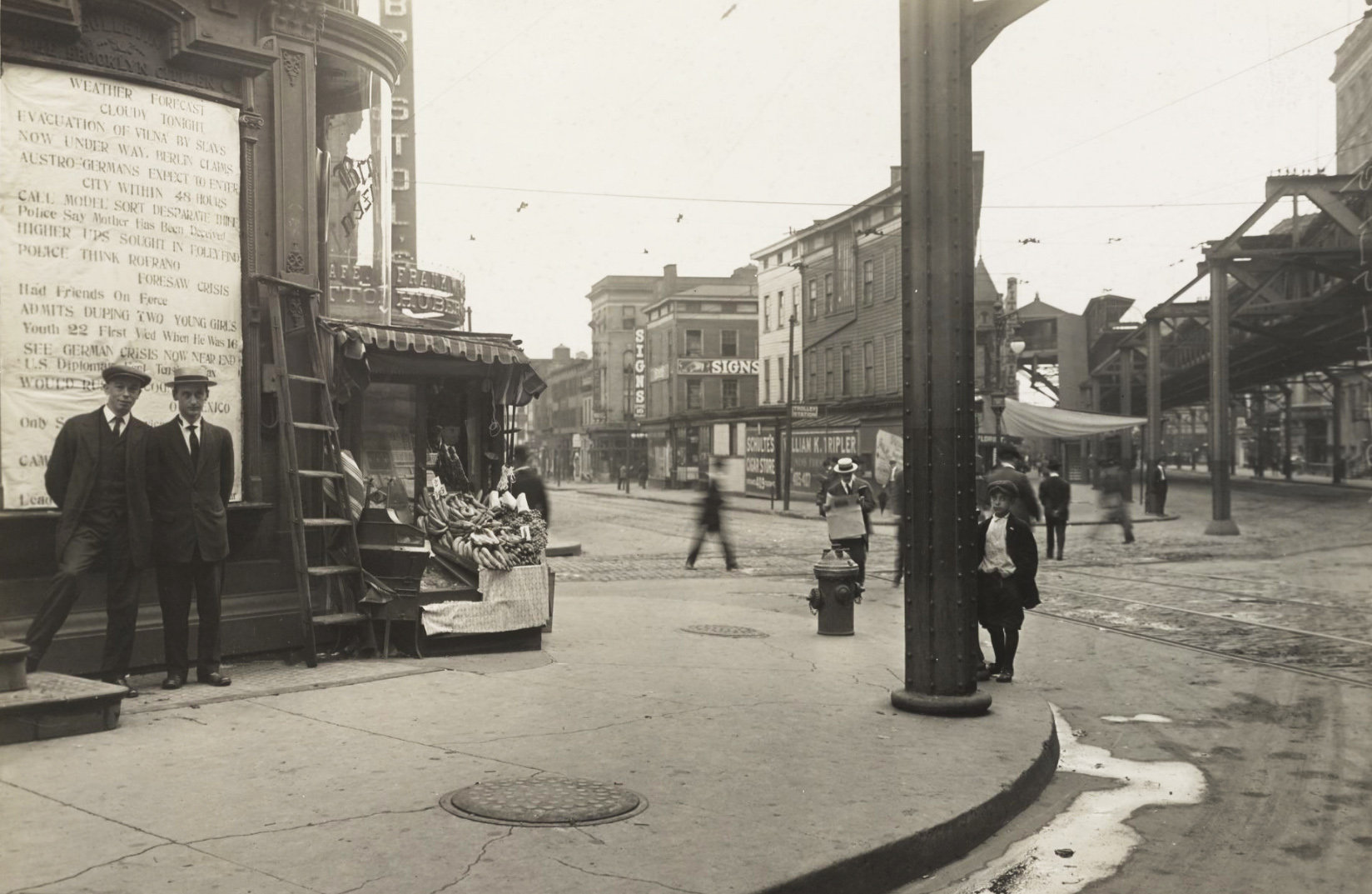
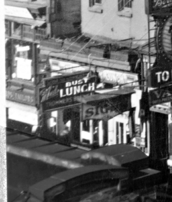
Then in May 1925 the Brooklyn branch appears on the ad, and the ads (inc. Brooklyn) continue on through February 1927 when they cease. I assume the 24-month block-booking was over. So the Brooklyn branch opened in spring 1925, and it was still in existence in early 1927. John’s first appears in Lovecraft’s 1925 Diary on 4th May, so that both fits and confirms. Possibly there was a grand 1st May ‘May Day’ opening day, something that would be most suitable for an anarchist. Lovecraft returned to John’s to eat on the 6th and 7th May, and frequently thereafter. In the letters a typical encounter with “John’s — the Italian joint around the corner in Willoughby St.” is…
stopping only at twilight, when I wended my homeward way, pausing at John’s Spaghetti place for my usual Sunday dinner of meat balls and spaghetti, vanilla ice cream, and coffee. Incidentally — not many doors away, on the other side of Willoughby St, I found a restaurant which specialises in home-baked beans.
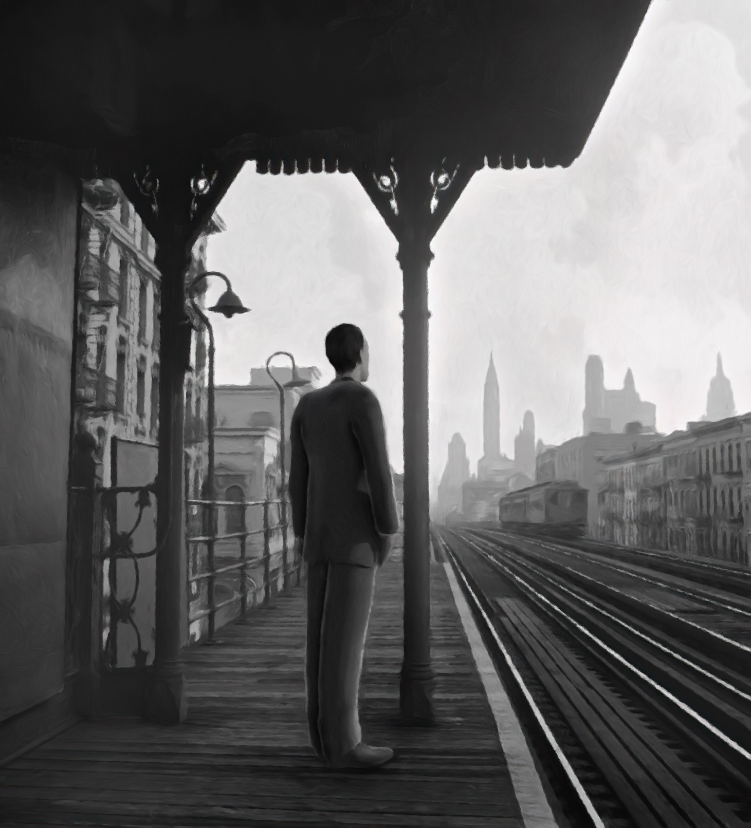
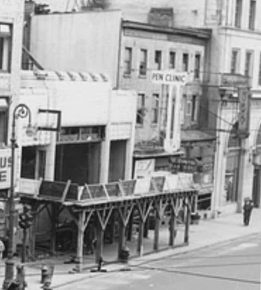
This fits the facts, as the “home-made baked beans” shop was further up and on the other side as can be seen on 1940s.nyc. But John’s remained Lovecraft’s spaghetti “headquarters”, as he later phrased it. He was getting the best that 1920s New York could offer, made by cooks born in little hill-villages in the old country. Which must have been quite some spaghetti. He would afterwards find it difficult to get a comparable ‘New York flavoured’ spaghetti meal in Providence.
Back in New York, John’s had closed before summer 1931. On page 937 of Letters to Family Lovecraft states it was “defunct” by July 1931…
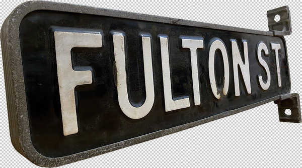
All three now set out for dinner — at the old Bristol Dining Room in Willoughby Street near Fulton, next door to the now defunct John’s, which was my Brooklyn headquarters for spaghetti in the old days.
Was John ever on the premises? Unless any Lovecraft letters can show otherwise, back in the mid 1920s it may well have been that John Pucciatti — the anarchist who looked like a Roman nobleman but who was actually from the “little medieval village of Bevagna, between Spoleto and Assisi” — wasn’t sitting down at a table to chat philosophy and art with Lovecraft. He appears to have lived and worked at his main branch. Still, he might have popped in now and again, when he wanted to escape from the big-name gangsters and the fumes of Mama John’s back-yard hooch-brewing.


