It’s possible to embed a scrolling PDF at DeviantArt, and have a download button for the PDF file show up. Who knew?
Category Archives: Tutorials
Whoot to Wootha!
I’ve never seen this one before: Setup a Real Time Black and White Preview Window in Photoshop. Very useful for digital painters. Sadly the setup process can’t be recorded and then run as an Action (I tried), but you’ll probably memorise it once you’ve done it a few times.
Another way to quickly colour Poser lineart
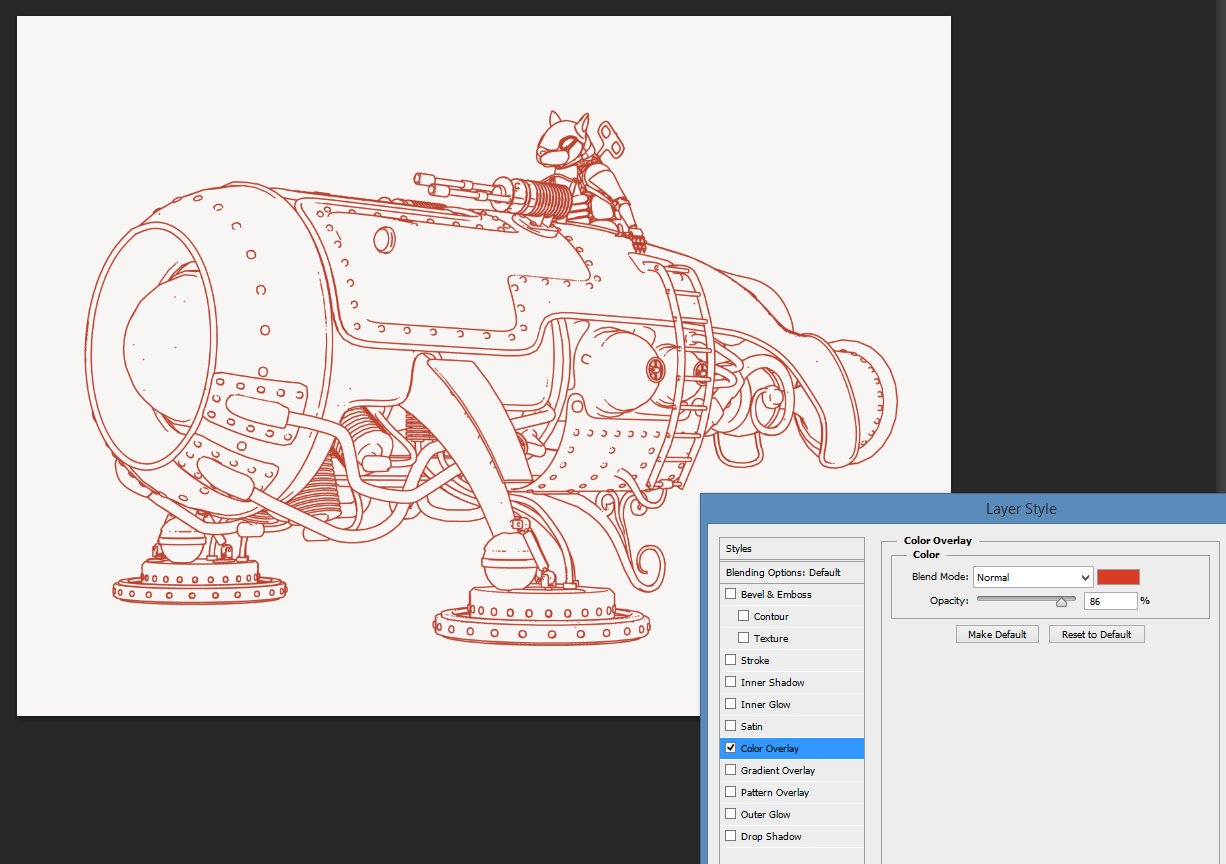
Here’s another way to quickly change the entire colour and/or line style of Poser’s Comic Book Preview or Toon Outlines lineart. It’s not the same as hand colouring with a soft brush, to partly match the colour flats layer beneath – but it’s a quick way to get the ink line colour away from black. It uses Photoshop’s Layer blending mode.
1. Open Poser’s render of your ink lines, in this case a simple toon outlines render.
2. Run a Photoshop Action on the layer that knocks out the white, leaving only the black lines.
3. Add a new white layer under the lines, so you can keep on seeing your lineart properly.
4. Top menu | Layer | Layer Style | Blending Options | tick Colour Overlay | click on Colour Overlay to open its controls.
5. Adjust the colour and settings of Colour Overlay, to taste. In this example I’ve had the ink lines become red…
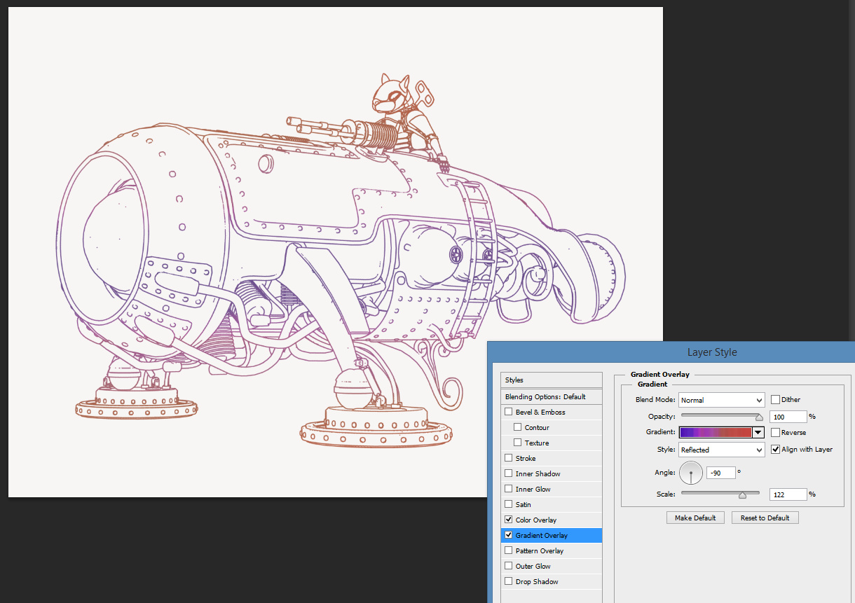
You can also simultaneously apply the next Layer blending mode, Gradient Overlay…
The stacked blending mode can be saved as a preset to the Styles palette, from where it can be easily applied to other lineart.
90-minute webinar on Poser for comics production
A new free 90-minute webinar on using Poser for comics production, “How to Create Graphic Novels and Anime Art Using Poser Pro”, from Digital Art Live and Smith Micro. It’s on YouTube in 720p. This is the second of two versions of the same webinar, presented by Tasos Anastasiades. The first run-through had some glitches, but this second one is excellent.
There’s also an in-depth interview with Tasos, to be found in the latest (Dec 2017) free monthly magazine from Digital Art Live.
Tutorial: how to make an easy pencil sketch with Poser
Poser’s Sketch Designer module probably doesn’t get as much love as it should do. It’s been around and unchanged forever, which means that most Poser users last took a serious look at it a long time ago, when running on underpowered PCs and a crash-prone Poser version. Sketching took forever, could easily crash your PC, and the render size was insufficient to do much with. Most people seem to have forgotten the Sketch Designer is even there. If they do try it, they try the official presets and find that most still take forever and still crash your PC.
But there’s a whole lot that can be done with it, and with super-quick rendering times, once you break free of the presets and work out what the sliders do. Learning how to turn off background sketching is the biggest time-saver. This done via: Background tab | Opacity 0% and just-in-case bring all the other sliders down to 0% too.
Ignore almost all of the official presets.
Turn off background and brew your own presets.
There’s also the fact that Sketch Designer results can now be quickly improved with some fairly recent additions to Photoshop’s features. For instance, here’s how to quickly fix the output from the plain vanilla “Sketch” preset, using Photoshop CS6 and higher. Here I’m using a flat IBL light, and I’m in Comic Book Preview mode in Colour with lines turned on. Basically, the scene is about as flat as it can get, though admittedly we’re still getting some indication of shading from the character’s materials.
Then we run Sketch Designer’s standard “Sketch” preset on it, after turning off the preset background and turning the sketch lines’ Opacity down to maybe 40%. If you were trying to sketch a creature with a dark material, such as a dinosaur, either re-texture or set opacity much much lower.
This is the result in a 2400 by 1800px render size in .PNG format…
You could also experiment here with turning Depth Cueing on, to see if you get fainter pencil lines further away from the camera.
Then load the PNG render in Photoshop, apply Smart Blur followed by Surface Blur, then finish with a little bit of Noise. Sketch Designer’s strange swirly-whorly Sketch patterns now look like graphite pencil shading and some artistic smudgery, but we’ve kept the linework un-blurred…
The addition of Noise is a quick and clunky emulation of paper texture, but you could omit that and blend onto a real paper texture. In that case, you might not want to lower the Sketch preset’s opacity quite as much as I have in this example.
You might also add the original Poser Sketch layer back on top as a 50% blending Photoshop layer, then go over it with a big soft Eraser to remove the knots in the whorls and just leave what looks like ‘a trace of pencil strokings, here and there’.
The only problem with Sketch renders is that when you save the render to .PNG it is not masked. But there are multiple other ways to get the mask from Poser.
Poser: tweaking Geometric Edge line colour for comics
Following my recent Poser lineart colour tutorial, many thanks to Mike Mitchell for pointing out his “Noir Style Tutorial, Pt. 8 – Step 3: Edit Materials” blog post. Mike’s post usefully points out that Geometric Edge line colour can be easily edited, in Poser’s Materials Room.
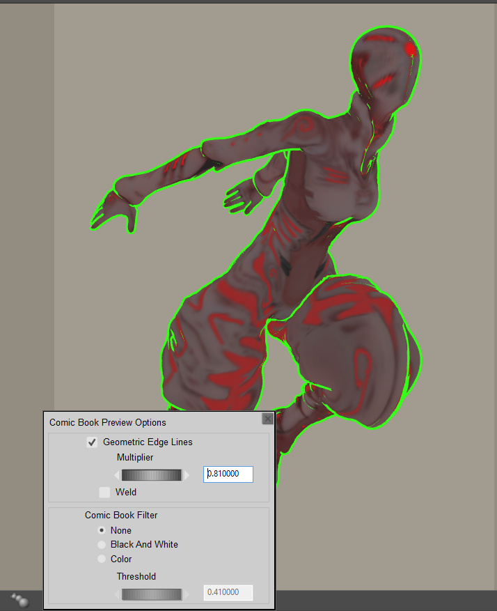
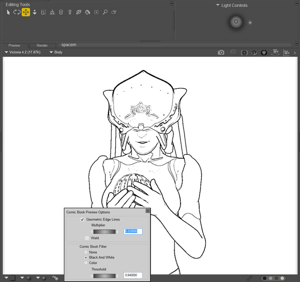
This works, but on its own it is not all that useful for my suggested Photoshop-oriented workflow of “colour flats + shading + linework” as layers. Because it can’t be applied in the Comic Book Preview mode’s B&W setting, only in its Colour or None setting. Here it is with Colour on…
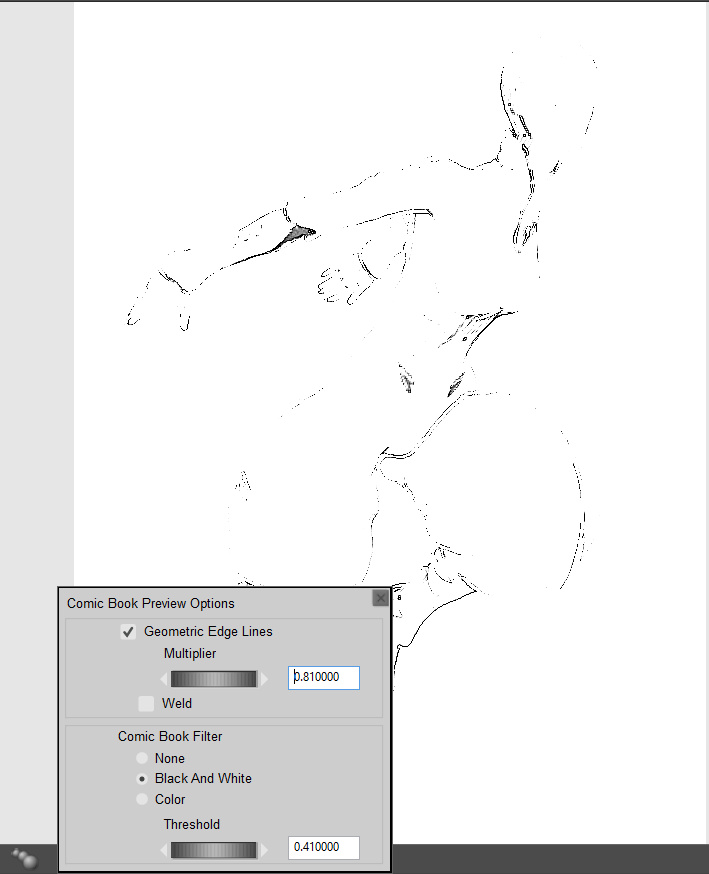
And with B&W on…
As you can see, the bright green line just isn’t being picked up when B&W is turned on. Nor does it help to switch Poser’s overall Display to one of the Cartoon Display modes, or to render in Firefly with Toon Lines on. Nor does it help to use a shade of grey for the green line.
Mike’s tip would be most handy if you’re tweaking textures directly on the character, in the hope of quickly pumping out a set of single finished/usable comics renders from Poser. I haven’t yet got as far as doing the whole ‘total character materials makeover for comics’ thing — which obviously has huge potential — and currently I’m still slowly exploring the best options for getting multipass renders stacked up in Photoshop. That’s mostly because I want to find a relatively quick-and-automatable way to create consistent comic frames that look like they’re hand-drawn (aka ‘the mythical Northwest Passage to the fabled Land of the “Make Art” Buttons’). “Consistent” is the key word here, so as to avoid two hours per page of colour adjusting and tweaking shadows to get them to look alike in each comic panel and from page-to-page.
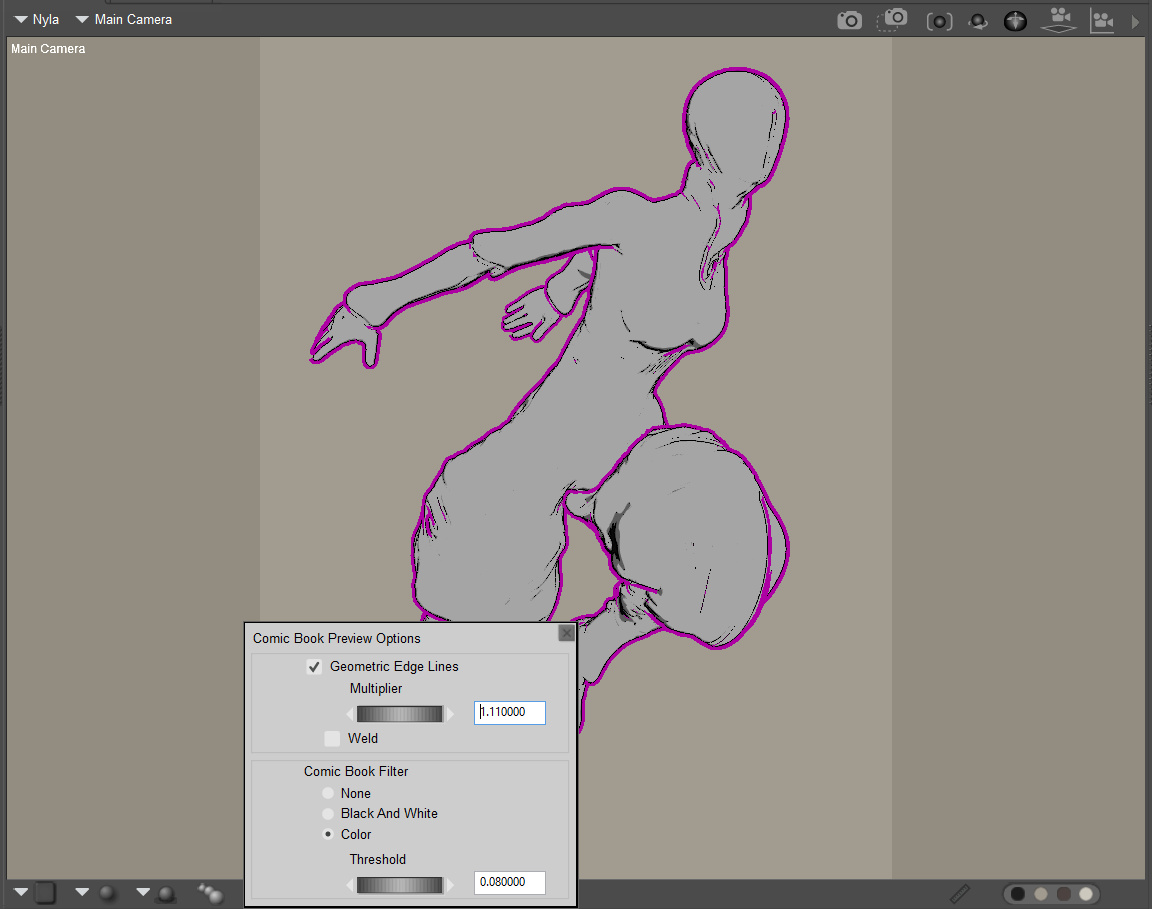
However, prompted by Mike’s note I’ve found that there’s an exception and a workaround. Simply switch Poser’s overall Display to “Cartoon w/lines” (three tones) and we get a grey-filled duplicate of the previous B&W mode. No extra ink lines are being added when compared to the B&W Comic Book Preview mode, but we do retain the green outline, albeit initially with a hair-thin black line either side of the green ink line. (I can’t see any way to colour-ramp the line with a gradient, as it has no ‘node connector hole’ in the Material Room. So it appears to me that the Geometric Edge line can only ever be a solid colour).
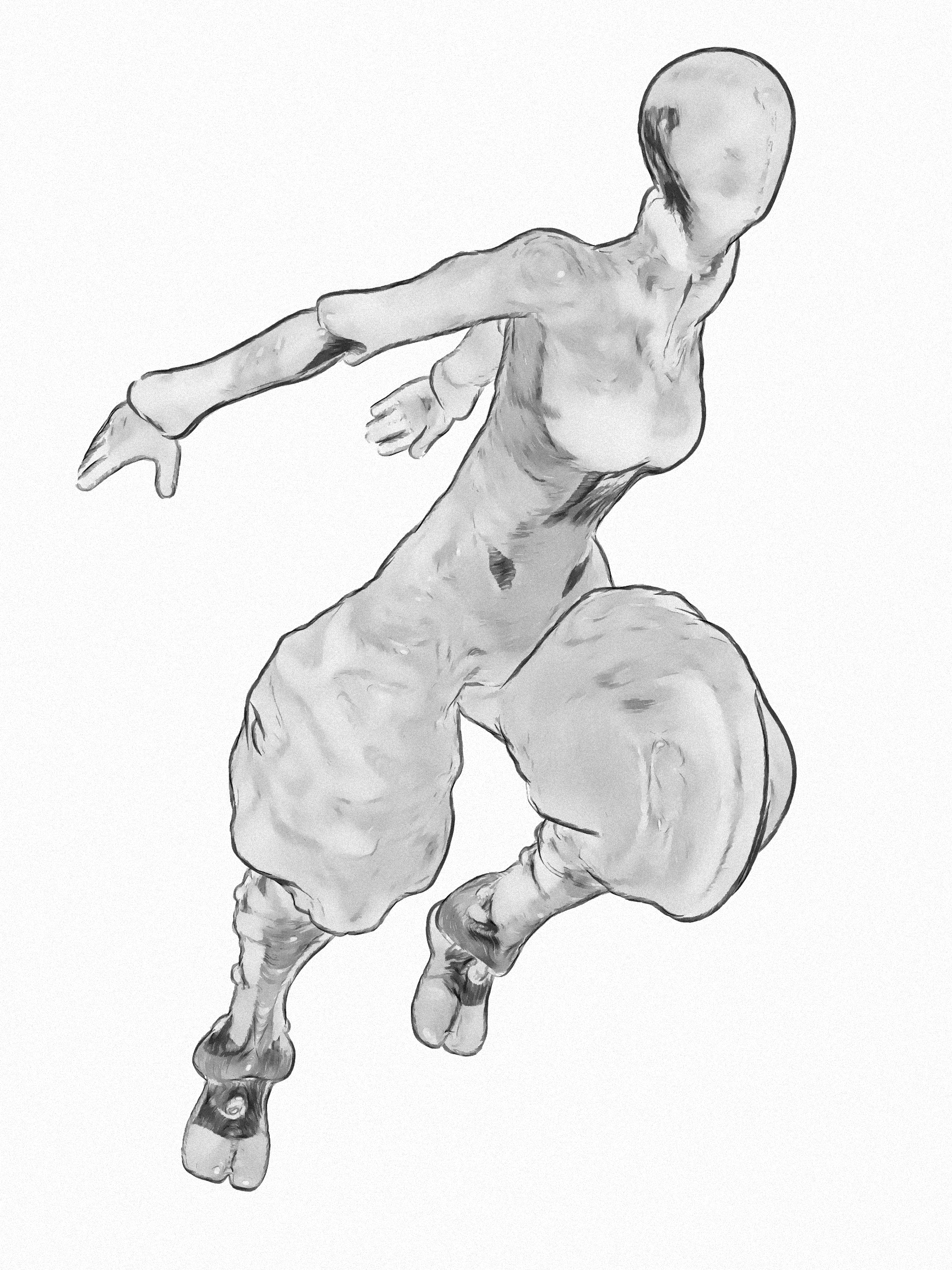
However, fiddle with the Comic Book Preview dials a bit and the unwanted hair-thin black lines vanish. This makes for a solid colour edge-line which is useful, for instance when used as a Colour blend layer in Photoshop. When we export this as a masked .PNG, then everything else in the render will be grey or black. Therefore it should be possible to either Colour blend or to select-extract just the coloured line. If you just want a solid colour fill on your linework, and don’t want to fiddle with fiddly adjustments layer or blending modes in Photoshop, then is seems this is a quick way to do that. Here’s Darkseal’s Nyla in a nice dark pink line…
There’s no need to make multiple renders for multiple line colours, because Photoshop can ‘Replace Colour’ with ease, or change colour of a layer using Layer Blending modes and Colour Overlay.
Tutorial: How to change Poser 11’s black comic-book ink lines to any colour.
How to change Poser’s Comic Book ink lines from hard black to… any colour you like. You can’t yet do it natively in Poser 11, although perhaps the forthcoming Poser 12 will add a feature to make that happen.
I’m assuming here that you make several quick real-time render passes from Poser. These being, for this tutorial:
i) The Comic Book ink lines from a flat IBL light-lit scene.
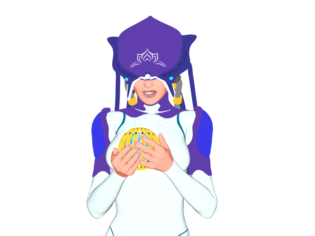
ii) The colour flats, with the same light, made by just turning off the same Comic Book mode’s ink lines.
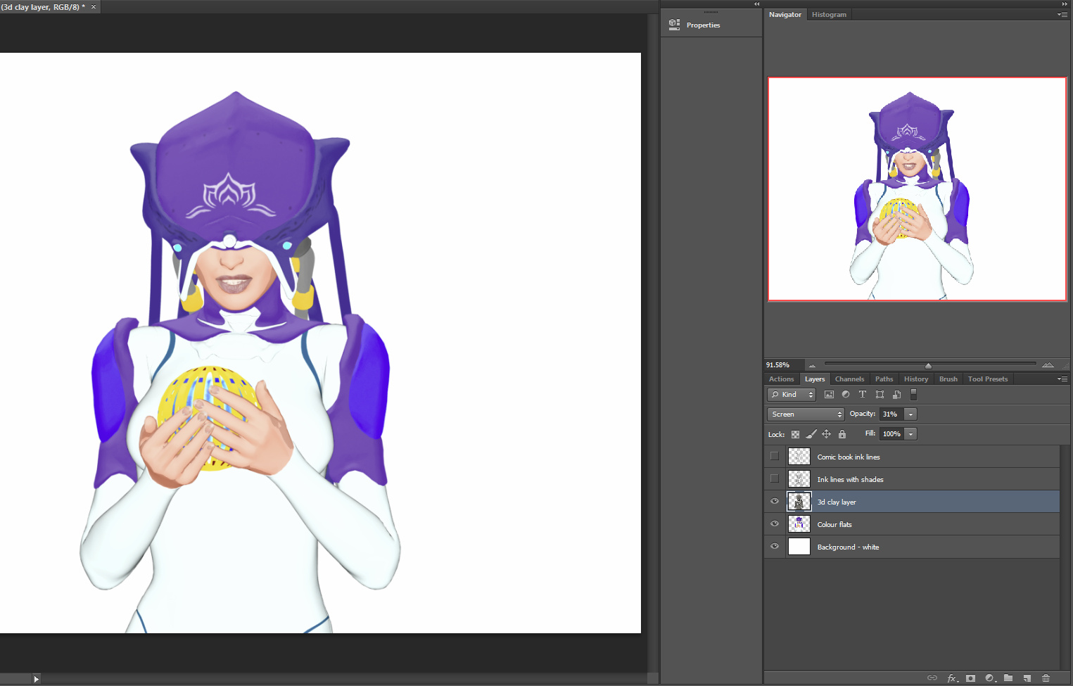
iii) A 3D grey/shadows layer. In this instance, from a simple switch to the old default Poser light preset + set Display as Cartoon w/Lines. (If you’ve swung the camera before starting, make sure there’s a fairly even illumination by having your main light ‘dead-centre’, as you can see happening on my light preset icon). This layer is just used later to subtly add detail to the colour flats. Any good lots-of-shadows layer, suitable to become a greyscale, should work. It doesn’t need to be pretty, so don’t waste time tweaking it.
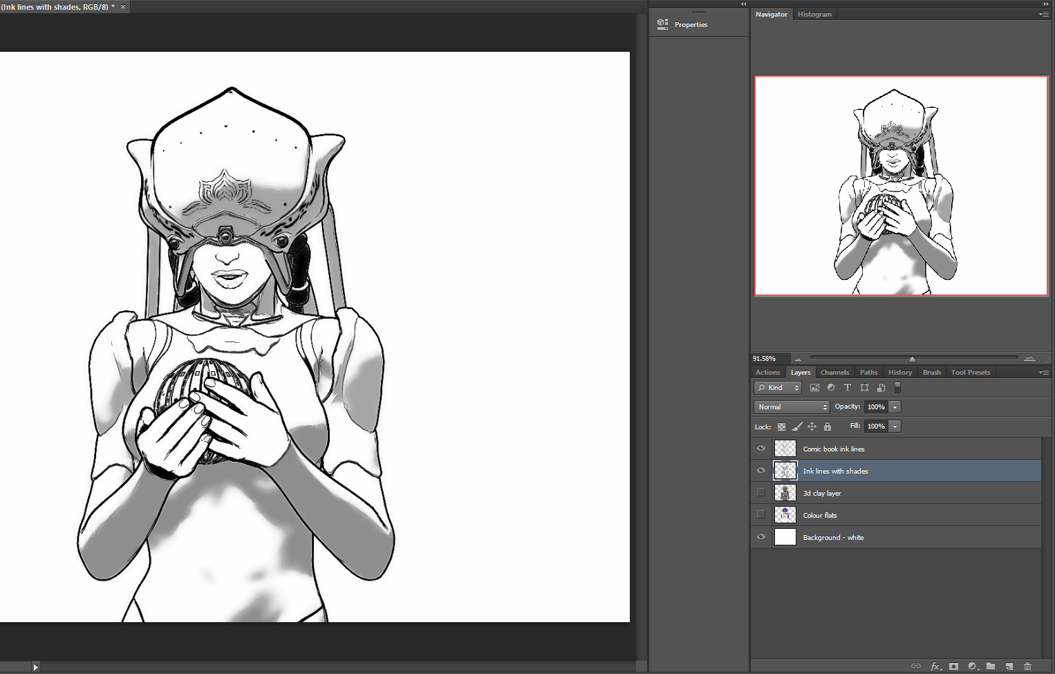
iv) Then you make an alternative linework render. This is made very simply by switching scene iii) from Colour to B&W in the Comic Book controls, and tweak the B&W dial slightly to get a layer with different lines and more of a 2D manga-like subtle shading to it. The horrible posterision of the shading edges doesn’t matter, as that’s easily fixed in Photoshop. (Though if you want better shadows in Poser, try taking Preview-light “Shadows” up from 512 to 2048). (If you save ‘2048 shadow’ lights, label them ‘do not use with Firefly’ – as lights with that setting will reliably crash Poser when making a Firefly render with them).
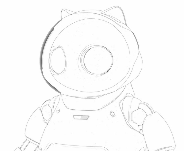
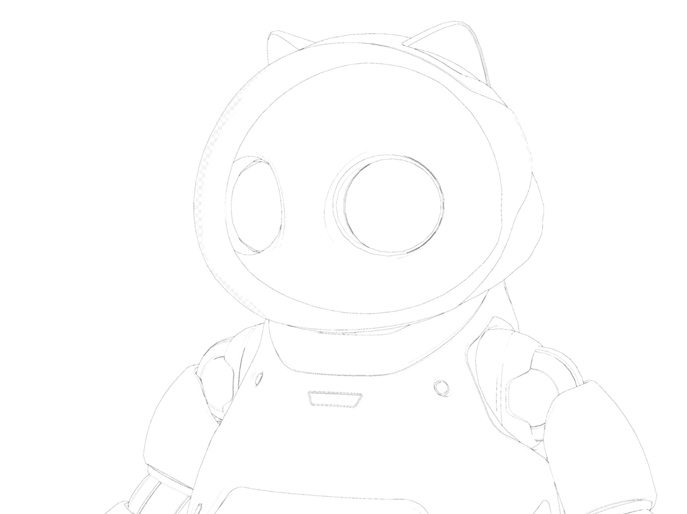
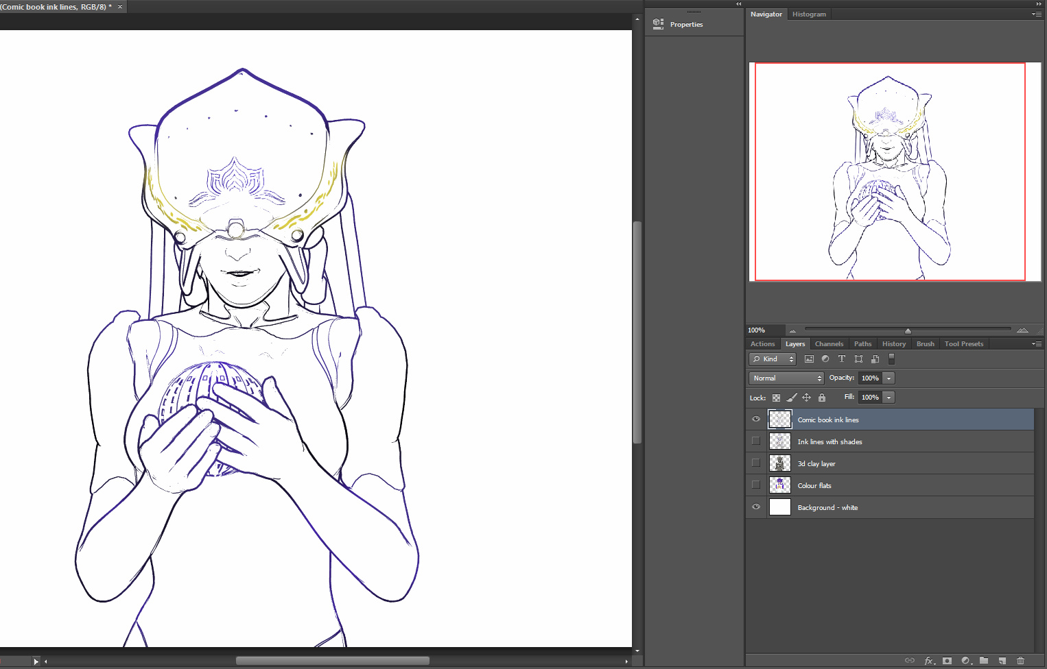
Once the two ink line layers are loaded into Photoshop with “Paste in Place”, you can knock out white, blend the two line layers and clean any stray lines and ink in missing lines. Here I’ve knocked out the white from both layers (there’s an automated Photoshop action for that), then used the eraser to clean the mouth ink lines and a couple of unwanted weird lines that were lurking below the helmet edge. I could have done much more to tidy up the linework, but this is just a demo. I then softened the posterised edges on the subtle shadowing ink-lines layer, by applying Surface Blur to the whole layer at 7 | 42.
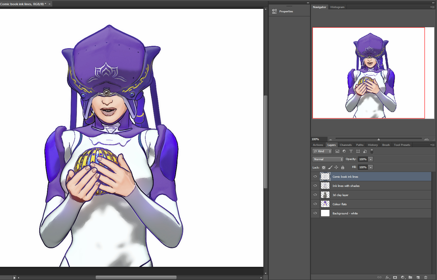
Under the ink lines is the 3D grey/shadows layer, but converted to greyscale (with a simple Desaturate), and then set to Screen blend at 30%. That makes it blend into the Colour Flats layer below it, softening down the colour layer while also adding a bit of subtle shaping to the colours, but not so much as to provoke an “Ugh, that’s so 3D!” reaction. No watercolour shaders required.
The problem then is that when you turn the two ink line layers back on, over the colour, then the inking looks way too heavy and crudely black. To beautify we need to make the black ink lines change colour. Here’s how…
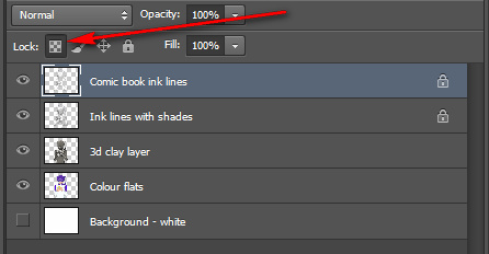
Firstly, in the Layers Pallette, turn off all but the topmost of your ink lines layers. Then click on that layer’s tweeny-weeny little checkerboard icon…
Then select a big soft brush at 100% opacity in Normal blend mode, pick a colour and simply paint over your chosen layer’s black line work. Only the ink lines should be colorised, because we turned on the little checkerboard icon.
Repeat for the next ink line layer.
Here’s the result, with the ink lines coloured up a bit so as to better match the colour flats layers below, and all layers turned on.
In the comic book colouring trade, this is known as a “colour hold” on the line.
The ink line edges are a bit jaggy here because I’m only doing a demo here so have been working with 800px 72dpi renders. Ideally you’d be working with 5000px and above. Even at that size they render quickly, because all the renders come from the real-time Preview render setting.
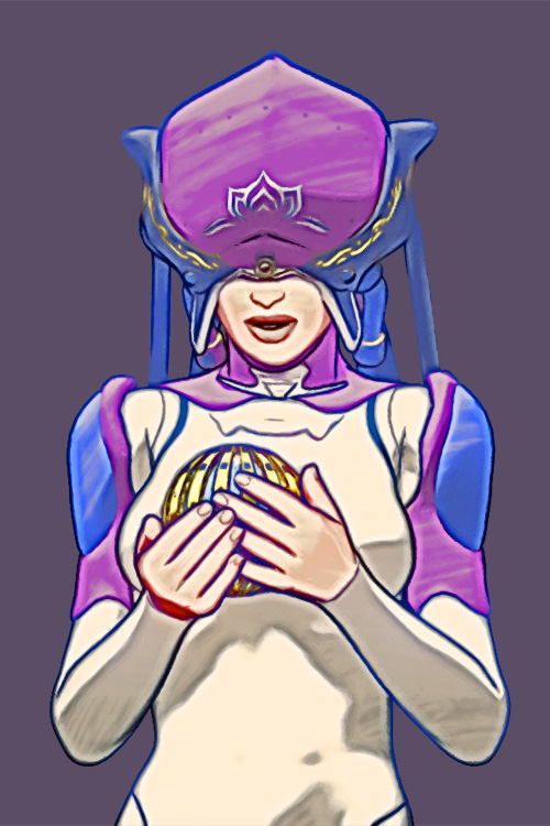
The flattened final frame can also be art-ified by being run through a Photoshop filter. Note how what was a clunkily-inked nose and mouth now look very nice indeed.
Here’s another and less garish version, with the same filter just run on the base layers and then with the colour layer blended. Still not ideal, as again we’ve lost some of the ‘sci-fi look’ on what was a white jumpsuit, and our carefully coloured ink lines are now shades of dark grey and white. But at least they’re not a jarringly hard black, and you get the general idea.
If you have an additional Poser Sketch Designer sketch-lines render layer, you could blend that back onto filtered versions, for a charcoal line look. That charcoal linework could also be coloured using the technique above. You can also colourise in Photoshop using the Replace Colour option (though not from a hard black) and can use the Sponge to desaturate small areas when a filter causes them to “pop” too much.
Tutorial: how to activate and load Micheal 4 and Morphs++
Here’s how to quickly load Michael 4 (M4) with his morphs in Poser, avoiding a half-hour of “where the heck is it!” searching:
1. First, install M4. Then ‘initialise’ M4 so that he can accept his vital set of Morphs++ morphs. Do this by running DzCreateExPFiles-M4.BAT and DzCreateExPFiles-M4Gens.BAT files which are both found on your hard-drive in your DAZ content directory, likely to be in: ..\Studio\content\Runtime\Libraries\!DAZ Just double-click on each of these Windows .BAT files.
The .BAT files only need to be run the first time you ever install and use M4. After that you don’t need to touch the .BAT again, until you get a new PC or re-install Windows. (I have no idea what Apple Mac users do, as .BAT is a Windows format. I assume Mac users have an AppleScript or something like that?)
Poser’s Library can show more than one runtime. Make sure you have the one containing the M4 selected. Also be sure you don’t for some strange reason have two ..\Runtime\Libraries\!DAZ\Micheal 4 folders.
2. In Poser’s Library, then find your installed base M4 character at – Library | Figures | DAZ People | Micheal 4. Load him to the stage/scene.
3. The M4 Morphs++ are found at – Library | Poses | DAZ’s Michael 4 | Morph Injections | and then look for the INJ Morphs++ M4 icon.
Select M4’s full Body on the stage, then double-click INJ Morphs++ M4 to inject the morphs. Alternatively you can go to ..\Runtime\Libraries\!DAZ and run the .BAT there as DzCreateExPFiles-M4 file.”
Give it a couple of minutes to work. There’s no confirmation that the new dials loaded. But they are there. You may need to select a body part to see them.
You may also want to run the DzCreateExPFiles-M4Gens.bat file which looks like it erm… ‘handles’ the naughty bits, separately.
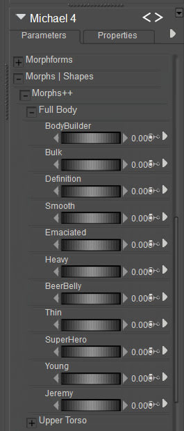
4. Now randomly select almost any M4 body part and look down at the Parameters dials panel. Under Morphs | Shapes you should now have lots of new Morphs ++ dials for total control of M4. The injection of the Morphs++ worked.
Morphs++ is required by a good number of cool character presets, which in your runtime are usually labelled INJ BODY or INJ HEAD or similar. A youth (middle teens) body morph, for instance, is free at Renderosity as Connor for M4 (in Library: Pose | REC Connor M4).
And of course the Morphs++ dials can still be useful for manual tweaking. Here are the full-body ones…
5. Now save the Poser scene file with your fully morphed-up M4, so that you can quick-start making an M4-based character in future. You probably want to get away from the bland default M4 face as fast as possible, and there are many character heads available.
You may also want the M4 Magnet Fits which injects morphs in clothing, for fine fitting of too-puffy shoulders and suchlike.
The loading process is much the same for V4.
How to move from Flickr to 500px.
So you want to move from Flickr to 500px? This step-by-step guide assumes that the idiots at Yahoo have lost your Flickr login details to hackers, which means you no longer have access to your account there.
1. There are a few initial hurdles to get over. First, sign up to 500px, which to me seems the best alternative to Flickr and is run by photographers. Their free account only lets you upload six pictures a week, last time I looked. They have periodic sales on upgrades to an annual subscription.
You pay annually by PayPal, recurring. Given that payment is via PayPal rather than a credit card, it should be fairly easy to cancel in the future, if you need to trim back your subscriptions for some reason. If you can’t afford a 500px subscription, then also look at a free WordPress.com blog with the excellent free Dyad 2 theme. If you make imaginative digital art rather than photos, then of course DeviantArt is your go-to place and is also free.
2. You need to install the Adobe Air framework on Windows, and then get the excellent Bulkr (which runs on Air). Bulkr is very easy to use and lets you download from Flickr in bulk. There’s a free version of Bulkr which is only slightly crippled. But if you have thousands of photos on Flickr then you’ll probably want to purchase the license key which upgrades Bulkr to the full version, so that you can auto-download the largest versions of your pictures.
Bulkr doesn’t require you to be logged in to Flickr, in order to view and download entire folders of your pictures. If you can log in to Flickr, then the 500px uploader may be of use to you. See step 5.
3. Point Bulkr’s elegant user interface to your Flick home URL. Marvel at how fast it loads, compared to the bloated Flickr in a Web browser. Work down your Flickr folders, saving their contents out to your desktop PC as the largest versions. Be aware that Bulkr only shows 100 pictures per screen, which means if you have 200+ pictures in a Flickr folder then you’ll also need to move to Bulkr’s “page 2” etc. You can also download tags and descriptions, or embed them in the picture file.
Several thousand photos, across 50 or so folders, might take 90 minutes or more to download. Usefully, Bulkr fixes the filename to reflect the title you gave the picture, e.g.: Kelly, watch the stars_2622682267_o.jpg Sadly, it can’t also embed tags and Creative Commons license info.
4. Now you’ve mirrored your old Flickr photos on your hard-drive, you can make a safe archive copy. You can then use a bulk file re-namer, such as the free ReNamer Lite, to remove the _2622682267_o bits. 500px will then use the filename as the picture title on the upload, complete with original capitalization, commas etc.
5. Now upload them to your chosen new photo gallery service. 500px has an easy browser-based uploader with bulk upload capabilities (feature details). It can also integrate with Dropbox etc. You just drag and drop the pictures to upload. If you have slow broadband and slow upload speeds, you’ll probably want to do it in small steps — uploading a couple of small folders a day.
The 500px uploader seems to work best with six photos at a time, and can choke when you give it more. Obviously it’s not a service suited to the wedding or commercial photographer who has 600 photos to upload in 10 minutes, so that the client can see them. If I had known about the repeated upload failures, I’m not sure I would have chosen to pay for 500px. One failure on one picture means the whole batch can’t be uploaded! Anyway, I’ve paid for it now.
6. Rather than laboriously re-tagging pictures, tagging folders is probably easiest in terms of adding back some public find-ability. You can download the tags with Bulkr, but only as either a .txt file or as an embedding in the EXIF data. The other big annoyance of 500px is the amazingly dumb auto-suggest of keyword tags for your photo. They auto-fill the tag box, and there appears to be no way to turn off this feature.
If you were putting your Creative Commons pictures in their own folders on Flickr, or using their title to declare them “- Creative Commons”, then it shouldn’t be too difficult to set the CC licenses on 500px in bulk. Descriptions are tricker, and it may well be that you will have to manually copy over the more important of the explanatory descriptions on Flickr.
7. If you run Stylish as an addon/extension in your Web browser, it’s free to get a new dark theme for 500px, even with the cheapest level of subscription. Such as 500px Quite Dark. Also useful is the “Add download pictures” button.
That’s it.
Guide: setting up your new Amazon Fire 10″ HD tablet
Welcome to my hands-on guide to wrangling your new 2017 Amazon Fire 10″ HD tablet, after you first unbox it. The guide is especially geared to creatives who want things like: the best sketchbook apps; comic-book readers; and the right DeviantArt app.
Update, Jan 2019. I’ve added a few more nice apps I’ve found since this post.
1. On unboxing your new Fire 10″ tablet, for your own security first stick a tiny blob of Blu-tack over each of the two camera holes. Then power up the tablet, set your wi-fi password, and sign-in to your Amazon account. The Blu-tack can come off the camera later, once you’ve settled down with a range of apps you trust.
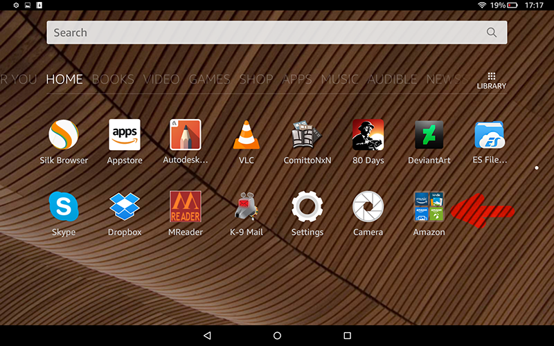
2.Then you can hide all the pre-loaded Amazon apps you’ll never use. You do this by hold+dragging one of the Amazon app icons on top of another one. When this is done the two icons automatically form into a folder, into which you can then drag all the other icons for the Amazon apps you don’t intend to use. Creating this single “Amazon” folder goes a long way to cleaning clutter off your tablet screen. Because… you can’t delete any of the apps the tablet comes pre-loaded with.

(Tidier, but still not prettier. I’ve yet to find out if naff app icons can be switched out for nicer ones).
3. Now dive into the tablet’s “Settings” menus for thirty minutes (there’s a lot to find, down there) and turn off a whole lot of things — such as tracking, recommendations and ad-like notifications. Reboot.
4. OK, now you have the basics sorted and the tablet is 90% tamed. If you purchased the most affordable 10″ HD version you still get ads on the tablet’s lock-screen, but you can set these to be ‘family friendly’ in “Settings”. I found these lock-screen ads quite fun, being a random mix of best-selling kiddie games, interior design apps, and travel gadgets. None of which I’d ever buy, but I admire the slick artwork as I flick past it and into my Kindle ‘Home’ screen. Which, incidentally, still features the occasional Amazon ad in “New items”. If you really don’t like that happening then you can either find instructions online on how to remove them, or pay Amazon £10 to get them off.
5. Note there’s no Google Play store on the Fire tablets, and Amazon’s Kindle app store can be a bit of a pig. The quality apps are in there, but often all-but-hidden under a mountain of rubbish.
Firstly, note that not all apps are equal in the store. Some apps will show up in search results even when using a partial name. For instance, “Sketchbook” will find Autodesk’s official ‘Sketchbook – free drawing app’. But typing “Tayushi” or “Comitton” will not find either ‘Tayushi Sketches +’ nor ‘ComittoNxN’. Amazon obviously deems these to be ‘lesser’ apps, that can only be found by typing their exact store name.
Secondly, note there’s no “Creativity tools” category in the Store. Nor can you bookmark a WishList, which seems odd since a WishList would surely help Amazon to boost sales.
The apps:
* Best art app: Autodesk Sketchbook is on the Kindle app store for free under the name ‘Sketchbook – free drawing app‘. The free version works fine, but there’s also a one-time £2.49 upgrade purchase which gets you things like smudge blending, markers, etc. Sketchbook on the Kindle Fire 10″ is wonderful, and big loaded brushes are fast and smooth even with a large canvas size. Everything you expect is here. All you lack is pressure-sensitivity. But even with fingers or a capacitive pen/brush it’s perfect for quick conceptual thumbnails, the best of which can be worked up later in a full pen-monitor (such as the Ugee or Cintiq) albeit as flat .PNG file. You get seven layers on a decent canvas size.
Hardware reviewers say the new Fire 10″ is nearly as fast as a 9″ iPad in bench-tests, and the way Sketchbook works seems to bear this out.
* Alternative art apps: I spotted the following worthy alternatives to Sketchbook on the Kindle app store: ‘ArtRage for Android‘ and ‘Tayushi Sketches +‘. Tayasui is very elegant app at £2, and well worth having to complement Sketchbook, since it has several fantastic unique features. But it only has three layers on the Fire, and saves to a flattened .PNG file. The other drawback is there’s no Smudge/Blend tool (as it seems there is on the iPad), but you can export a good size .PNG to Sketchbook where you do have Smudge.
Update: the fine Krita 4 is also said to have a tablet app version, but it’s not on the Amazon store.
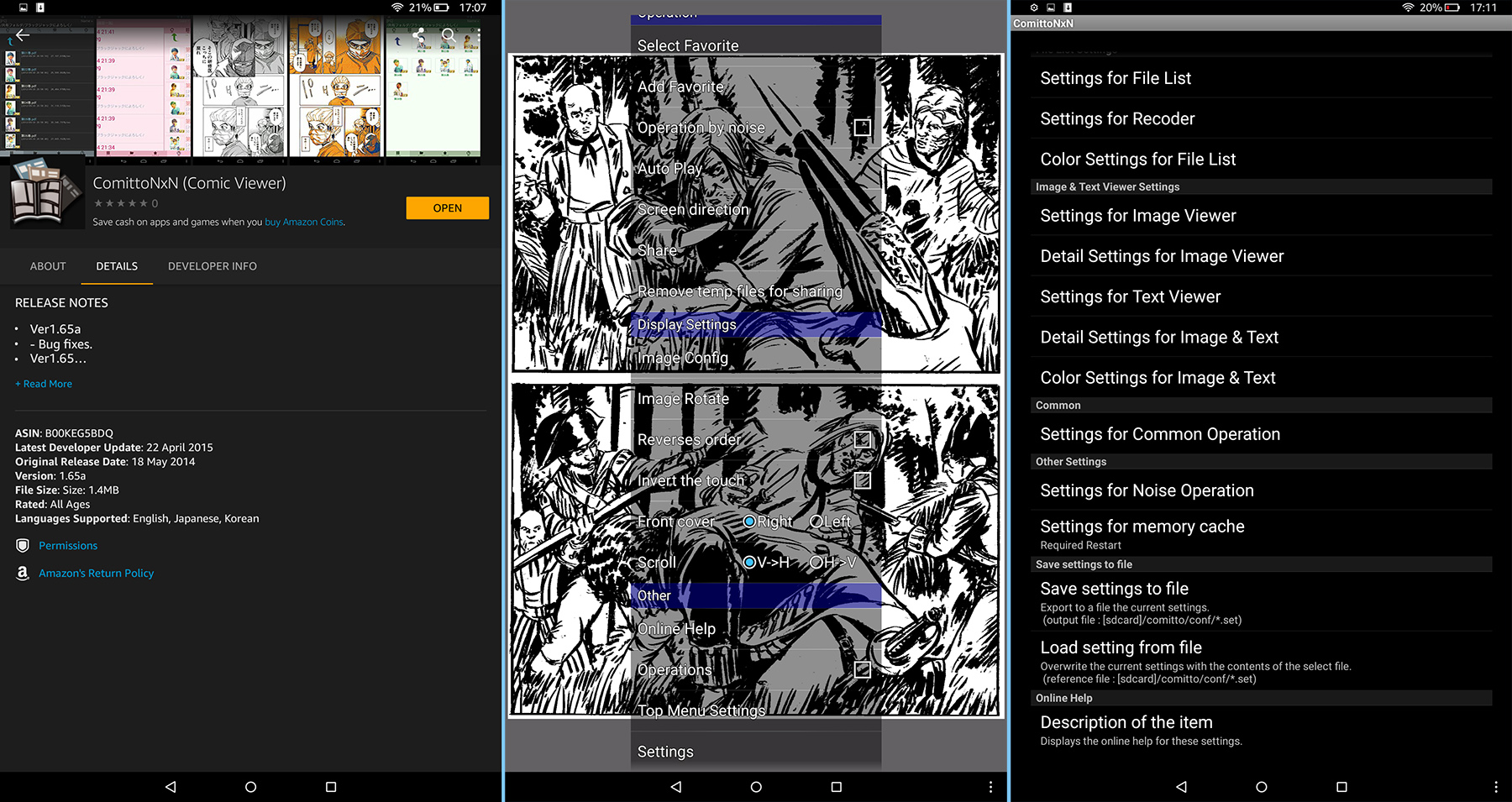
* Comic book reader: I was delighted to (eventually) discover that ComittoNxN 1.65 is on the store, at £1.50. Ignore all the other comic book readers, ComittoNxN aka Comitton is what you want. If you know how to ‘sideload’ apps then you can even officially get it for free as an .apk (sort folders by date, show full filenames, then download v1.65 as a .zip). Personally I thought that giving £1.49 to the creator was a worthy act, so I paid for it in the Kindle AppStore and saved myself some sideload-ing hassle. Just ignore the app’s very naff icon and Japanese language screens (shown in preview on the App store) — this is a top-quality app in English, just ‘made in Japan’ by one guy — who lacks a massive English-language marketing operation.
The only slight drawback is that, while it will load PDF files, it doesn’t show text on layered PDFs. Just the artwork. That can actually be quite an interesting feature, though, allowing the pure artwork to shine (if you have the correct sort of PDF). Incidentally it also works as a fine PDF viewer for scanned PDFs, but it seems you can’t tell the Fire to “always open PDFs” with it.
After the install of ComittoNxN you are first presented with a file navigator view of the full Fire system, which can be a bit daunting. On the Fire 10″ you then need to go to: /storage/emulated/0/.. to get to your usual media content and download folders. Or drill down to your SD card. After loading your first .CBR or .CBZ comic / graphic-novel you then go into ComittoNxN’s “Settings” and set ‘Image Viewer’ to ‘Fit Width’ / ‘AutoRotate’ / ‘Not to Sleep’. You can also set the app to ‘operate by noise’. Then you’re pretty much good to go.
Update: Comic Time is another fine free reader.
* Media player: ‘VLC for Fire‘, the free ad-free Kindle Fire version of the well-known and trusted media player. This loaded and played a 2.4Gb .MKV test movie with no problems at all, not even the slightest stutter or hesitation. Wonderful.
Update: Playlist-creation handling in VLC 3 for Android is still very basic, with VLC not even able to make a playlist from ‘all files in a folder’ and then allow the user to manually re-sort files into their correct order by select-and-drag. Thus you need to ensure the files are correctly named before sending them over (001-to-100 format) from the PC, so that ‘a sort by name’ in VLC will then place them all in the right playing order. If you have 400 video files in a big video tutorial, doing that is not a lot of fun — which is where Windows utilities such as Winsome File Renamer come in handy.
Update: OneCast is the best free podcatcher for podcasts.
Update: Screen On is the best free app to keep your Kindle from dimming or rebooting while you listen to music. It has a curious way of being turned on. To start it it, first you stop it (even though you think it’s not running), then you restart it.
Update: to send links to things like YouTube videos, without some Cloud sharing service, just set up a Trello board for your links and drag/drop them there.
Update: AIMP is now my preferred audio player on both Desktop and Kindle. AIMP has a fine free Android app that can be ‘sideloaded’, and has good playlist creation features. NX Player is also good re: playing the audio streaming from your PC over wi-fi, using the desktop freeware “Stream What You Hear”.
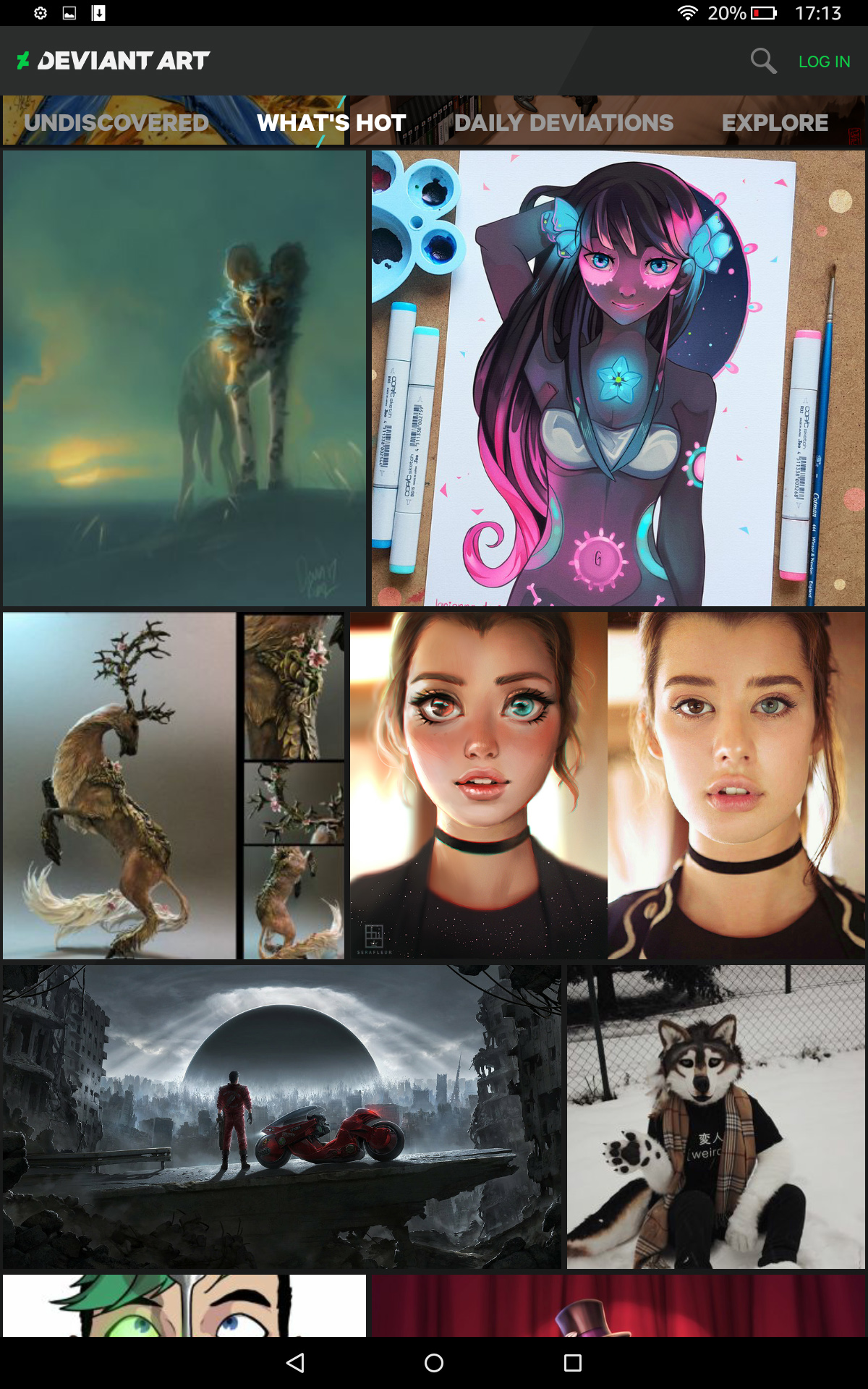
* DeviantArt: Yes, DeviantArt has its own free app, and as you’d expect it’s a beauty. This is what the luscious 1920px Kindle Fire 10″ screen was made for. Be aware that there are a lot of con-apps pretending to be DeviantArt, and it’s rated “Adult” so you won’t even see it in the Store if your Kindle’s Child-Friendly Settings are turned on. The official app you want is this one. You don’t need to log in, to browse DeviantArt’s pictures.
Update: It’s now actively censored by a team of moderators (as the similar ArtStation app). What is censored goes far beyond the ‘Mature content’ filter, in order to conform to the Google Play Store’s extreme prudishness. What you’ll get with the app is no longer the same as what you’ll get with a Web browser.
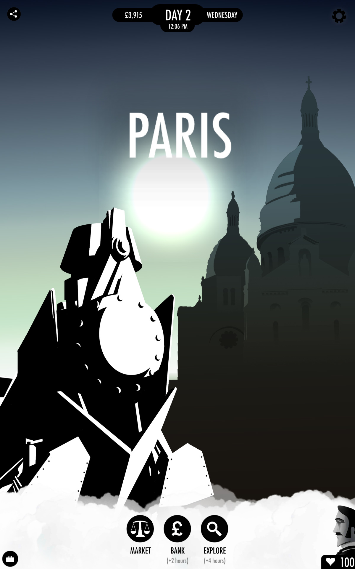
* Games: be warned that the Kindle store has a lot of drek and shady look-alikes. I wanted just one game on the tablet, and so I plumped for the acclaimed gamebook ‘80 Days‘ by Inkle, in its robust/expanded v1.3 version. Its vector graphics adapt very crisply to the screen size, and everything worked very smoothly.
A quality game more suited to young children would be the steampunk point-and-click Machinarium, available on the Kindle.
Interactive graphic novels:
There are just a couple of these in the app store, both quality.
The famous Anomaly: Interactive Graphic Novel with music, voice-cast, and autoplay. Made with Poser, and this is a special Kindle Fire HD edition of the book. A bargain at 59p (about $1), but it will eat 600Mb of your tablet’s space.
Also Niko and the Sword of Light, which was later made into a TV series by Amazon Studios. The first three chapters free, then currently £2.51 (about $5).
Both of these are from 2013/14, and it’s sad to see that nothing followed them on the Kindle Appstore. I guess the ratio of time-spent vs. profits was not enticing to other entrants. There are also a few Alexa-based 2017 ‘interactive audio adventures’ available, but one suspects the format will suffer much the same fate — too expensive to make, too few sales.
* PDF Viewer: Installing the free Dropbox app will also give you a good trusted free PDF reader. It’s a very basic and infinite-scrolling (rather than per-paging) PDF reader, but is perfectly adequate for looking at occasional academic papers or think-tank reports from the comfort of a sofa. You don’t even need to sign-in to Dropbox, to use their free PDF viewer. I found that Amazon’s native Kindle app can also open PDFs, and in a more ebook-y manner, but the rendering wasn’t as good as Dropbox. I’m not sure I’d want to read a full ebook from either, and unless it had lots of pictures and graphs I would prefer my dedicated e-ink Kindle ereader for reading a book (re-flowing / larger / crisper text, and it’s not as heavy to hold).
* .ePub reader: Obviously the Kindle reader won’t be opening your .ePub e-books, as ePub is “the competition’s format”. The best .ePub reader I tried was MReader, perfectly good, free and ad-free. You may need to turn on its “Autorotate” option after install.
* .mobi reader: Of course the native Amazon Kindle app will open your .mobi ebook files. There’s no third-party .mobi reader here, such as the excellent ALreader on Google Play. If you find that the Kindle reader refuses to load a .mobi for some reason, simply use desktop software such as the free Calibre to convert it to .ePub.
* Email: ‘K-9 Email’. Yes, this trusty old community-built warhorse (or war-dog) email client is available on the Fire, free. A good alternative to the email app that comes pre-installed.
* Web browsing: The Kindle’s own pre-installed Silk Browser seems perfectly adequate for light Web browsing. If you plan to do heavy browsing, and need ad-blocking, then you probably want to ‘sideload’ the mobile version of the Opera browser.
* Folder browsing: I installed the free ES File Explorer File Manager, but I’m not sure I’ll keep it. It’s overkill, but does the job until I can find a solid free + ad-free alternative.
* Wi-Fi file transfer: If your Kindle-PC USB connection dies (in my case, through Windows utterly refusing to load/reinstall the USB drivers) there is another albeit slower option to send files over Wi-Fi using an app and desktop FTP software. After much research I settled on two options here, free and paid.
i) the free Easy WiFi FTP Transfer.
ii) the paid ES File Explorer 4 in combination with desktop FTP software such as WS-FTP. The free ES File Explorer is not to be recommended.
For security you may also want to use a wi-fi FTP app in combination with the free Wifi Turn On, Wifi Turn Off app.
* Screenshot maker: You already have one built-in. Locate the Kindle’s Power button and Volume-Down button, then press down both buttons together for one second. That takes a screenshot, and saves it as a .PNG to a Screenshots folder in ‘Pictures’.
Other thoughts:
The Fire 10″ tablet is a touch heavier than I though it would be, but I’ve very pleased to find it doesn’t even get warm (let alone hot).
If you have hard floors that it might drop on, or plan to take it out-and-about, then a protective tablet case is going to be a must-have. Also useful for propping it up.
Be careful if you turn on “One-click apps purchases” and also have the Alexa voice-control on. I found that Alexa was useless for me, as she would consistently mistake what I was saying, and without pre-warning would start doing something I never intended. The risk of accidental purchases seemed too great, so: “Alexa, off”.
If you already have a dedicated e-ink Kindle 3 ereader, and want to keep using that for your “Send to Kindle” delivery from your desktop PC, then you’ll need to delve into device settings at the Amazon website. Otherwise Amazon will initially assume that your desktop’s “Send to Kindle” items go to your new Fire and will then clear them from the queue. Your ebook purchases, on the other hand, should be available from any tablet with Kindle installed. New ebook purchases and samples should show up on your Kindle Fire ‘Books’ screen.
That’s it, I hope these observations were helpful for those getting a new tablet for Christmas.
Reconstructing the “Marvel Method”
Below is my itemisation of the “Marvel Method” of making a comic-book, as best as I can make it out from reading various interviews from Stan Lee / Jack Kirby glory days.
The method began at Atlas and would later change and morph at Marvel in the 1970s, but here’s what it was meant to be originally in the early days of Marvel…
1) Stan Lee wrote (or told face-to-face, sometimes with physical play-acting) a quick loose plot treatment for the comic’s next issue, ranging in length from a simple paragraph to a page or two. Just a plot with beginning – middle – end, and some general indications of where each scene might be set and what the character motivations/reactions might be at specific points. There were almost no detailed descriptions for the artist to follow, unless Lee wanted something very specific or innovative in a particular scene. The ending might also be made quite specific, in terms of exactly how things should end up in the final scenes.
2) The artist would break this story down into pages of framed art, pace the story across the number of pages available (sans splash page). The character designs and relationships/motivations had of course already been set up by previous issues of the title, so the artist could work pretty much ‘on automatic’ in that respect. Then he laid out the story across each page, with rough pencils. He might have to micro-plot specific scenes that the wider plot seemed to require, and/or bring a secondary character into the scene if that was needed. He added visual emphases and visual “cliffhanger” moments.
Obviously here the “Marvel Method” assumed a top-flight action artist like Kirby etc, as the method is not going to work with talent that has lesser visualisation and pacing skills. Or with comics that talk-talk-talk rather than show. Or with comics that need elaborate multi-issue pre-plotting and fiddly sub-plots.
3) The artist of course knows to leave space on the penciled pages for caption boxes or dialogue balloons, but doesn’t indicate exactly where they would be. He likely adds margin notes on the top of the page, to: i) explain the action to the writer, if the pencils are very rough or he’s invented a filler scene; or ii) repeat the section of the writer’s plot he’s covering, to jog the writer’s memory and/or for future reference later down the production line. That would be especially important if the plot had been delivered verbally.
4) The artist then added the splash (opening) full-page to summarise the story, meaning the story as they had imagined it on the page.
5) Stan Lee then came back into the process. He approved the penciled art pages for conforming to his basic plot, picked up errors and misinterpretations (most likely via notes to the inker, such as “the people in this cafe need to be more seedy-looking, please”).
7) Stan Lee penciled in the placing and size of the caption boxes, and suitably sized balloons, so as to meld these well with the artwork. Lee also said in one interview that he invented and penciled in all the sound-effect words (THHWONK! etc) at that point. This means the writer must also have an excellent sense of graphic design and spacing in page layout.
8) Once that was done he had a good idea of how wordy each page could be. He then wrote the copy for the caption boxes and dialogue/thought balloons, so as to fit with what was in the panels — the facial expressions, the details shown in the settings, any new elements the artist added etc. His captions would also help fill in plot aspects that were not being conveyed by the visuals.
Stan Lee: “And I found, as I was doing it, it made it much more enjoyable. Because I wasn’t looking at blank paper in a typewriter, but I was writing copy [dialogue, captions] for people, for drawings that I was looking at, with expressions and actions. I felt carried away.” [He would also ‘act out loud’ his ideas for lines, trying out how they sounded, in the same way that Robert E. Howard had done in the 1930s].
9) Small gaps left over in the layout might be filled with occasional footnotes to the reader, which referred them back to events in previous issues or in other titles. This helped to cross-sell titles to readers, and also helped the creatives keep track of continuity.
10) Did Lee also pencil in the lettering of his copy-writing? I guess it would have saved him typing time, and it seems he did — as in one interview he admitted: “I write the captions and dialogue [aka ‘the copy’], usually right on the original artwork”. This would also have helped with exactly fitting the copy to the space available on the page, making the finished page look even more elegantly arranged. Which means the writer also has to have lettering and copy-fitting skills, albeit not in ink.
The penciled and laid-out and written pages were presumably then photographed as a backup, and then went off to the inker of the artwork. Then to a letterer and colourist, under the supervision of an editor.
That, as best I can re-construct it, is how it was done.
How to stop Poser 11 looking for “missing textures”
How to stop Poser 11 from spending ages automatically searching the hard-drive for “missing textures”, while at the same time preventing you doing anything else in Poser. Effectively, this problem simulates what may must like “a fatal crash” to many new users. Most often this happens on trying to load older freebie content that was poorly-installed via an ‘un-zip and manually install’ process.
Go: Top menu bar | Edit | General Preferences | Library | File Search | set to Shallow (or None) | OK.
Shallow is probably best.
You want to to make this setting after your initial install of Poser, as ‘Deep’ is probably what the software will require for its ‘first pass’ at indexing your runtimes. Once that initial index is built, and only needs to be incremented thereafter, then it can be switched to ‘Shallow’.
Have Vue render on three of four cores
How to have Vue only render on three cores of a 4-core CPU, so that you can also do other work on your home PC:
1. Load Vue.
2. In the Windows Start Menu | type Task | launch Task Manager.
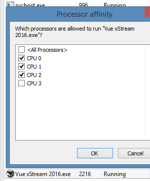
3. Right-click on Vue | Go to Details | Find Vue in the list of active software | right-click and choose Set Affinity.
4. Un-tick one of the four CPU cores | OK | Exit.
This should also work on any other CPU-hogging software. Vue renders slower, but now you can surf the Web, have a music-player running, open a PDF and suchlike.
Making Complex Accessories – training webinar coming soon
Arki has another Live training webinar with Digital Art Live, coming soon. It’s in three parts, on the making of Complex Accessories. Booking now for an end-July starter event, and then the in-depth series should be underway in August.
“Now, where did I put that Sonic Screwdriver…”
I was pleased to find another H.P. Lovecraft for Poser, albeit as a morph for the older character of Michael 3. It’s OK-ish, but without the required morphs it’s not as accurate as the dedicated character from Meshbox. I discovered that there are quite a few packs of “famous faces” made for M3 and still floating around, as I had a quick look around and a runtime search for superhero freebies for M4 / Freak 4. I dug up a David Tennant (Doctor Who) and an Edgar Allan Poe, both for M3, for instance.
Such faces are mostly for M3 and require the Head morphs from the ‘Michael 3.0 Head & Body Morphs’ pack [update: no longer sold]…
1. Load M3 base character from Figures | Daz People
2. Then go to Pose | !M3 All Morphs INJ | ! All Head Morphs.
3. Then select the Head of M3, and load your character head.
Many such also benefit from the Brom morphs.
It’s not the “David Tennant for M4, that looks nothing like him”. It’s another one, tucked away in an old multi-pack of superhero morphs for M3. The problem with a David Tennant as Doctor Who is, of course, finding the Fabulous Hair of Cosmic Awesomeness that will also look good in Poser’s Comic Book mode. The hair is so Awesome it has whole blogs devoted to it, and deservedly so.
Fancy trans-mapped hair is no good for Poser’s Comic Book preview renderer. Though Maraboo Hair looks like a useful starter, if you wanted to render in full 3D. The popular Reivel Hair was also a possibility.
In the end, the M3 hair seen above was down to a surprising combination of the ancient Ben hair and the almost-as-ancient M3 Star Trek hair for McCoy.
The Ben hair can be easily detached in pieces and re-positioned over the McCoy base, and as long as you don’t delete the base scalp (hide it in the body) the Ben hair doesn’t revert to bare guide hairs.
The David Tennant Poser-portrait above is just an alpha version, and I haven’t even checked it against reference photos yet. But it’s already somewhat recognizable. The M3 coat has a strange forward bump, as if it’s expecting V4 to drop in at any moment, but it’ll do for now.