A free Poser Workshop – Sunday 31st March 2019 on Renderosity.

This is a tutorial for complete and utter beginners with ZBrush, who just want to test the exciting new NPR features in ZBrush 2019.
This tutorial uses the only method I found that worked in ZBrush 2019 that gives proper anti-aliasing on a large canvas — without which NPR filters are useless. Thus much of this first tutorial shows how to wrestle ZBrush into a setup suited to NPR destined for the pages of a comic or magazine. I’m not an expert, just a fellow total newbie who carefully worked out what the workflow is supposed to be.
1. Firstly, don’t even try to understand ZBrush’s baffling and non-standard user interface, unless you’re willing to spend at least a day just watching tutorials on it.
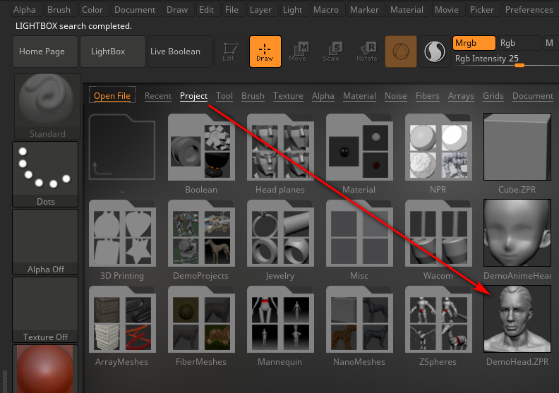
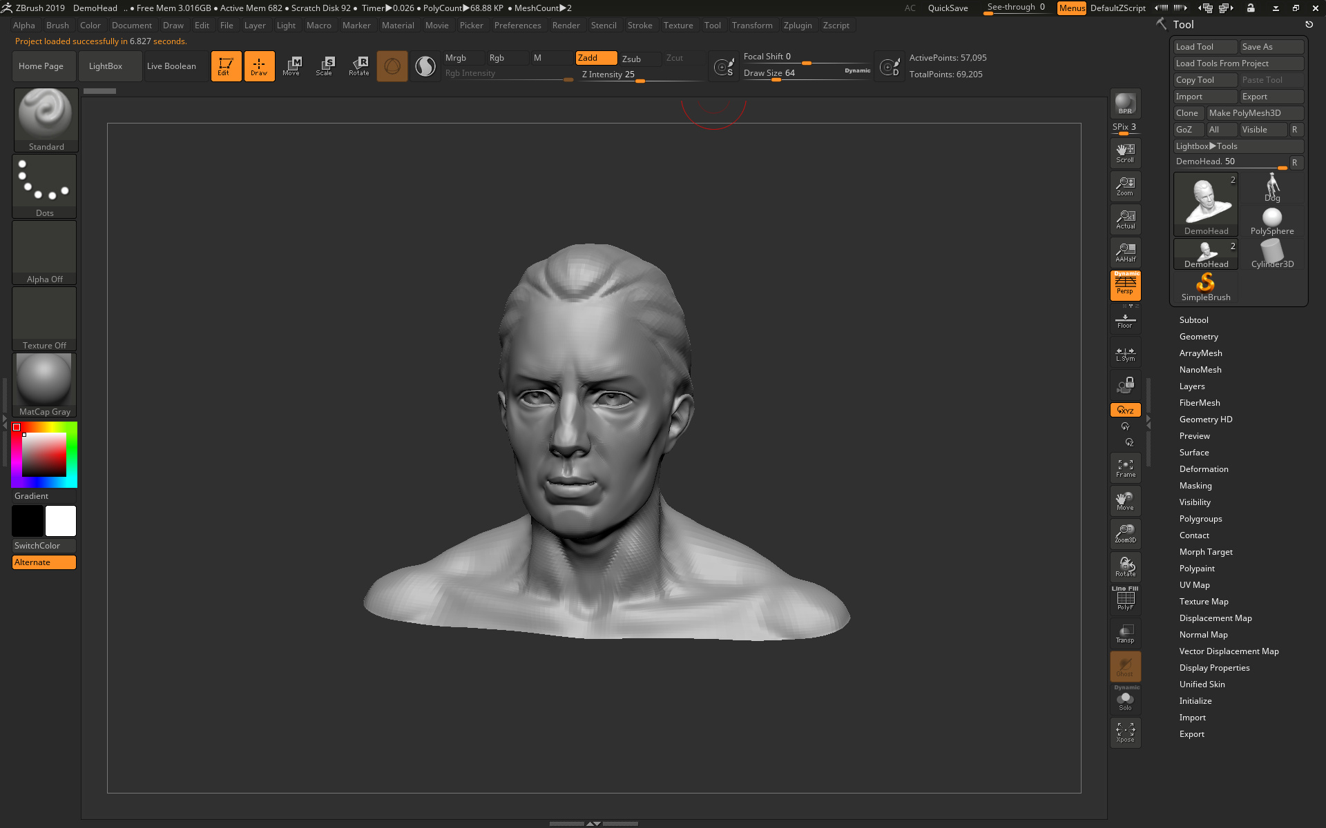
Instead, just load ZBrush. You will then be asked to pick a preset project from the Library. Pick a good choice for a NPR test, such as the obvious default “Demo Head”. Double-click on the head’s preview icon, to load it. We see a flickering old floppy-disk icon appear. Then after a few moments a little text message will appear in the upper left, saying that the project is loading. Wait for this to finish loading before continuing.
2. Now we need to force ZBrush to use full maximum-strength anti-aliasing on a big canvas. NPR filter effects, such as hatching and line-art, are no use if there’s no powerful anti-aliasing going on, and also if the final render size we get is puny. Thus there is a vital need to first set up a large Canvas. To do this go to: Top Menu | Document | Double.
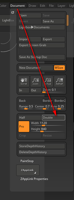
3. Press the “Double” button twice. The second time will trigger a Windows alert. Click “Yes”.
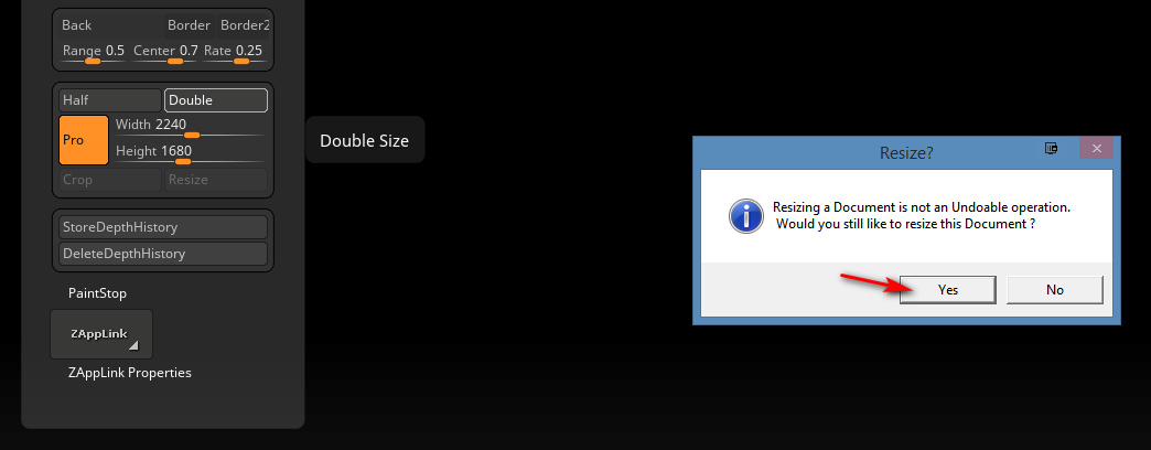
You can go up to 8k on the Canvas, but if you do ZBrush becomes very sluggish and unresponsive. It seems that 2 x Double is the ideal.
(Incidentally if you were wondering what the orange “Pro” button here is, it doesn’t mean you’re on “Professional” settings. It means the “Pro-portions” of the Canvas are locked together).
The head will now look terribly jaggy, as we can see here…

But don’t worry, as we’re going to delete this horrid head. We’ll replace it with a fresh identical one. The new head will match the new big Canvas size we just set in the Document menu, and it will be much smoother.
4. But first we must now go: Top Menu | Layer | and then with Layer 1 selected we press “Clear”. This deletes the first head. OK, we now have a large cleared Canvas at a size that’s theoretically feasible for production use for comics.
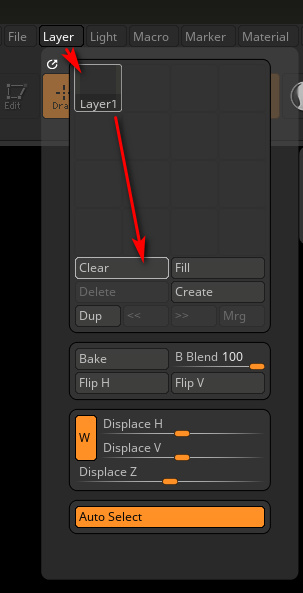
5. Now we load the same head model onto the Canvas again. To do this, first glance over on the upper-right hand side of the UI — where the “Tool” panel should be visible. This glance is just to ensure the brush is set to “DemoHead” as it should be.
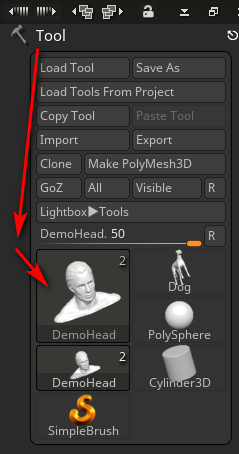
Then we left-click with the mouse near the upper left edge of the Canvas, and drag-hold to “draw out” (i.e.: place and then enlarge) the DemoHead onto the Canvas.
(At this point there’s also an alternative route, of bringing in your own .OBJ model. ZBrush can’t handle .FBX files, or if it can it’s not in my version. Import is also done over on the Tools panel on the upper-right, via the “Import” button. But let’s assume we’re continuing with the default head, for our NPR test Update: FBX import is now possible for ZBrush).
6. Then once the object is roughly placed on the Canvas we immediately press “T” on the keyboard to escape from the the “DragRect” placing tool. We have to press this button now, or we’ll never be able to escape the “DragRect” mode and will be trapped in it. ** It’s absolutely vital not to skip past this step and omit it! **
7. Then we go on to adjust the head with the side-toolbar buttons (“Move”, “Zoom 3D”, “Rotate”) so that it has the angle and position we want. Then over on the right hand toolbar we click “AAHalf” and then “Frame” (not the other way around!). This sets up a basic anti-aliasing trick and frames the head on the Canvas. Only when the zoom factor is exactly 50% are the contents anti-aliased by ZBrush, or so I’m told.

8. Then the head’s mesh needs to be smoothed a bit, to make it a better test subject for NPR. Press Ctrl + D twice on the keyboard, to smooth the head’s mesh by subdividing it. It appears that ZBrush will only let the user subdivide a mesh three times. OK, so after doing that we have a nice smoothed head, centred on a large Canvas, and with a basic anti-aliasing trick applied.

The basic setup is now done. Sadly we can’t now save this changed project file and have it carry the large canvas settings within it. Save it and load it again, and it just loads into the puny default canvas size. So far as I can see there’s no way to force ZBrush to always use a higher default Canvas size. It always loads to a useless 1479 width, which then needs to be manually doubled and doubled again.
All this fiddly setup rigmarole should really be made far easier by ZBrush, like ONE BUTTON with ONE CLICK, and the button labelled “Automated Setup for Print”. But for now, at least, we have the basics all set up.
9. OK, now we can finally open the NPR Presets Library, by going: Top Menu | Render | BPR Filter | Lightbox > Filter.
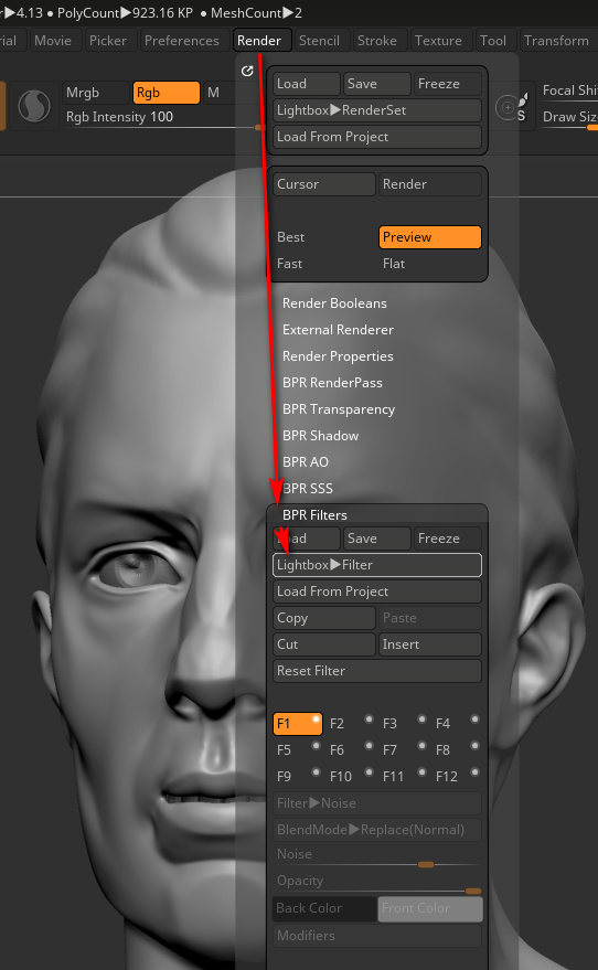
Confusingly, in ZBrush “BPR” = “Best Preview Render”, and the acronym has nothing to do with “NPR” (Non-Photoreal Rendering). Yet the “BPR Filter” menu item is how we drill down to preview and load the NPR presets.
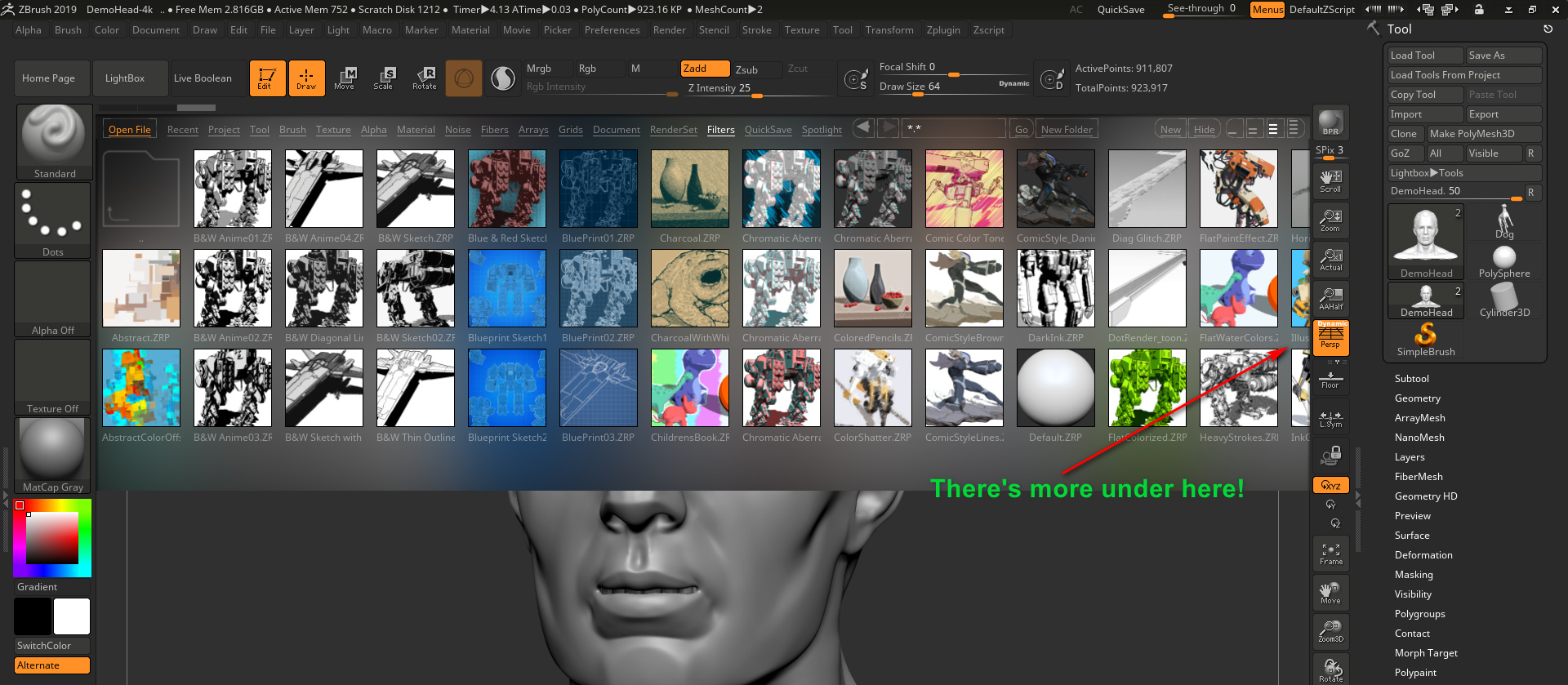
Don’t they look lovely? But, as seen here, some are hidden from the user. Why the Library display can’t just show everything in one single view, I don’t know. These hidden presets can be revealed by left-clicking anywhere on the preset library display, but only if the user knows to hold-and-drag the left mouse button over toward the right. Doing this will slide the Library presets view over to the right, thus revealing the hidden presets. So far as I can tell there’s no way to see them all together, all at once, in ZBrush.
But here I’ve Photoshopped them together…

10. Choose and load an NPR preset, by double-clicking on its visual preview. We should see a text message briefly appear, up in the top left of the user interface. This will say something like: “Opening a ZBrush Filters file…”. It might take about ten to fifteen seconds.
It’s quite possible that nothing will then happen to the sculpted head on your Canvas. The user may be puzzled by this — didn’t the slick demo videos for ZBrush 2019 show the NPR filters being instantly applied in real-time? Yes. But that only seems to happen for some of these NPR filters. For the rest, it seems we need to then manually press the “BPR button” that’s located at the top of the right-hand bar…

“BPR” = “Best Preview Render”, which seems to translate as… “OK, ZBrush… make a Preview render at the best quality you can”. On a large canvas this may take a while. First the basic render is done, then ZBrush will appear to pause while it also adds the NPR effect we just selected. Then it will lay the NPR effect on top…
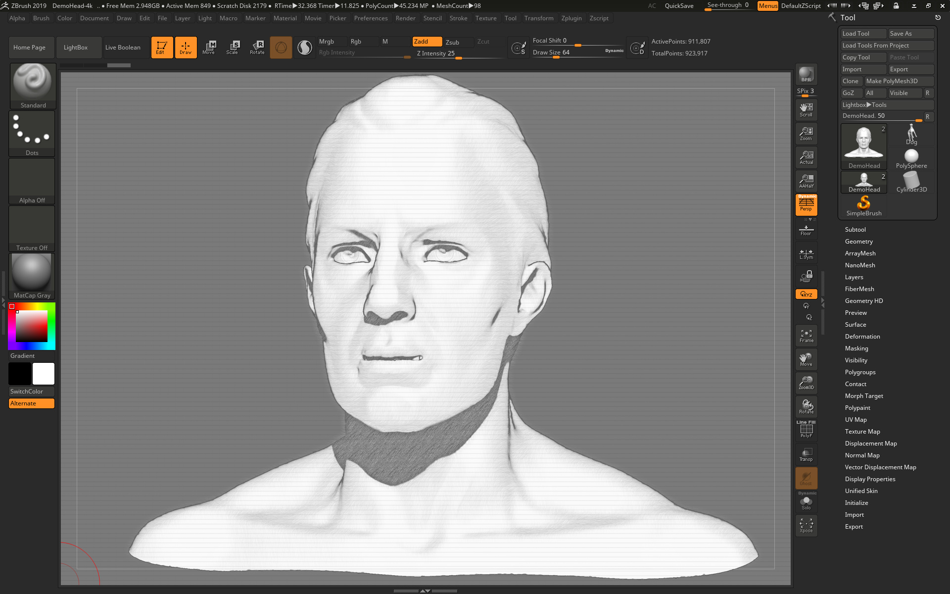
See how nice and smooth it is. No jaggies. That’s because of the tedious ‘big Canvas’ setup we did at the start.
Note that this NPR effect only seems to work on the BPR Preview render mode, not on “Best” render mode.
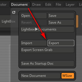
11. Now we want to save this final render to a file. Go: Top Menu | Document | Export, set a file name and folder destination.
The newbie user might think that’s it, and go off looking for the render they think they just saved. But that’s not it. What ZBrush is now showing on the screen only looks like the Canvas. It isn’t the Canvas, it’s actually an Export window that only looks like the Canvas…
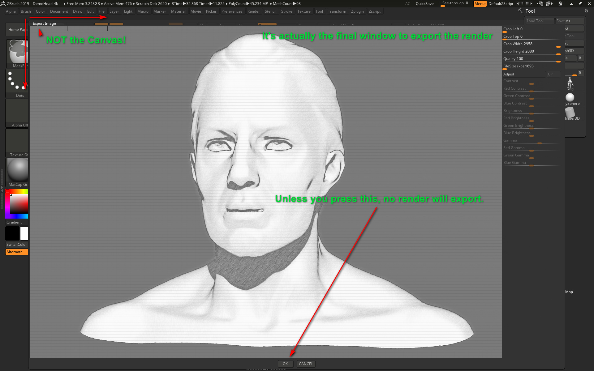
Only once the final vital “OK” button has been clicked, do we at last get the render saved.
It may be disappointing to find that the model is stuck in the middle of the big Canvas, and is barely 1k once cropped out. But it seems that that’s the way ZBrush rolls, in order to get anti-aliasing. It’s only 72dpi (ZBrush can go no higher) but is just about an adequate size for a comic-book panel on a six-panel page. Though it is going to cause severe frowns from a magazine editor who wants a cleanly anti-aliased full-page cartoon illustration or front-cover at 6000 pixels and 600 dpi. The same is going to be true of publishers of children’s books, posters, t-shirts etc. A 1200px 72dpi render is just rubbish, to them.
(Apparently one can zoom to see the whole Canvas, then “Zoom 3D” to resize the model to fill the Canvas, then render and get a really big render with the object filling the render. That might get you a 4000px object, but the problem there is that it’s not anti-aliased. So far as I can tell, full useful AA is only applied when you click the “AAHalf” button, and doing that unavoidably shrinks the object back down into the centre of the Canvas.)
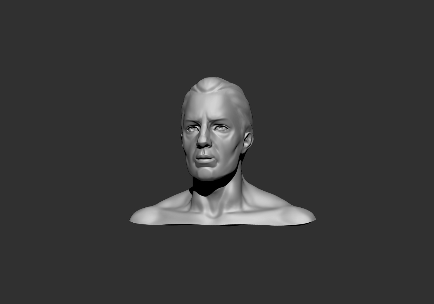
In some ways it might actually be quicker to just take a screenshot of the final render-export window, and forget the save from ZBrush. Both the screenshot and the export will be 72dpi. Then you could just paste the clipboard straight into the likes of a Comic Life frame. It won’t be masked, but then (unlike Poser 11) neither is the PNG exported from ZBrush.
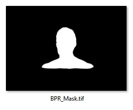
You can however also very easily and quickly save additional render types from ZBrush, such as a simple mask as a .TIF render…
Over in the “Zplugin” folder, there should be a “ZBrush to Photoshop CC” plugin, which can apparently also export and bundle all the rendered BPR layers into an aligned Photoshop .PSD file.
OK, that’s it for Part One. Now that we’ve wrestled ZBrush into an approximately NPR production-ready form, in Part Two I’ll look at the NPR effects themselves and if they’re worth having.
How to turn .WEBP images to .JPG, easily and for free.
What is it?: the .WEBP format is an image file that still experimental and without defined standards, but is occasionally found being used commercially in early 2019.
Where does the problem lie?: Most modern Web browsers are fine at displaying them, but once they’re downloaded locally to Windows they become a pest. Windows 8 can’t preview them as visual thumbnails in the file explorer. (I’m guessing that Windows 10 may also have problems with them, as they appear to be a ‘Google thing’?)
What’s the fix?: I was unable to find anything that ‘fixed’ Windows 8.1.1x to show previews of downloaded .WEBP files, in either Windows Explorer or Explorer++. However, for now, the best workaround seems to be simple quick conversion…
1. Get the free IrfanView and its plugin installer pack. The plugins enable .WEBP support.
2. When Windows can’t preview a downloaded .WEBP file, right-click and open it with IrfanView and save it as a .JPG at 100%, to the same folder and with the same filename.
3. Delete the .WEBP files.
IrfanView has batch convert capabilities, if you’re saddled with a whole folder full of these pests.
The Dynamic Auto-Painter (DAP) ‘GrNovel preset’ often leaves blue in the result it gives. Even with straight inked line-art from Poser’s Comic Book Preview renders. Here’s how to remove the blue at source, rather than with the Channel Mixer or desaturate in Photoshop.
1. Right-click the GrNovel preset and open the Template editor.
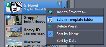
2. In the window that opens, click to go onto the second tab, and there find and click the Reactor button.

3. This then loads the Reactor Effect window. Dial down the ‘Colour Coverage’ to zero, to remove the blue. Taking the adjacent ‘Colour Saturation’ down to zero may also help speed the effect, as it’s no longer needed (since there’s no colour for it to work on).

4. OK. Save as new preset. Click “Save Main Template”, and you will be prompted to choose a name to save your custom preset under…
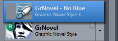
While you’re at it, you may want to back up presets that you’ve made. If you also have Photo Reactor (the Photoshop plugin version) your DAP custom presets are at:
C:\Users\YOUR-USER-NAME\Documents\ReactorPlugin\Presets
I read on the official Poser Forum that rendering in Poser 11 was was both faster and more convenient when using the Render Queue Manager. I thought it would be useful to write a quickstart on this feature, as it exists in the latest fully patched and updated Poser 11 Pro. Since the only YouTube video on it is now out-of-date.
Things to know, straight off, as a new Poser user:
* “Render Queue” is a Poser Pro-only feature.
* “Render Queue” was only for Firefly renders in Poser 11. But apply patch SR3 or higher, and Superfly can also use it.
* “Render Queue Manager” is not the same thing as Poser’s internal “Render in Background”. “Render Queue” is for stacking renders, so they automatically render one after the other. As such it can save quite a bit of time on a multi-render project.
* Rendering is done by a separate programme in the background. On many new 64-bit multi-core Windows systems this should make rendering faster, and Poser far more responsive while rendering. Again, this will save you time in your workflow.
* There is also something called “network rendering”, where the rendering task can be shared across many PCs on a network. This was introduced for Firefly in Poser version 11.0.3.
Short version:
1. Load and tweak your Poser scene. Save. Do a small test render, then set your full render size and quality in Render Settings | Firefly or Superfly.
2. Go: Top Menu | Render | Render Queue. The Render Queue Manager launches as a new standalone window, asks for the filename and folder it should save to, then goes off and starts rendering.
3. You then carry on with other work in Poser or Photoshop etc, while the rendering is done by a separate programme in the background.
Long and tedious version:
1. OK. First, where is it? Well, if you downloaded Poser 11 and its extras a while ago, look to see if you have a ‘Queue Manager’ sitting in your Start folder alongside Poser 11…
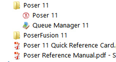
If you don’t see it there, check you have it at: “C:\Program Files\Smith Micro\Poser 11\QueueManager.exe”. If it’s not there, check in your Smith Micro Download Manager to see if you actually downloaded all the various bits needed for Poser 11 Pro.
Let’s assume you find it’s installed. Now go find your set of serial numbers that came with Poser 11 Pro. Copy-paste the serial for the Queue Manager, as you may be needing it in a moment.
2. Launch Poser 11 and load and set up a test scene. Save. On the latest version of Poser the “Render Queue” is then found on the Top Menu | Render | Render Queue…
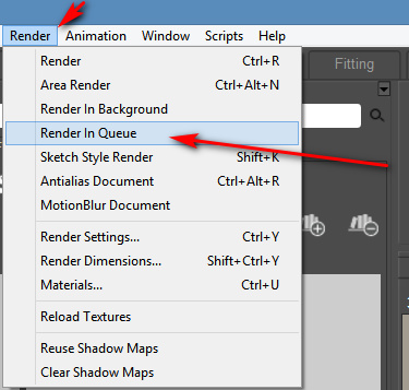
On revisiting the “Render Queue” I found that this menu item remained curiously ‘greyed out’ and inactive for me, even when I switched to the relevant tab in Render Settings. I found that what I actually had to do first was make a small test render using a Firefly / Superfly render engine. Doing this caused the “Render Queue” menu item to become active and selectable.
3. Now, clicking on the active “Render Queue” item should launch the Render Queue Manager .EXE window. If this is the first time you’ve ever launched it, it will need the serial number to be input. Then you will first be asked to set a filename and destination folder for your render, then asked to give the QueueManager.exe Firewall permissions (which only needs to be done once, at launch).
QueueManager will stay open and waiting after the first render completes, hoping to be sent more renders.
In the Windows Control Panel | All Control Panel Items | Windows Firewall | Advanced, you may then want to make the Firewall settings permanent. Once done, this should mean that you won’t be asked each time it launches…

OK, it’s up and working. “Process jobs locally” if you’re on a single desktop PC…

From now on you just skip merrily through the simple version of my tutorial, as given above.
MOVIES? Rendering multiple movie frames is apparently currently more problematic, for those with the latest patch applied. It can be temporarily accomplished through a MovieRenderToQueue.py Python script. Apparently a vital button on the Movie panel in Render Settings was removed with the latest patch, along with the advanced Auxiliary Render Type switches. There’s a simple workaround for the Auxiliary Switches and the Poser devs reports that the Movie queue button should be back in Poser very soon…

ALTERNATIVE ACCESS: One can also access the “Render to Queue Manager” command via the official partner script for Firefly. This is found under Top Menu | Scripts | Partners | Dimension 3D | Render Firefly. Or it can simply be invoked by pressing Shift + F on the keyboard.
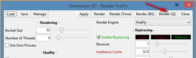
NETWORK RENDERING: You’ll of course get the full benefit of using the Render Queue Manager if you’re using it to render across several PCs. As we’ve seen, the Render Queue Manager is a separate .EXE file and on Windows you’ll be running it on Windows 7 or higher. Render Queue can ‘network render’ across several such machines, only if: i) the Render Queue Manager version on your slave PCs is the same as on your main PC; ii) each .EXE has been activated with the serial (not the same as your main Poser 11 or PoserFusion serials); and iii) you have all the remote and desktop Firewalls set up correctly. Each .EXE will need to be given both inbound and outbound permissions through the Firewall. All this is needed to that the main PC can talk to the network PCs, and the network PCs can talk back.
If you do lots of large renders or animation with Poser then you’ll want to look at advice on building a dedicated render network or base unit. Some advice is to be found here. Looking for the apparently-required 2 x CPU “2x X5650” to “2x X5690” refurbished Xeon workstation on eBay suggests that about £400 should get you something quite powerful (24 render threads) under your studio desk. That’s comparable with the cost of a high-end graphics card, but gets rendering off your PC entirely so you can get on with other work. It also means you don’t have to faff around with upgrading the PC’s PSU, fitting a huge slot-in card, fan-noise, summer overheating etc.
AUTOMATE PREVIEW AND SKETCH RENDERS? For renders other than Firefly, you might want to look at setting up Windows automation software like JitBit Macro Recorder, which records and automates software clicks, and then set wait-times (such as 60 seconds per Preview render, allowing a 3600px Preview render ample time to complete). You could also try to have JitBit use keyboard shortcuts only, to make your automated macro/action independent of User Interface changes and screen size. Obviously this doesn’t take the renders off to another programme or PC, but there is some ‘background’ automation involved.
 Posted in Comics, Companion software, Freebies, Natural media emulation, Poser, Tutorials
2 Comments
Posted in Comics, Companion software, Freebies, Natural media emulation, Poser, Tutorials
2 Comments
I’ve spent some time working through Krita 4.x’s G’MIC-QT filters. They’re the equivalent of Photoshop’s native filters + some nice plugins, all rolled into one plugin. Krita is the leading ‘open source’ graphics software, and both Krita and G’MIC-QT are free. G’MIC-QT ships integrated into Krita.
Below you see my trusty test-bot for the G’MIC-QT filters. Quite a dark raw Poser Preview render, and not at all optimized for tooning. That top-hat is going to be a particular challenge.
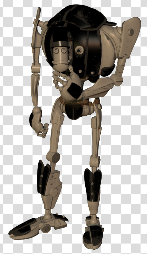
I was looking for things that can’t be done more easily in Photoshop.
Here are the G’MIC-QT filters I noticed and worked with, for good or bad:
1. Artistic. Brushify. A nice but mundane paint effect with the default settings. The drawbacks, even on default, are that: i) it takes a ridiculous amount of time to process; and ii) it paints into a background that should remain transparent. Still, the ‘real thick paint’ effect is nice, and it takes far less time that it would take you manually overpaint a render.
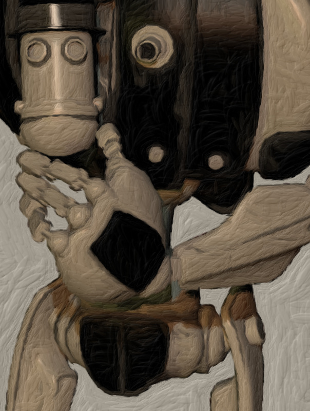
2. Artistic. Cartoon. This just gave the usual “Ugh, 3D run through a Photoshop filter!” look, of the type that only pleases those who have never actually seen the inside of a decent comic-book. Horrid. Rip it out and burn it, now!
3. Artistic. Cutout. This had something to recommend it at a setting of 6 0 6. You might want to take a quick look at this before your pay good cash for one of the TOPAZ Clean / Simplify Photoshop plugins. That said, even on a workstation this filter takes a very long time to run, like 90-120 seconds! Also you get some posterization artefacts that you would not get with Topaz Clean.
4. Artistic. Felt Pen. I was able to work it up to a custom effect I saved as ‘Felt Pen Burnoff’, which burned off most of the 3D grunge. It ran very fast, but the applied effect was not great when seen at 100%. It worked much better when seen reduced, at 33%. Still, to get this from such an unpromising 3D render is quite impressive.
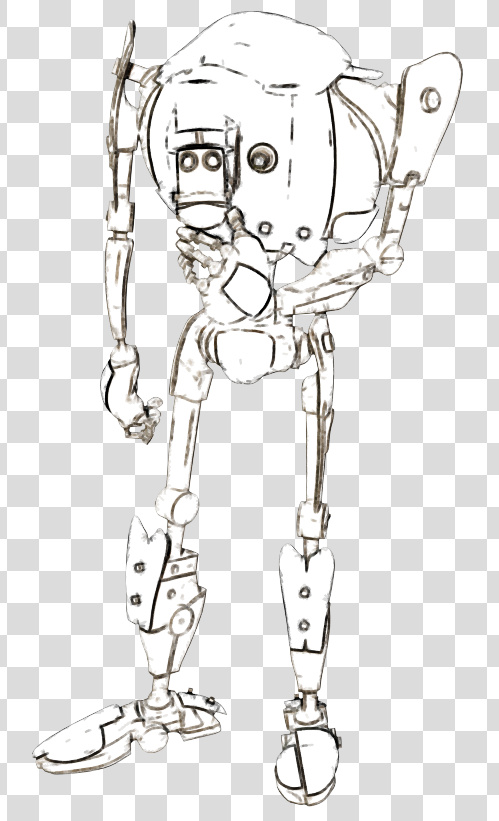
As you can see, it doesn’t add a holding line around the edge. Though that may be because I was using a .PNG cutout with transparency.
5. Artistic. Pen Drawing. It doesn’t quite give the effect you might expect from the name. It’s more like a basic toon filter, and is too close to a recognisable ‘standard Photoshop filter’ look for my tastes. Can be sort-of acceptable, though only if ramped up to maximum settings. There are only two sliders, so I assume there’s not much more that can be done with it.

6. Artist. Sketch. Capable of some awful crap, as most such filters are. But I also crafted the unusual custom preset seen in action below, which is like an oil glaze on thick smeared pencil. The setting took three minutes to process a 3600px picture, but the results were rather nice when viewed at 100%. Zooming out just makes the figure look like they’ve been dipped in motor-oil and dried off a bit, which is not so pleasing. I could imagine that 100% crops from this, placed into panels, could form the basis of a graphic novel style for a macabre story.
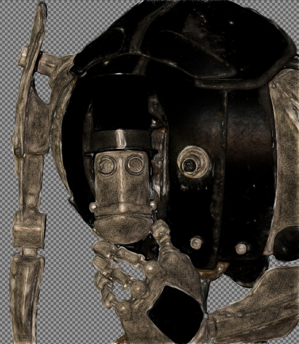
7. Black and White. Charcoal. Quite tricky to control, and frankly not very impressive as charcoal. But… also capable of a reasonable basic stipple effect, which I saved as my ‘Stipple’ preset. Though, as you can see, it doesn’t like to run across black or near-black.

8. Black and White. Engrave. Despite the name, this is of interest for comics makers. I was able to work it up to several pleasing effects and save these as presets.
One I named ‘Skritchy Pen’, which took two minutes to run…

Another preset I called ‘Berni Wrightson’, which took about 90 seconds to run. I love how the engraving lines follow the contours fairly neatly, which is never the case with such filters. How it does that I don’t know, but it does. It doesn’t even have the 3D mesh to ‘follow’.
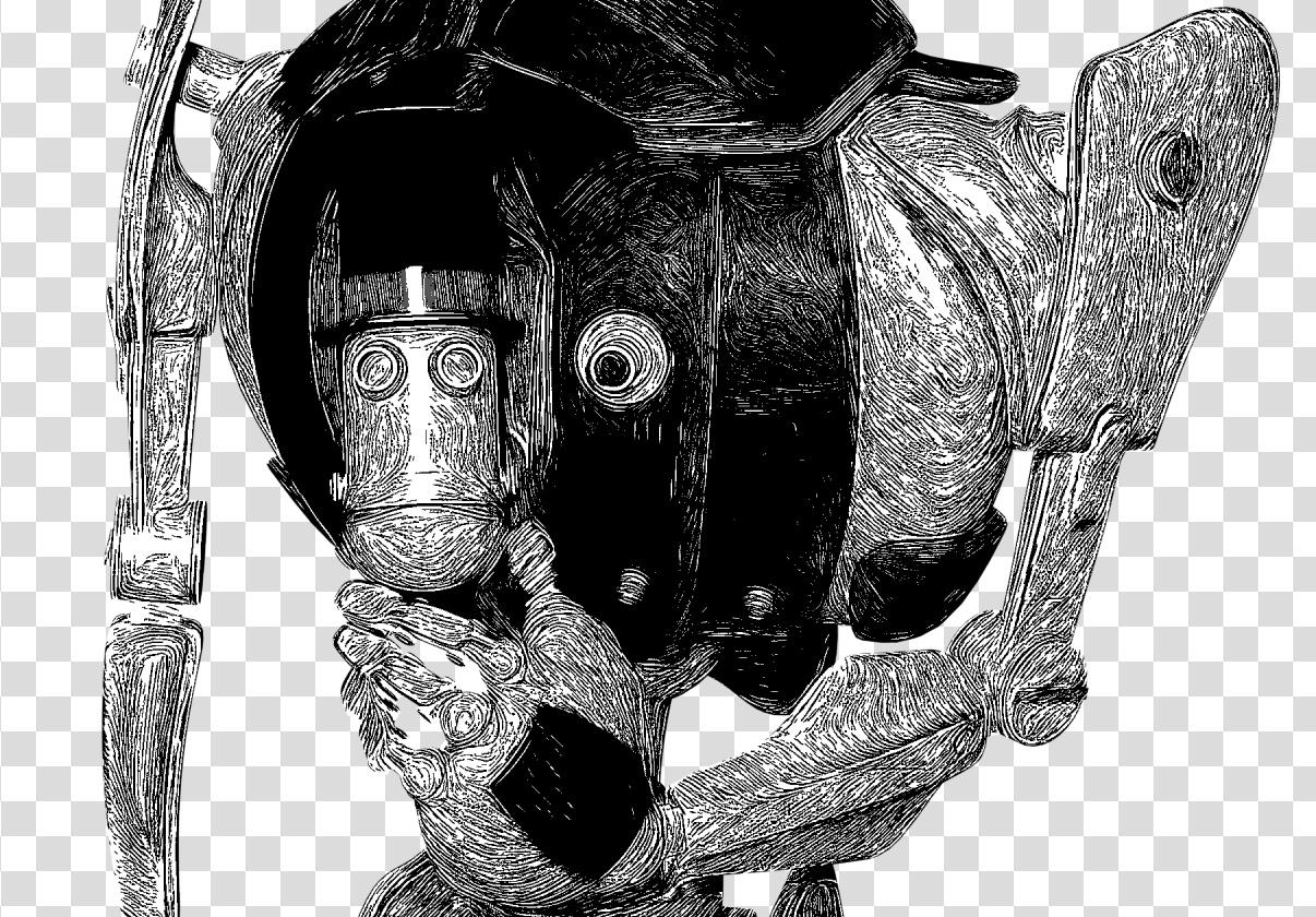
Another custom preset I made I called ‘Comic with Inks’, which was fairly fast with no anti-aliasing, but it took two minutes once its anti-aliasing was on. Very impressive, given the less-than-ideal source material. I’m not particularly keen on such dense blacks, but one might find ways of toning them down without too much work. Retexturing the Poser model would probably do it, at the risk of simply turning the blacks white.

These thin lines look like they might fat-ify quite nicely if run through DAP.
9. Black and White. Pencil. Nothing like a pencil, it’s more like maybe Posterize in Photoshop. Meh…
10. Colors. Detect Skin. Unusual. This may interest someone who does a lot of skin renders in Poser and DAZ Studio.
Thus I got about eight good useful custom presets with it, which I’m pleased with.
It’s possible to save user presets in G’MIC-QT, though with typical Krita awkwardness in naming they are called something very different. Your “Faves” are thus not just bookmarked favorite filters. They also capture the settings of the filter at the moment the ‘Fave’ is saved.
I don’t see any way to extract and share individual ‘Faves’, though you can back them up as they’re in the C:\Users\YOUR_PC_NAME\AppData\Roaming\gmic\gmic_qt_faves.json file. This is just a text file and can be opened with the Notepad++ freeware. Looking at the structure of the file it looks like someone used to code could, with great care, copy-paste a preset from someone else’s ‘Fave’ .json file and thus import it.

And, lastly, I don’t see anything in G’MIC that can do what DAP’s ‘GrNovel’ filter can do. Though G’MIC looks powerful enough to replicate it, if someone cares to try.
This tutorial shows you how to get a ‘pseudo Toon ID’ render from Poser, using a quick Preview render. As such this method works in both Standard and Pro versions of Poser, and gives you what is effectively a ToonID render layer (usually a Pro feature). Rather usefully, it also uses the real-time Preview render mode, rather than a slow Firefly render.

1. Set up your scene as usual and get to your final artistic framing and lighting. Save to MyScene-final.pz3. Render your final renders as usual. Without making any changes, then make a working duplicate of your final scene, MyScene-toonID.pz3. You need to work on a duplicate from now on, as you’re going to mess with the scene a bit.
2. Go up to the top menu: Display | Cartoon Settings | One Tone.

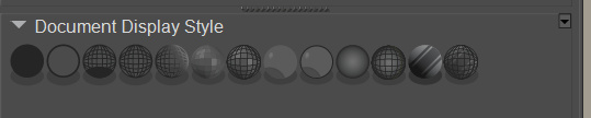
3. Go down to the Document Display Style icon palette, and set Cartoon Display mode. Everything goes flat. Each flat colour you see is being driven by the Diffuse colour in the relevant scene material.

4. Now, you may be happy with what you see. Lots of clearly defined flat colours, just begging to be precisely and easily selected with the Magic Wand or Colour Select in Photoshop. In which case make a Preview render and save your ‘pseudo Toon ID’ image. Take it into Photoshop and ‘Paste in place’ to align it precisely on top of the other layer(s). You’re done. Bring on the Magic Wand and Paintbucket!
5. Are things not looking right? Lights should not make a difference, given the combination of Display modes your scene is in. But try scrapping your scene’s existing light rig and replacing it with one single ‘flat’ IBL light. ‘Flat’ meaning it is pointed straight at the scene and is causing as little shadowing as possible.
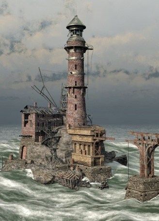
6. It could also be that some or all of the colours in your scene are too similar. You may have dark greys on top of dark greys for instance, as was the case with these sludgy dinosaurs before they were jazzed up a bit.
You could jazz up your too-similar colours by going into the Material Room, select each and every Material and change the Diffuse colours manually. But you may have too many materials in a big scene for that to be viable. What to do?
i) If you have MATWriter Panel 2014 installed in Poser 11, you’re in luck. These make it really easy to change Diffuse colours in bulk across each character and prop, and XS even uses the Windows Colour-picker for the colour selection.
ii) The free EZMat has a Randomise script that does the same per character/prop with auto randomisation of the Diffuse colour.
Be warned that you need to work on backup copies of your scene with these!
Once you’re done, don’t forget to go back up to the top menu: Display | Cartoon Settings | and set Poser back to ‘Three Tones’ or whatever you usually have set there.
For comparison, here is a default ToonID render layer from Poser Pro. Without any colour adjustment done in Poser, in Photoshop the default ToonID layer usually requires a quick Auto Contrast and then a Brightness/Contrast tweak to make it visible and its parts selectable. That’s been done here. Note that the opacity mapping has been handled by Poser much more nicely than the above Preview method, albeit at the cost of render time. On the downside, we don’t have a selection area for the eyes, which we do have on the ‘pseudo ToonID’ render, but those could be manually input in the Material Room (change the toonID number to something very high, i.e. six figures).
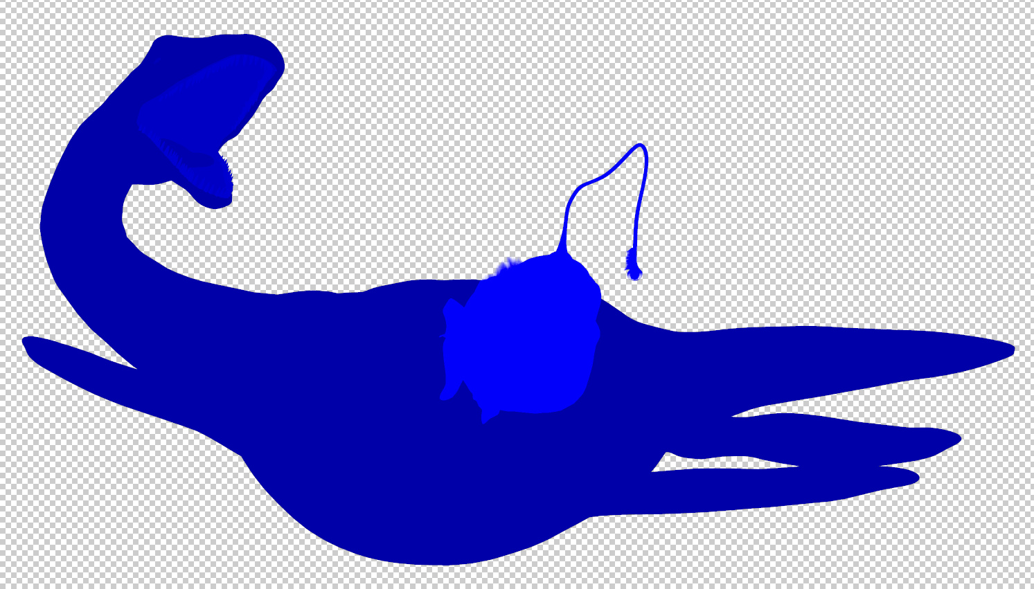
There is a free script that will quickly and vividly block-colour the ToonID channel for each character and prop in your scene.
Update: Poser 11.2 has restored these render switches.
Possibly as a result of the latest Poser Pro update, I seem to have lost the Firefly “auxiliary render” switches. These add additional render types, and their drop-down switches are usually always found on the Firefly Settings panel. These extra renders are then bundled into a saved Photoshop .PSD file as layers.

But there’s a workaround fix for this problem, for me and possibly for others. Because Firefly renders can also be controlled by an official partner script, which ships with Poser. This script still works, and is robust. Go up to the top menu and find: Scripts | Partners | Dimension 3D — and from there launch the ‘Render Firefly’ scripted panel. This can also be invoked instantly with Shift + F on the keyboard. Update: Shift + F seems to have changed now.
Note that this panel may require you to toggle the render type – see the drop-down in the top-right corner. It appears to default to the last-used render type.
At the foot of this alternative Firefly rendering panel, you’ll see the expected Auxiliary render type switches (the ones which seem to have vanished from the standard Firefly settings panel).
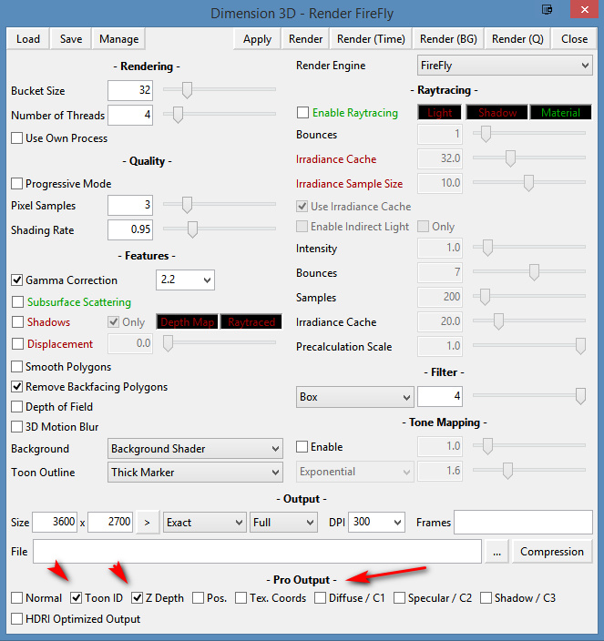
Regrettably this can’t use your regular render presets, but you can recreate them and then save them as presets for the new panel.
Doing a Firefly render this way works fine, as the features are still there even if the switches are not. You then save a Photoshop file and it has the expected extra layers. In this instance, Z Depth and Toon ID.

For future reference, here’s what these Auxiliary renders give the Poser Pro user, even if these days you may not care much for the main Firefly render itself:
* Normal. This produces a psychedelic colour-shaded render. I’ve never had cause to use it, but apparently such renders can be used for adding enhanced bumps and scratches, and were most useful back in the days of low-poly gaming? See the page ‘Normal mapping’ on Wikipedia.
* Toon ID. Also called ‘ToonID’ in the Poser Material Room, and simply ‘ID’ when its render is in a Photoshop layer. Each material on your character gets its own material colour, and this is rendered out to a plain flat RGB colour. This enables easy part-selection in Photoshop. For instance, instantly select all of a helmet, and just the helmet. ToonID is automatically assigned and its number (and thus colour) can be changed per-material in the Material Room.
* Z Depth. A greyscale depth mask for your scene. Not useful for scenes with transparency-mapped elements such as leaves and petals, which become ugly square blocks.
* Position. Aka a Position Pass. Looks similar to the Normal render. I’ve no idea what it does, but the Cinema 4D manual says vaguely… “The Position Pass can be used in 3D-compatible compositing applications that can in turn be used to create all sorts of effects with it.” Sounds like it’s of use to high-end compositing and video editing software, such as After Effects.
* Texture Coordinates. Looks similar to the Position render, and a sort of combination of Position and Toon ID. Again, possibly useful in video compositing, at a guess?
* Custom 1. Renders Diffuse only, unless it has a Material plugged into its node in the Materials Room. In which case this channel will only render that material.
* Custom 2. Renders Specular only, unless it has a Material plugged into its node in the Materials Room. In which case this channel will only render that material.
* Custom 3. Renders a Shadows only layer, with dense shadows hard-merged onto a white background (i.e.: not over transparency). As with Custom 1 & 2, Shadows only render if no materials are plugged into its node. Note that this is not the same as: Render Settings | Options | Shadows only, which appears to produce shadows lighter in tone than Custom 3 (even from exactly the same scene).
One can also fairly easily get an Ambient Occlusion (AO) shadows pass from Poser, though not via the Auxiliary render switches.
Poser 11 makes excellent line-art from 3D content, using its Comic Book Preview mode. This effect can easily be switched into plain black-and-white, giving you just the ink outlines for a character, scene or prop. (See my video demo of this).
The free open source Krita 4.x can add to your options here, by providing you with another layer of colour for your art. It does this by cleverly auto-colorising the inked line-art it gets from Poser.
Here is the workflow for how to do this in Krita 4.x, with screenshots. Note that this is very different from how it was done in Krita 3.x.
Obviously what follows is a very simple two-colour example done for this tutorial, and I could have got more funky with auto-painting colours into the line-art.
1. First set up your exported Poser render layers in Photoshop. The layers will usually be…
Shadows.
Inks.
Colour Flats.
Background.
You then run the usual Photoshop Action to remove all the white on the Inks layer, to get this result…
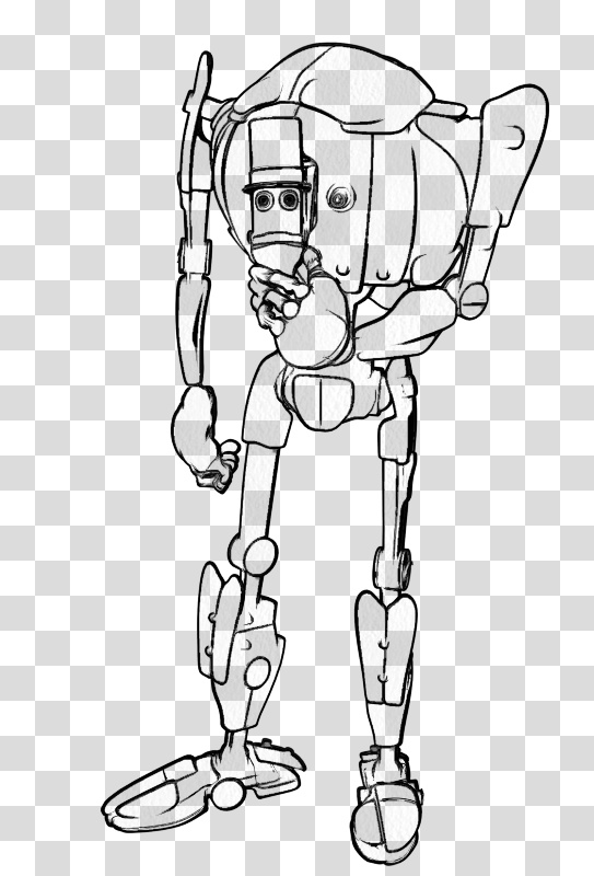
Then you save to an unflattened .PSD Photoshop file.
2. Now start Krita 4 and open your new layered .PSD file. In Krita’s Layers palette, right-click on your chosen Inks layer. A menu will pop up, and you then select: Add | Colourize Mask…
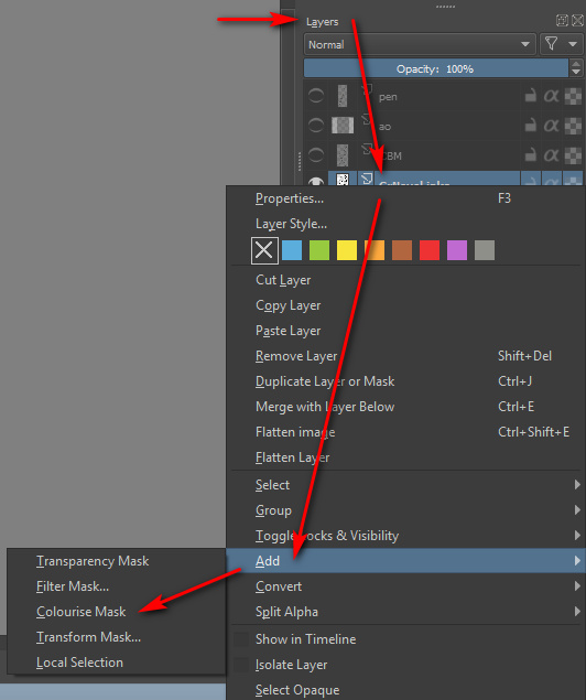
Krita will then add and auto-name a new sub-layer, which sits directly below the Inks layer…
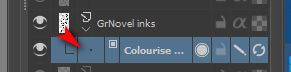
3. Now you make an absolutely vital initial selection in the Krita user interface, which isn’t mentioned in the Manual. You go over to the Toolbar and select the “Colourise Mask Editing Tool” icon. The Tool you need to select is the paintbrush icon with a sort of ‘glowing tip’, which should be near the Eyedropper…

This Tool stays selected in the Toolbar even as you then select a suitable brush or pen from the Brush Library. DO NOT EVER select the normal Brush icon on the Toolbar, as this will mess things up over in the Tool Options.

You then roughly paint and dab colours where you want them to be auto-painted by Krita. It’s important to also indicate a background colour, even if you don’t want a background colour, as the auto-colour process can only fill the entire canvas. I’ll show you how to get rid of the painted background in step 6 of this tutorial.
Dabbing and squiggling the colours can be done with the mouse, but will be easier and more pleasant to do with a pen-monitor such as a Wacom or Ugee. Ideally with a good level of zoom-in. Here it’s very crude and just two colours…

4. Ok, you’ve completed your basic indication of where Krita is to lay in its auto-colours. Now go back to the Colour Mask layer and click its end-icon, the one that vaguely resembles a recycling icon…

Clicking this icon triggers Krita’s ‘autopaint’ process, and Krita works out how the colour dabs should spread out to meet each other and the ink lines. Doing the calculations for this may take a while on a large canvas with complex colouring. You should see a tiny ‘progress bar’ while this process happens. The default settings in Krita should be able to intelligently cope with gaps in the line-art.
5. With the auto-painting run completed, you then switch back to normal mode simply by clicking on the pencil icon on the layer…

Clicking this pencil icon reveals your fully auto-coloured line art…
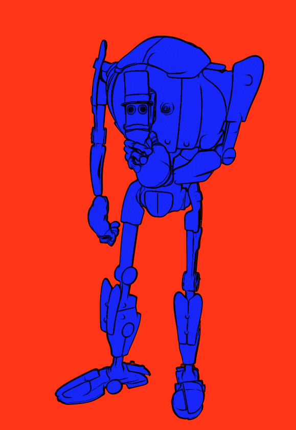
If the colouring is not quite correct, you can fix it. To do that you click what has now become a cross icon instead of a pencil…

… and this returns you back to ‘colour dab’ mode, and there you can edit, erase and add to your dabs and strokes. You can also tweak some settings over in the Tool Options. When you’ve made your corrections, click the ‘recycling’ icon again to run the auto-paint again. It should only take a couple of tries to get it right.
6. Now you tell Krita that you want a transparent background colour. For instance, in this example we can make the outer red be transparent when Krita ‘paints’ into the line art.
Regrettably Krita’s manual can be utterly baffling in its instructions on how to do this, if you naturally used a regular paint brush to dab your colours on the line-art. It merely says: “We want to have the [red colour] transparent. In the tool options of the colorize editing tool you will see a small palette.” But if you selected a normal paint brush then: i) you will have no clue that the “Colourise Mask Editing Tool” lives over on the Toolbar; and ii) because you never selected this “Colourise Mask Editing Tool”, there will be no mini-palette. The Tool Options docker will not reflect your active use of the ‘Colourise Mask’ layer, and it will be stuck in ‘normal brush mode’.
However, you followed my instructions above in Step 3 — to find and pick the “Colourise Mask Editing Tool” for painting colours, before selecting a brush from the Library. This means that your Tool Options docker is correctly showing this by default…

In this Tool Options docker we can now scroll down to find a line of colour chips at the bottom. Each of the colours found here represents a paint colour you used on your line-art a moment ago. We then select the red colour chip and click the ‘Transparent’ button. We then update the layer’s paint effect, and the red is gone…
We now just have the colour-filled line art and the original background layer underneath it. The red colour has simply vanished, cleanly and without leaving any ugly fringing.
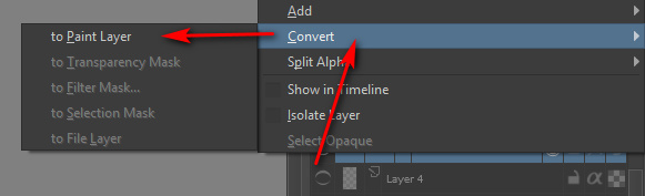
7. Once you you are happy with Krita’s auto-paint, select the Colourise Mask layer and right-click on it, then choose…
Convert > to Paint Layer.
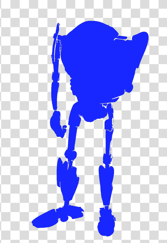
This is what the raw converted paint layer looks like on its own. If we had made more paint dabs on the line-art, obviously we could have got a far more complex colouring in of the line-art…
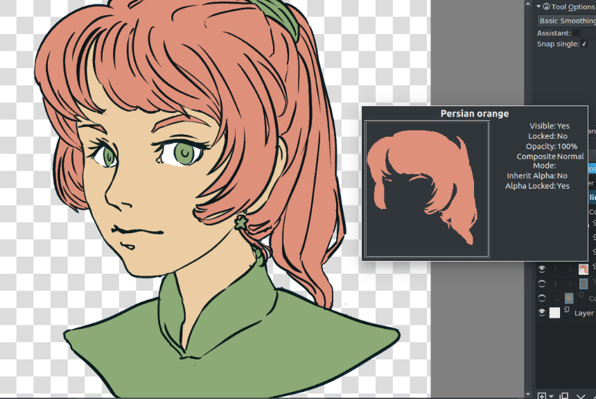
Here’s a very slightly more complex example of what can be done, and how it’s possible to save each paint layer as its own ‘island’ of colour…
Ok, then you’re done in Krita. Save the .PSD and load it up again in Photoshop. You can then use this new Krita layer to interact with the Colour Flats layer you had from Poser. It could also interact with a shadows layer to colourise the shadows.
The above workflow sounds complex, to accurately describe it and to warn about the pitfalls. But once you learn it, it is fairly quick.
For some types of Poser scene it can also be mimicked and bypassed inside Poser by a render using:
Single ‘flat’ IBL light, ‘flat’ meaning it is pointed straight at the scene.
Top menu, Display | Cartoon Settings | One Tone.
Set Cartoon Display mode in Document Display Style icon palette.
Then make a Preview render.
This gives you a pseudo ToonID Preview render, onto which you can paintbucket new colour, depending on how many colour segments you have. If you only have eight segments you’re fine, but if you have 200 segments per frame then you’d be at it all day.
Lastly, automation. Sadly Krita isn’t Photoshop, which means we can’t encapsulate this somewhat fiddly workflow in a semi-automated Action. But I don’t know of anything that can do what Krita can do here, inside Photoshop.
A simple three-minute video intro to how to set up a clean comic-book effect on a character with Poser 11. This effect is available in both Poser Standard and Poser Pro. It is very easily controlled, and you render in just a few seconds by using real-time Preview renders.
This is a tutorial in how to quickly combine the best of two inks-only renders, from Poser’s Comic Book Preview render, by using Photoshop. For future speed-of-working this tutorial can, of course, be encapsulated and semi-automated as a recorded Photoshop Action.
We’re going to manually select just a few nice lines from one render, and combine them with lines from the other render.
Why do this? To subtly boost the quality of your ink lines output from Poser’s Comic Book Preview mode, at only a small cost in time spent per comics frame. Depending on your intended style, possibly also to selectively combine sketch edge-shading, from a Poser Sketch render, with your Comic Book line-art inks.
Tools: Poser 11 (Pro or Standard) with a suitable Poser 3D character to render. Adobe Photoshop (CS6 is being used here).
What’s it called in Photoshop?: “Q” mode or “Quick Mask”.
1. First render your two nearly-identical ink lines renders from Poser 11’s Comic Book Preview mode. The differences between them will perhaps arise from your selecting different Display Styles for Preview renders, or choosing Poser lights that cause new ink lines/shadows to appear in the line-art. Here I have kept the lighting fairly flat, and run a Sketch render into the Preview ink lines to make them a bit less slick and more grainy.
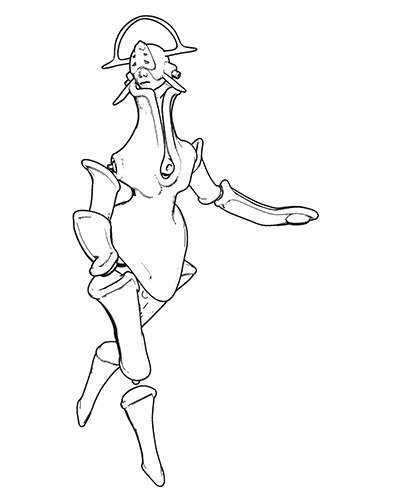
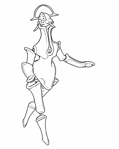
Animated GIF comparison between the layers:

2. Bring the two renders into Photoshop, with each render placed on its own layer. The renders should be exactly aligned one above the other, and Photoshop’s “Paste in place” command may help you with that.
3. ‘Knock out all white’ from both renders (there are many free line-art Photoshop actions that do that). Then place a new white background layer behind them.
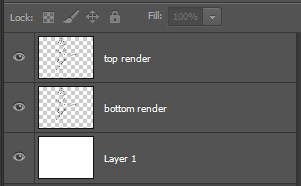
Toggle the ink layers on and off, to let you decide which needs to be renamed as the ‘bottom render’.
The ‘bottom render’ should be the one that has some nice lines you wish to add to the top main render, while junking the rest of its lines.
You choose the other render to be the ‘top’ because it’s mostly OK and barely needs changing.
Ok, you’ve now decided which layer is to be which. It’s time to rename the layers sensibly, so that an Action can be run on them. Your saved .PSD production file will have three layers — named as: top render | bottom render | White. It should look like this…

I’ve capitalised “White” to remind you that layers are case-sensitive for Photoshop Actions. If an Action expects to find a layer called “White”, it will not run if the layer has been re-named to “white”.
4. To make it easier to identify the ink lines of the bottom layer, we now turn the lines a uniform dark mid-green. To do this you first press ‘Crtl’ on the keyboard while clicking with the mouse cursor to select the layer thumbnail in the Layers palette. This gives you a clean automatic selection of your inks, indicated by the dotted lines…
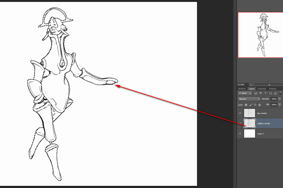
Then you make a wholly new blank layer, and fill this blank layer with green by using the Paintbucket. Then you select the ‘bottom render’ layer and hide it.
You are now going to be working on the green lines in the copy of the ‘bottom render’. It doesn’t matter that it’s a copy, as we’ll switch back to the original soon (once we’ve selected the lines we want to keep) and then junk it entirely.
5. Ok, so how do we select those nice ink lines? With the new temporary green layer selected, you now press “Q” on your keyboard. Then you select a hard round Brush from the Toolbar and size it for picking out fine details in line-art. The brush size will depend on your render size. I tend to render in Preview to 3600px.
6. While you are in this “Q” (Quick Mask) mode, any Brush will automatically paint in semi-transparent red. That will be the only visual indication that you have entered this special mode. With this red brush you then simply paint on the active layer, and where you lay paint indicates the details you want to keep.

You can see here why we needed to add the temporary green inks layer. Without it, there would be no way to tell the difference between the black inks of the two layers.
7. Once all these details are selected, you switch back to your copy layer and make it visible. Your selection is now acting on the original inks, not the green inks. Press “Q” again. Your red painted areas now become selections with dotted lines around them. Once this happens, you hit the Delete key. Everything except the selected areas is then deleted. Now you can also delete the green inks surrogate layer, as it’s no longer needed.
Ok, you’re basically done. The above process may sound fiendishly complex, but once it’s in a recorded Action with stops and user prompts then it becomes something that can be completed with ease in 30 seconds, and you don’t need to remember anything other than where the Action is located in the Palette.
Finally, you might then select a good small inking brush, to manually add just a few completely new hand-painted lines. You can also erase any bits of the inking you still don’t like. Here that’s been done, especially fixing the mouth. The sketchy dotting on the ink lines is not that pleasing here, in combination with the smooth colour layer, and I could have produced cleaner inks from a straight Comic Book Preview render. But this is just a quick demo. Here I’ve added a filtered colour Preview render layer and a subtle Ambient Occlusion shadows layer from Firefly (which was almost as fast as Preview, since it was only doing light shadows)…
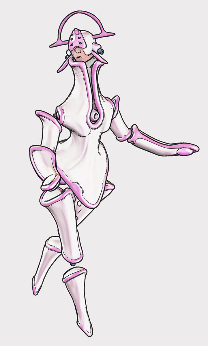
If your graphic novel has 600 frames and the above process takes a minute per frame (even with the recorded Action), plus a few more manual inking stokes just to finish off, then that’s 10 hours of additional work. But that seems a small price to pay for creating nicer ink lines.
In Poser 11, saving the Poser Comic Book Preview render as a single-frame Flash .SWF movie results in yet another type of toon render. The Preview render is vectorised and saved as a single-frame .SWF file…
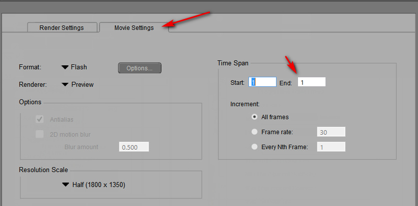
To then quickly test if your .SWF output is viable, you then simply load it in Internet Explorer browser. Even if (very sensibly) you have uninstalled Flash from your PC, the IE browser still has a native Flash-viewer baked into it and un-uninstallable. Though IE cannot then save the .SWF out as an image — a screenshot is all that can be obtained…
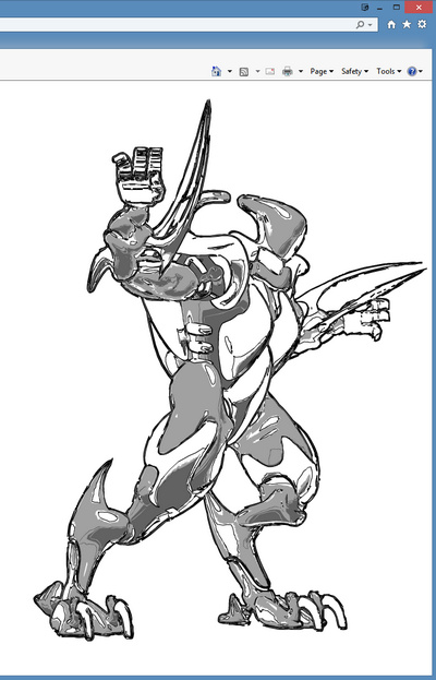
If you’re making webcomics that may be all you need. But what if you want it as a nice big .PNG? Well, .SWF is now a obsolete vector format. It was used by Adobe Flash, and Poser’s output of the format seems to be utterly impossible to open and save to .PNG or .SVG using freeware. I tried and searched and test-installed various utilities and possibilities. But with no luck on my test .SWF file output from Poser. Even the free JPEXS Flash Decompiler wouldn’t see the image inside it! And yet, IE displayed it with no problem!
In the end, a trial version of the full Adobe Animate (the new name for Flash) was the only free software that could do the SWF to PNG job and get the proper render out as a result! It is total overkill to install this sluggish Adobe behemoth just to get a PNG, but it works. Here’s the process:
1. In Adobe Animate, open a Stage from a template large enough to encompass your render size.
1. File > Import > Import to Stage > then load your .SWF in.
2. Then File > Export > Export Image. Uncheck “Transparency” and “Clip to Stage”. Save as an 8-bit PNG…
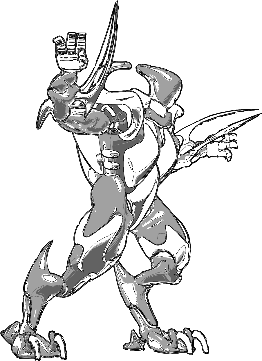
In practice the look of it is not that much different from a normal PNG from Poser. But, as .SWF is vector, you should also be able to save it to .SVG for editing in the likes of the open source Inkscape and (now also) Krita. It appears that one can do that from Animate, by using Tom Byrne’s free Flash2SVG plugin. Although I didn’t test that for this tutorial. But this should mean that one could export as vector just the ink lines from a Comic Book Preview render, then apply a radical new style to those lines at the click of a button.
Hopefully we’ll get a simple native .SVG vector export in Poser 12, to replace the old .SWF export.
Sketch presets in Poser require the render dimensions they were made for.
For instance: you render a Preview to 2800px, to set the canvas size, then switch over into Sketch Designer with Crtl + Y. Sketch Designer thus loads with a big 2800px canvas and lets you design Sketch presets for that size of render. These saved presets should be saved with a title that indicates their required output size and requirements. For instance – “Horror inking at 2800px – Skydock light – no CBM on” (seen below).
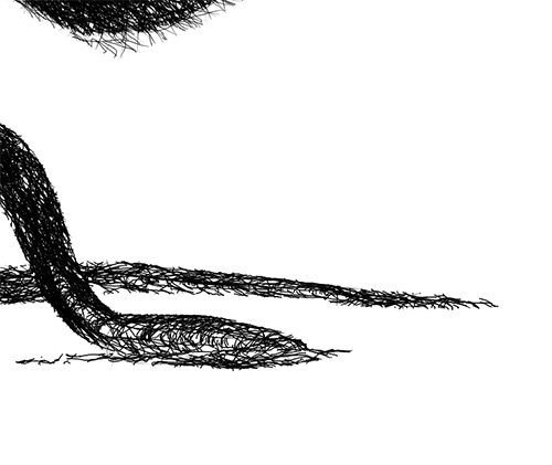
If you then start Poser another time, and try to Sketch render with the same preset — but to, say, 3600px render size — then part of the sketch effect will be truncated at the edge that is ‘expected’ by the preset. As you can see here…

The lines will also look different. Here they are more closely packed than the looser preset was designed for, because they are being run onto a larger canvas.
A demo test of the effect of Display Style on Poser’s Comic Book Preview b&w inks.
The starting renders shown below were obtained under the standard default old Poser light preset, and this only had the shadow maps on its Preview lights boosted up to 2048. The figure is the standard free robot that ships with the Poser free content pack, and is totally un-optimised for tooning. (If you save ‘2048 shadow’ lights, label them ‘do not use with Firefly’ – as lights with that setting will reliably crash Poser when making a Firefly render with them).
Poser 11’s Comic Book Preview effect is turned on, and set to b&w inks only.
With ‘three tones’ set:

1. Texture Shaded Document Display Style.

2. Smooth Shaded Display Style.
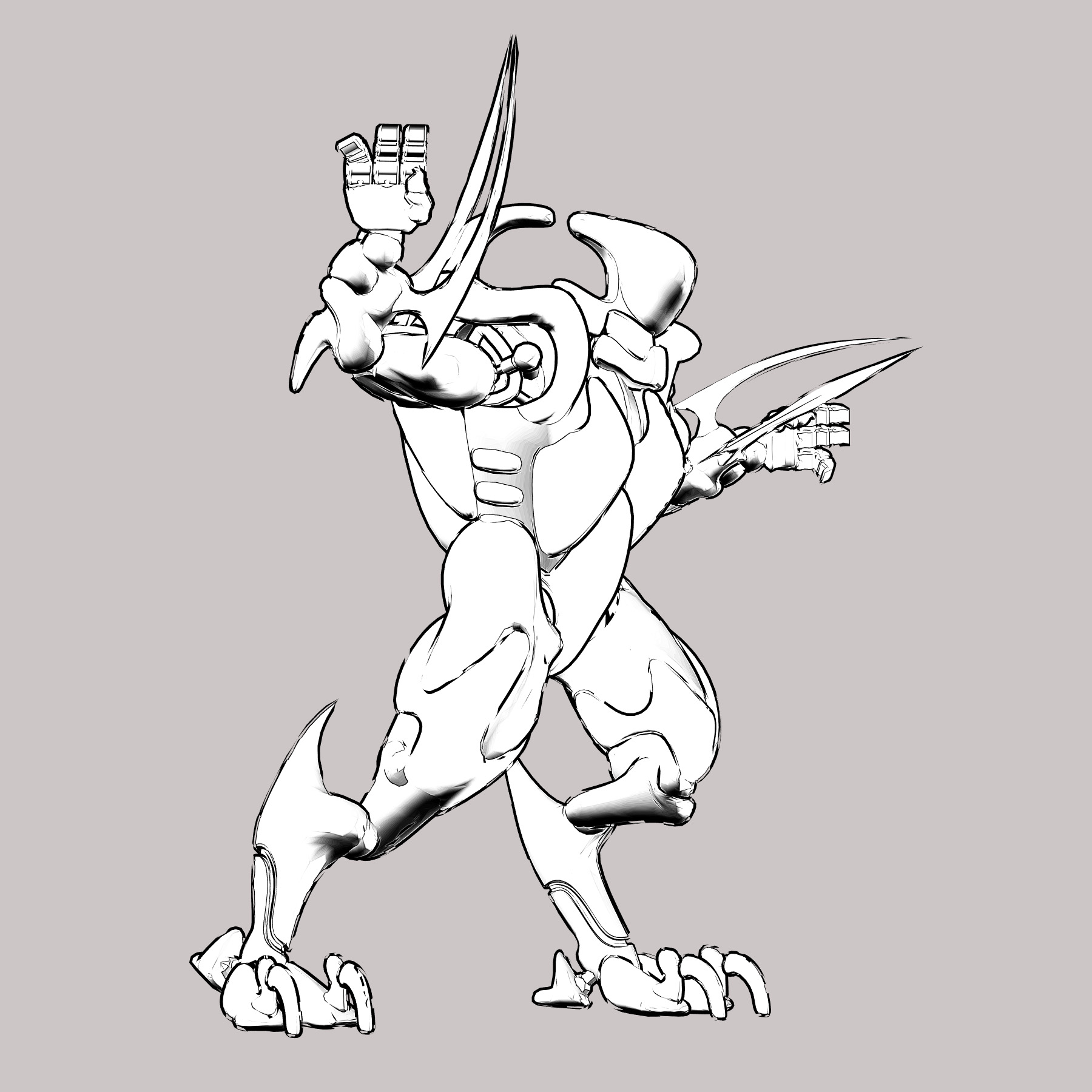
3. Cartoon w/Line Display Style.

4. Silhouette Display Style.
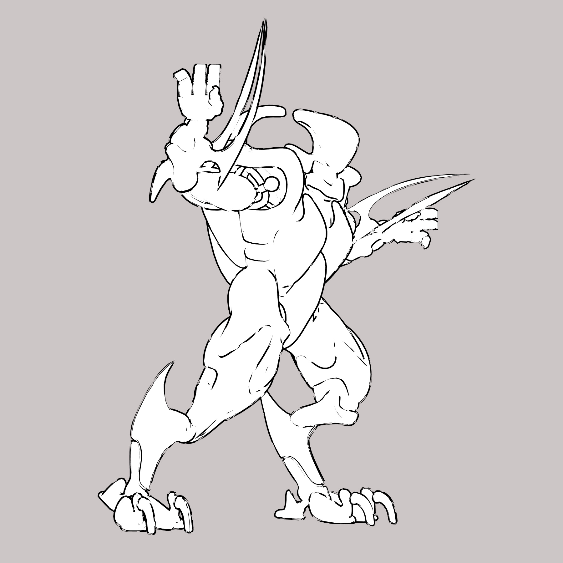
With just ‘one tone’ set:
1. Cartoon w/Line Display Style.

This appears to be a useful melding of Comic Book Preview and Firefly’s Toon Outlines, but in real-time. As you can see below, only a very few of the Toon Outlines lines are missing from this.
Firefly render with Toon Outlines output only. All edges are inked. For comparison.
Interesting finding: clicking again on an already-set Document Display Style button subtly resets the Comic Book Preview inking lines. If you have “weld” turned on, it does this in a slightly different way each time you re-click, and the changes to the lines can be seen in real-time.
This potentially has negative implications for those making animations (re: ‘edge flicker’), but could be a useful feature for comics makers to note.
Possibly the cause is that the OpenGL Preview is being just a bit ‘loose’ with its real-time line calculations, and not spending computational time on finessing them to perfection?
Posted in Companion software, Real-time animation, Spotted in the News, Tutorials
Leave a comment
FlowScape by PixelForest. If Vue was real-time and fun…
Price:
Very nicely pitched. It’s a $10 purchase ($12 if you’re in the UK, as a whopping 20% sales tax is gouged). Download is 1.1Gb for the current version, and it downloaded smoothly via my Web browser.
Why?
The developer states…
“I made this because the learning curve for doing this kind of stuff in Max / Maya / Unity / Unreal is very high, so I wanted to create something for people who are not technically inclined or just don’t want to learn massive software to be able do this.”
It’s a newly released version 1.0 and there’s no import or export, just screenshot output placed into the same folder as the install. But that’s fine by me, and for those who just want backdrops for compositing wildlife and prehistoric pictures in Photoshop. Or 2D overpainting of 3D, without all the hassle and fiddling of 3D setup in full 3D landscape software.
Asset export:
No. Though I presume that renders made from it are royalty-free, and that he’s using self-made and/or CC0 public-domain landscape assets. It doesn’t look like he’s licensed SpeedTree, as the similarly real-time World Creator landscape creation tool has. Which means that export could be an option for a future FlowScape feature. For now there’s neither import nor export, but the developer is apparently working on import.
Terrain sculpting:
At present it’s not any kind of terrain sculptor (for which the nicest and cheapest solution for fantasy/sci-fi scenes is probably currently the $20 Bryce), although you can pile its big stone blocks together and create a massification that way. Default terrains in FlowScape are fairly small, but that’s fine since it presumably keeps the speed up. The low-lying land is mostly going to be covered up by vegetation and water anyway. Asset import will diminish the need for terrain sculpting.
Genuine real-time:
Yes. This is genuine “What You See Is What You Get” real-time rendering which uses a videogame engine. So you benefit from having a good graphics card, sufficiently powerful to play modern videogames, in your PC. I could run it smoothly at 1920 x 1200px, with onboard graphics only suitable for very average 2016 PC gaming. FlowScape was still very responsive, even though I was only getting 10-15 FPS.
Addons:
Winter scene assets are reportedly planned. The developer might also think about a prehistoric plants pack for the dino artists, although most of them already know how to do 3D I guess. Possibly also space-art assets for alien planets. A line of paid add-on modules would be a way to expand the sales:
* Winter/Christmas.
* Prehistoric.
* Alien Planets / Beautiful Deserts.
* The Shire (the English countryside, gates, stiles, walls and suchlike).
* Game World (like some of the ‘platformer’ games, but I mean the art-game type rather than the cheesy ‘naff toon/Sonic‘ type).
* Utopia Beach.
This might help keep the focus on fun for both the developer and the users, rather than adding technical ‘pro features’.
Documentation:
There is no user manual yet, but it’s a fairly self-explanatory interface. There is only a useful Tips and Tricks page, with advice on how to delete stuff you’ve added, and change camera FOV.
Initial roadblocks:
The main initial problem is that it works like a game and not like Windows software. One thing that completely puzzled me at first was how to break away from the isometric view and level the horizon in the camera. This was the very first thing I wanted to do, but… how? I eventually realised that my StrokesPlus mouse utility in Windows was preventing FlowScape’s ‘right-mouse and drag’ camera adjustment from working. Turning off StrokesPlus meant that I could get down to a normal-looking horizon view with clouds.
Trying to add a layer of water to the scene irrecoverably replaced the existing scene with a new and unwanted one. There needs to be a “Do you really want to replace your entire scene?” warning about that.
Workflow:
As with all videogame-based Unity/Unreal ‘software’, the camera control is initially horrible… if you’re used to 3D software like Poser. The routine, on being faced with a new terrain in its default zoomed-out isometric view, is:
1. First ‘dress’ your terrain fully while in this zoomed-out view, which is the easiest way to do it.
2. Then “Forward arrow” on the keyboard, to zoom in approximately.
3. “Right-mouse + drag” to tilt up, so that you have proper horizon view.
4. Then press the “Q” / “E” to lower and raise the camera to near the ground.
5. Then make fine movements to get the exact artistic angle. Remove elements as needed, to improve the view.
Ideally there would be a one-click sidebar icon to make this move automatically, to get you from ‘layout isometric’ to ‘artistic-picture levelled’ without so many clicks…

Scrolling the mousewheel adjusts the size of the eco-painter brush, which is the next big thing to learn. You can also delete environment elements quite easily, and it looks like you can also scale them. I’d like stuff in the scene to temporarily turn red or something, when I select it, so I know that it’s been selected.
Depth fogging:
Yes, and it works nicely. Fog distance can be set independent of the basic set of Atmosphere presets. I set a fog distance and it was “sticky” even when I changed Atmosphere presets. The Atmosphere presets are fairly limited, and there’s no Bryce style range here.
Panoramas:
Sort of. It would be nice to have a “pin the camera on a tripod and take a series of slightly angled screenshots” option, so you could then stitch them together in paranorama software to get 6k images. A future paid 360-VR panorama capture module might sort that out.
Screenshots:
Currently limited to your screen size. But I’m guessing that in future implementing Unity addons such as Instant Screenshot should allow scaling up of screenshot output “without loosing output quality”.
I’d also like to see the commercial usage status of screenshots clarified by the developer.
There’s a Reddit to post pictures on, where you can see people are already finding arty ways to use it.
Conclusion:
Even after 90 minutes with it, I can see that it’s a nice new tool for quickly making a lush landscape backdrop without needing a five-hour render. At this budget price and relative ease of use it will appeal to a wide market and the user base should quickly generate a set of tutorials videos and other documentation.
Demo:
First raw picture made with FlowScape:

After adding some male and female Bolladon from Poser into the scene, and sticking it together in Photoshop:

Updates:
* Version 1.01, early Feb 2019. Now does 8k screenshots.
* Version 1.1, mid Feb 2019. Castles, houses, cliffs, rolling fog.