This post is about how to partly fix line-breaks and missing ‘chips’ in Poser 11’s Comic Book Preview lineart renders. Solutions are not being sought here for the purposes of ‘closing gaps’ to enable easy flood-fill colouring in paint software. Since, if you’re doing it right, Poser already gives a ‘colour flats’ render. I’m thus assuming that your basic output layers are colour flats, lineart, and shadows/highlights, each as a separate render from the same scene and ready for a Photoshop Action to composite and tweak. Thus your lineart is on its own layer, making it vastly easier to filter and correct later on.
Here the solutions are being sought simply to have nicer lineart with fewer or no breaks.
Update: the solution. It’s No.1 + a couple of little-known Photoshop features.
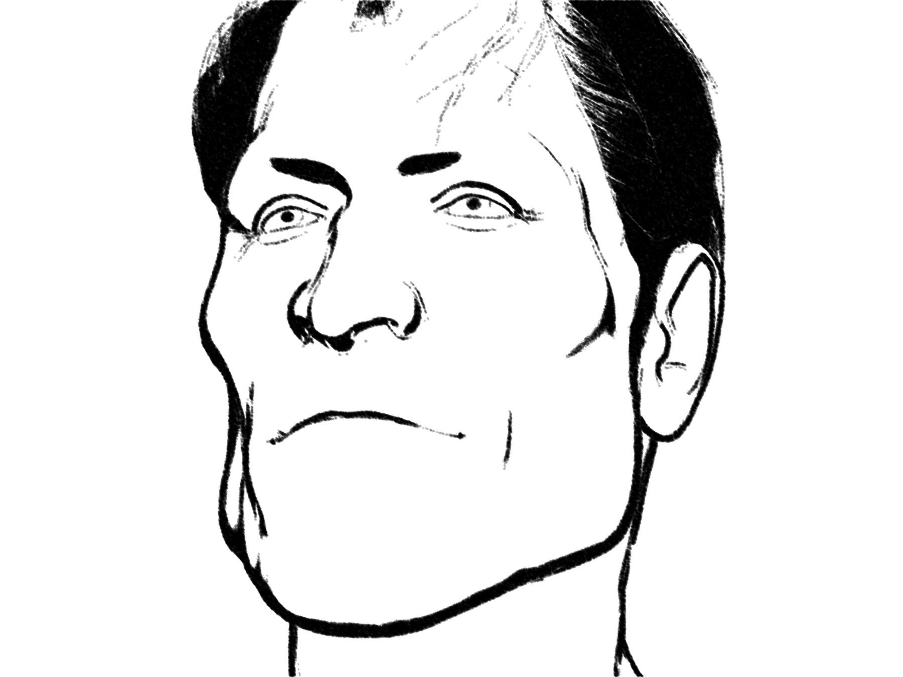
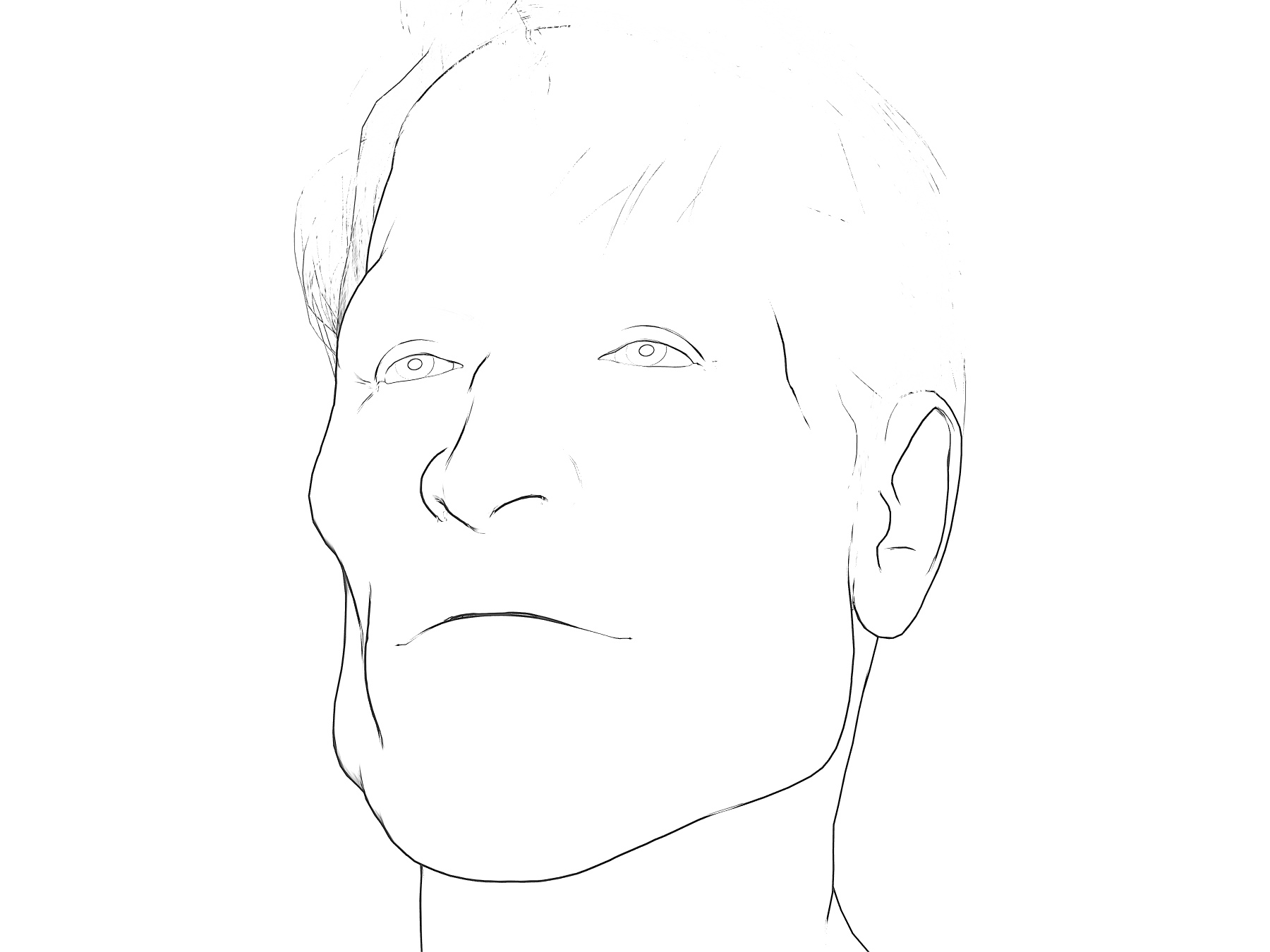
Here we see a deliberately extreme example showing the breaks and gaps that can happen in a raw lineart pass from Poser. We’re in Poser’s Smooth Shaded Display mode here, and on B&W in Comic Book Preview, and thus some of the Neal Adams-style inking is coming from shadows cast by one of the two lights. Poser is running in real-time with OpenGL, and it’s all WYSIWYG. Brom’s hair (‘Mature Mark’) is of course completely un-optimised for tooning as yet.
As you can see his nose and eyes may still need some manual clean-up, even when using some of the tricks given below. Manual clean-up of such source linart is not ideal. If cleanup takes just under an hour per page, and you have a 28 page comic, that’s perhaps four days of extra work. Per month, perhaps! Across a six-issue series intended to become a graphic novel that’s… way too much fiddly and non-creative work.
Here are a few of the options I explored…
1. PARTLY WORKS. In Poser, before you render to PREVIEW you click the Document Display Style ‘ball’ again. Then do it again. You’ll notice that each time you click, Poser slightly randomises the lines-joins on the inking, and may also make other lines look better. Nice.
Sadly, it’s not viable to then do six clicks, save a PREVIEW render from each, and then combine them all to ‘fill the gaps’ in Photoshop. I’ve tried it and the accumulated result is just dark and grungy blurgh. We would need a Photoshop plugin able to computationally ‘spot the differences’ between a near identical set of lineart. (Update: the solution is that Photoshop has this natively).
So, ‘click the ball again’ is simple and a neat trick, but there’s also not much this trick can do about the nose when the faces is seen at certain angles (see example above).
However, it does has two advantages:
i) it quickly enables you to at least find a state that offers a balance between ‘good eyes’ and ‘reasonable lack of line-breaks’. Such a balance may be good enough, when mixed into a final complex blend of colour flats, lineart, and shadows. You have to remember that your ‘artist eyes’ see things in the art that the general reading public never even notices, and especially so if the intended audience is under age 12.
ii) it also offers the possibility of making just two near-identical lineart renders, one where the eyes are at their best, and another for the rest of the linework. Then you’d make a loose Lasso selection around the eyes and have a Photoshop action feather, switch layers, ‘paste in place’ and merge, and then drop back down the layer stack to delete the source layer.
Bad eyes
Good eyes
iii) there are also more complex ways of using Photoshop in which you effectively just ‘paint in red’ on nice lines you want to keep. But here we’re trying to avoid the whole ‘spend an hour carefully fixing the lineart across six panels per page’ thing.
2. SOMETIMES SUCCESSFUL. Make a suitable fast custom-preset for Poser’s SKETCH renderer, one that gives you lineart with a fat charcoal line when run on b&w lineart. A preset that smurshes away most of the gaps and broken chips. Here’s my “2000AD” custom SKETCH preset at work…
We’d still need to dab some white on the nose and draw in some Dan Dare eyebrows, but it’s nearly there. Like I said above, the hair is completely un-optimised for tooning and we’ve smurshed it to black here. Although the black does then lend itself to raking with a wide white ‘rake’ brush.
Alternatively idea 2 could be emulated by running the lineart through a Photoshop filter, G’Mic filter etc, of a type that also smurshes out most of the breaks and gaps. Partly the success of this will be dependent on your comic’s style.
A sub-option for idea 2 it to simply scale down the inking, via the dial on the Comic Book Preview control panel. With thinner lines you have more leeway when bloating them, either by SKETCH rendering into PREVIEW lineart or via a third-party filter.
3. FAILS. You might think there would be some computational solution by now. CorelDraw does have a tool called “Join Curves” for lineart. Apparently Illustrator can also do that. For those who need free software, Inkscape also has a free inkscape-chain-paths plugin which does much the same thing. However, judging by the Inkscape experience it doesn’t work as hoped, in terms of nicely closing small gaps in vectorised lineart.
4. FAILS. Clip Studio has a feature found at Correction Line > Correct line height. This fattens all lines on lineart from which you’ve ‘knocked out’ white. (That latter option has the deeply un-memorable name of Edit -> Convert brightness to opacity, where it should have a dinky little icon showing a white Mickey Mouse glove throwing a knockout punch). Sadly Correction Line just fattens everything. I’m very much a newbie at Clip Studio, but it appears to me that there’s no way to have Clip Studio do a more refined fattening of the lines. For those who need free software, line fattening is also easily done in Paint.NET via the free Overliner plugin.
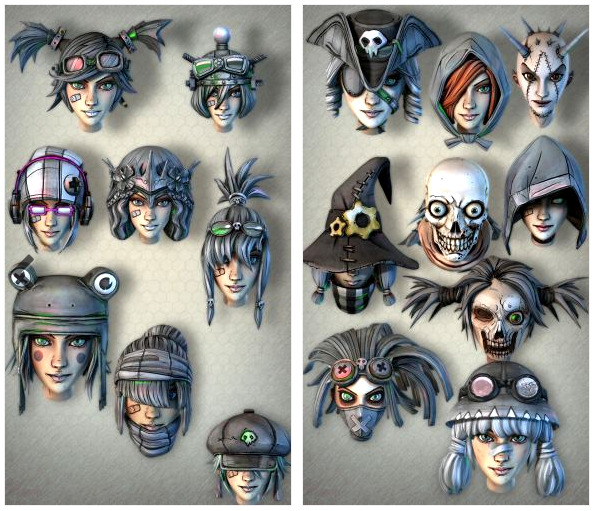
5. SUCCESS. I’ve yet to get to this point in my experiments, but from what Sixus1 has said I suspect that one takes a Texture Atlas from a figure + clothes, up-scales it to 8k and starts hand-inking ‘along the edges/seams’. The intention being to give the figure a total ‘hand drawn toon’ makeover, which you can then load back onto the figure at 4096. Possibly body and head are each done separately. That’s my guess, based on what I’ve picked up. You can see this partly happening in this Brian Haberlin screenshot from a while ago now. This is one of his hand-inked faceplates seen in Smith Micro webinar, presumably partly designed to work with and mask Poser’s small lineart breaks and chips.
Like I said, I’ve yet to get to experimenting with this ‘intensive makeover’ approach, but from what I’ve heard on webinars and podcasts that seems to be the gist of the approach. And judging by Brian’s marvellous Poser-made comics, the approach can succeed very well. It looks quite labour intensive at the start, and before you start you’d have to be absolutely sure your ‘runtime bashing’ was finished and you’d devised exactly the character you want for your story. Because changing things later could be difficult.
One other trick learned from Brian Haberlin’s webinars is that it’s possible to emulate inking in Poser by zooming right in and selecting a line of polygons, and giving these a black colour. For those who find they have a persistent ‘break’ on a character’s lineart, even from different angles, this may be worth considering.
You have to do this ‘Haberlin approach’ by hand because there’s as yet no market in figures designed like this, or in off-the-shelf makeovers designed to do this for existing figures. Although if you go look at the Gage fan-art Poser figure on the Forender store, then you’ll get an idea of how attractive this approach might be be made for buyers, and how it would play very nicely with Poser’s Comic Book Preview.
X. A future possibility. Software such as Krita, Clip Studio etc can already successfully flood-fill gapped lineart with colour. Presumably it does this by detecting and forming an invisible shape in order to “hold” the paint. This shape could theoretically be repurposed by future plugin makers to run a dark line along the ‘invisible shape’ outline, which would then be imposed to fill gaps in the original lineart. If the result would be pretty or not is anyone’s guess. I suspect it would be a blobby mess, which itself would then need manual cleanup.


