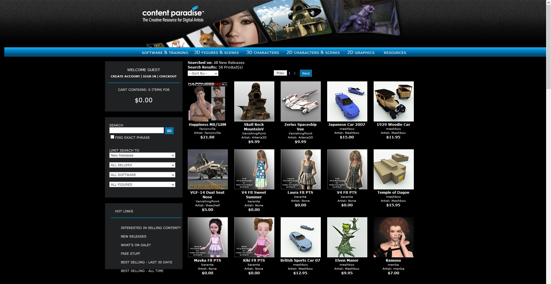
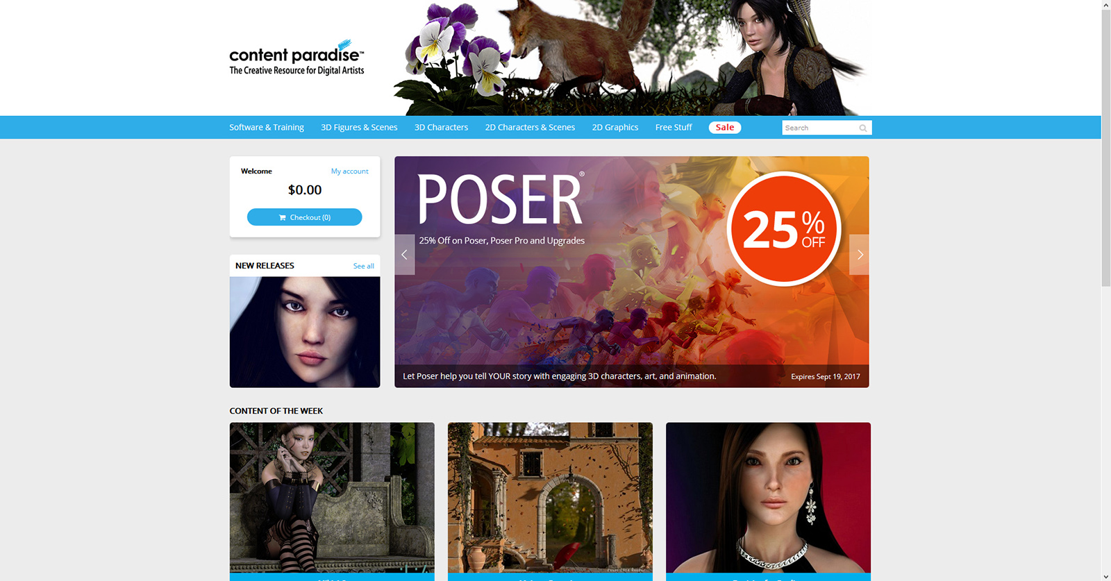
The new Content Paradise store is here.
Before:
After:
It’s a simple and clean look, akin to the Hivewire 3D store. The thumbnail previews are larger, but store index/selection pages load just as quickly. The font size on the individual product description page might also be a size larger, and I’d prefer if it all the panels on each product page were opened up by default. Sign-in is as easy as before. The change doesn’t appear to have broken link URLs to specific content pages.
On the downside, it’s a tablet-tastic scroll-down layout. On a desktop PC this means that big wide spaces are wasted on each side of the main content. The header graphic is probably a step backwards, and perhaps they should run a competition for new ones. You still have to hunt for the tiny plain “My account” link, in order to reach your Wishlist from the front page. Personally I would have put a big Wishlist button/panel on the front page. No big sale, or newly rendered product renders, to accompany the makeover and encourage new sign-ups. Though Poser 11 itself does get a discount, as you can see in the above picture.
Overall, though, generally a welcome improvement.


