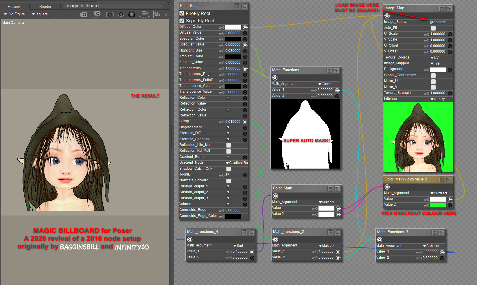
Here’s my revival of a 2010 node-setup for Poser, originally by BagginsBill, and which has seemingly been lost in the 404 mists of the forums. However, it was rescued from oblivion by Infinity10. Infinity had first tried to build his own version in 2010 but, soon after seeing BagginsBill’s better version, built another variant and posted that as a screenshot. This screenshot has survived to 2020, lurking and little-visited in the Renderosity Galleries of all places. Sadly the screenshot lacked vital instructions about how and where to use it.
As you can see, I’ve rebuilt it and tested, and my 2020 screenshot adds guidance. It lets you drop in any square render, and with a few clicks you can mask out the background colour. Not quite as good as iClone, where you just drop a masked .PNG on the stage and it becomes a cutout billboard prop. But what follows is ‘as good as it gets’ in Poser 11.
1. You first load a “One Sided Square” to the Poser stage (Library | Poser 11 Content | Primitives | “One Sided Square”). Select it.
2. Now switch to the Material Room. Create the setup exactly as seen here. I have not re-named any nodes, except for the one under the loaded image. This is where you pick the background colour from, and as such it has been slightly re-named to serve as a user prompt.
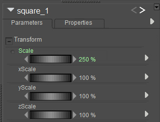
3. The image to be loaded has to be square, whatever the shape of the item within that square. It appears from my tests that Firefly / Superfly do not play nicely with a re-sized “One Sided Square” prop, when it comes to rendering. Although a square image in the “One Sided Square” can be safely scaled up and down as a %, thus…
The two images used for this demo were 1200px and 1800px.
(Some may also want to slightly increase the Value_2 on the Math node connected to the main BUMP input, and also increase the strength of the BUMP, depending on your prop type).
4. The ideal background for a figure with eye whites is probably a green-screen colour, although bright-blue might also work as long as you have no blue on the figure. You can see on the screenshot where you pick the background colour to “knock out”. Click on the colour chip and you get a little eye-dropper tool and then you hover over the mini-image and pick its background colour.
For trees and plants it’s different. White may be best for green trees without white flowers, snow on branches etc. Or black, depending on how dark the tree-bark is. The process doesn’t work with .PNGs rendered by Poser with an alpha, since there’s no colour for the node setup to “grab” onto and knockout.
5. Ok, you got your node setup to work. Save the working setup as a prop to your Primitives folder, for future re-use and for making and saving variants. I suggest the name “Magic Billboard” which is easy to remember. Having such a magic prop means no need for an alpha channel mask. The chain of maths in the nodes is doing the required masking for you.
The path to the image is embedded in the saved prop, so make sure your called images are somewhere stable on your PC — like a dedicated folder down in your runtime. Move or delete the called image, and… the prop will break.
Rendering:
It’s not perfect in terms of rendering. There’s still a touch of green fringing. But it’s quick and such props are anyway likely to be in the far middle-distance or background.
Poser’s SuperFly and Preview render-engines each give a crisp render from this, and the real-time Preview even retains the mask on saving the render to .PNG. Sketch runs fine on such cutouts, interestingly.
The drawback here is that Firefly renders are noticeably fuzzy with this setup, and a green fringing is very noticeable. As yet I’ve been unable to find an additional node chain to add, which might better de-fringe. Possibly this fringing effect was why such a node setup did not catch on in a big way for Firefly users.
But… now we have Poser 11’s SuperFly, which does not have anywhere near the same fringing problem, though a green fringe is still present on some of the finer isolated hair-strands. I’d thus say this sort of prop is going to be most useful for the background of Superfly pictures where you want many people in you scene and they have eye-whites and white teeth etc. Which means you can’t have the node setup knock out white.
On a test of a tree on a white background, a Clamp (see middle node) setting of 1.0 rather than 3.0 removed most of the white fringing. The same trick did not work on bright green. However, there may be a better, fringe-free way for foliage/trees. Read on…
I also found another, somewhat later BagginsBill node setup from 2014. This allows some cool “Hue” tweaks that instantly make standard green trees into Autumn/Fall coloured, Winter coloured, or (by going to 2.25 or 3.00) into “alien planet” foliage. Here’s my 2020 rebuild of that…
We almost lose some definition on fine twigs with this, but also usefully lose the cutout fringing. The “Hue” tweak also opens up subtle effects that might make trees in a forest look a little different to each other, and also seem to fade out in colour as their ranks recede into the distance.
Regrettably this “no-fringe” node setup only works with white, meaning that it can’t be used with people due to their having eye-whites and teeth. Still, if you want to build a super-lightweight library for a forest, cliffscape, cityscape etc relatively quickly, here’s a way to do that. It could allow you to make a picture in one pass, rendering relatively fast.
Theoretically one could also use this “Magic Billboard” to build a re-usable set of comic billboards, done in the same style as the final comic, to provide quick scale-adjustable backgrounds. One might also “double-stack” for comics effects, for instance by precisely placing hand-drawn hatching line-art billboards (with knocked-out white) on top of Poser’s native real-time line-art. I think I’d rather do that by i) drawing new inked textures directly on character skins, or ii) using layers and brushes in graphics software. But you can see how the Magic Billboard could become a possible help for a comics maker — especially those who don’t want to fiddle around with getting and saving out an alpha-mask every time they need a quick billboard made. Because the node setup is giving you the alpha-mask automatically.
If you do want to take masked layers out to composite in Photoshop, there are various methods for getting a PNG render with a transparency mask, as discussed here. The gist of it is:
SuperFly -> Apply “Holdout” node to the main Surface node. GROUND should be visible.
Firefly -> Options -> Render over “Current BG Shader”. GROUND should be hidden.
Preview -> Mask is automatic. GROUND should be hidden.
Sketch -> Not possible, but you can turn off sketching into the background and only sketch into the figure/prop. To mask the sketch render later, also export a Preview render of the same character/prop in the same position, then use a selection of that as a mask in Photoshop etc. Exact registration of the two renders is usually not possible, due to the slight distorting of edges introduced by the Sketch effect.
Extra: A Renderosity forum answer, by hborre in August 2020, was about how to place renders onto 3D primitives. Which seems to relate to putting images on planes. This might be useful to someone in the future…
Prop scale and image resolution: Find out your image’s x- and y- pixel resolution first (i.e. 2000 X 1000). In Poser, set the x- and y- scale for your primitive to the same dimension, in this case, 2000% on the X- scale, 1000% on the Y- Scale. Import your image to the primitive. Then, on your overall scale for the primitive, dial in your desired size.


