
The BBC Weather forecast page has changed. It’s slightly clunkier now, in terms of graphic elegance. Certainly a move away from the near-perfect design they had before. But there are new features, as trade-offs. Presumably the change is because the promised new supercomputers are now online, as so we get a nine-day default view rather than the previous five-day default view. They’ve also added a new unlabelled “Chance of precipitation” (meaning, rain) icon down the bottom just above the wind speed and direction…
To the 95% of the population who don’t understand probabilities, and are anyway not able to meaningfully apply them within the highly variable system that is the British weather, that new additional icon is probably unwanted. Also, why show a visual icon of rain when it’s not at all likely to happen? It’s a form of pessimistic “fake news”, done in the language of graphic design.
If you want to remove these “Chance of precipitation” icons, here’s how to do it in Firefox. I’m assuming you have AdblockPlus installed and its Element Hiding Helper add-on, which only work properly in FF55 or lower. In Adblock go to: Filter Preferences | Element Hiding Rules | Add filter. Add the following new rule…
bbc.co.uk##[class*="wr-time-slot-primary__precipitation wr-time-slot-primary__precipitation--grey gel-brevier"]
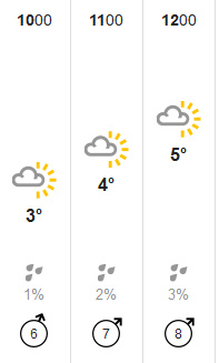
This removes the grey “low” probability icons…
If you also want the blue “low-medium” probability icons gone, then add the following rule…
bbc.co.uk##[class*="wr-time-slot-primary__precipitation wr-time-slot-primary__precipitation--blue gel-brevier"]
Even after this blocking, you can always click on an hour-slice and you get a slide-out which gives a more sensible type of “Chance of precipitation”…
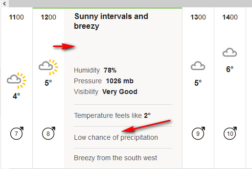
The gradations here are far more simple: Low chance | Chance | High chance. That’s good enough for me, as I don’t need to be constantly juggling with fine percentage gradations of an hourly probability of rain. We’re a damp nation and the ever-changing weather in a specific locality is complicated enough as it is.
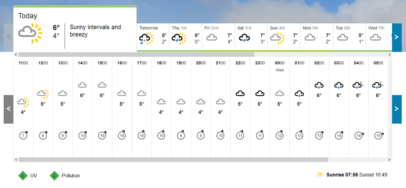
Here’s what the BBC Weather’s new nine-day hourly forecast looks like, after fixing…
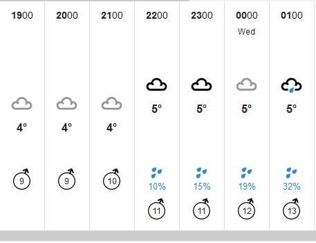
Regular users will probably also want to block the new animated tickers, the huge and ugly new satellite map that loads under the bottom of the page, and other page-junk, in order to speed up loading.