Update: this advice is now superseded: see Google in columns: how to do it in 2020.
There’s now a temporary sort-of fix for the badly broken GoogleMonkeyR browser userscript, the fix being kindly made by IzzySoft. My thanks to IzzySoft, but it still has numerous problems and also doesn’t work at all with News results. One of the worst problems is that results can get ‘sliced’ across columns, with one bit of a result at the foot of column one, and the other bit at the top of column two. It also doesn’t work well with Google Hit Hider by Domain.
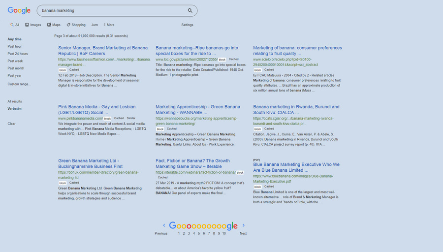
For now then, I suggest that someone wanting three-column Google Search and Google Books, on a widescreen desktop PC, should abandon GoogleMonkeyR. Instead try the following, to get Google Search looking like this…
1. Disable any installs of GoogleMonkeyR.
2. Get the Stylus extension. This is a host that enables quick makeovers of the style of a website, via simple style scripts.
3. Then install the Stylus style “Google Search in columns”, after first setting “3” columns in the download options. I could not get four columns to look or feel good.
4. I tried some Google Search makeover Styles, but none could colour the link title and URL separately. I’ve learned to instantly ‘read the URLs’ over the years, and thus want them clearly identifiable at the merest glance. For a fully configurable colours makeover I went to the Dark Theme for Google Chrome addon, which can do such things and which seems robust and updated.
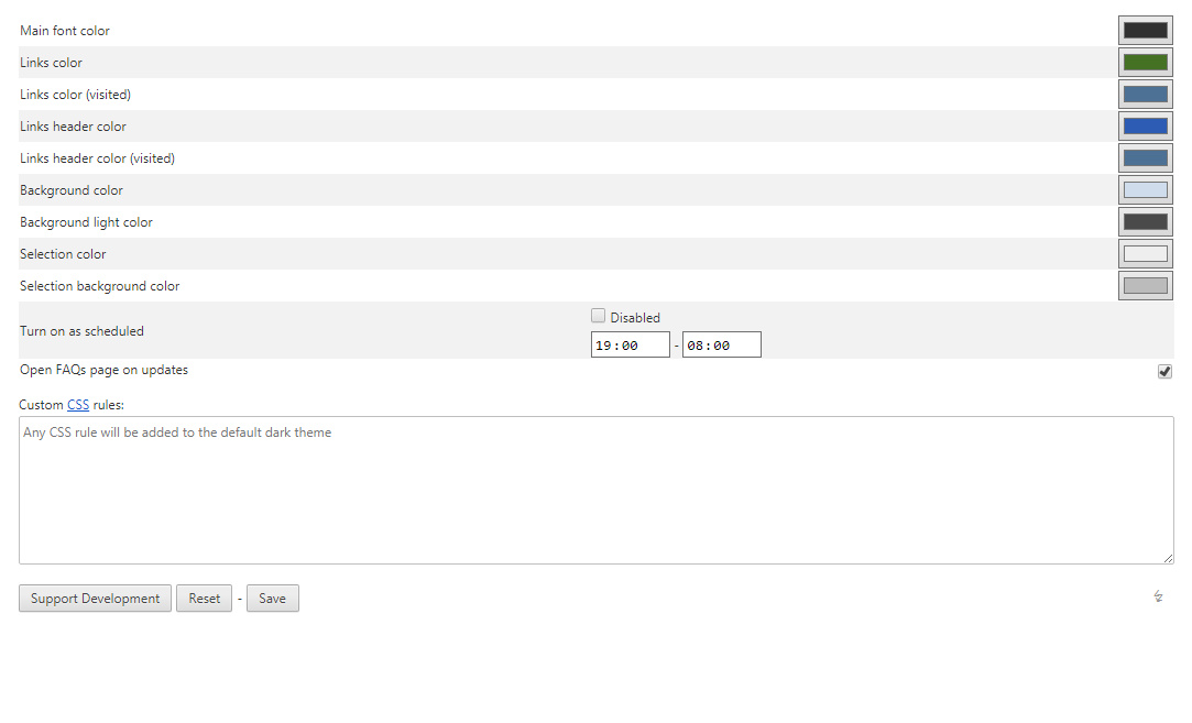
5. Tweak the colours in this Dark Theme addon. It’s fully configurable, inc. in my Opera browser, and you access its options via right-clicking its icon.
This gives you easy ways to set the colours, and you can even set a timer so the dark mode only kicks in at dusk and turns off at dawn.
There’s also a custom .CSS injector which looks interesting, and I’ll tinker with it at some point.
6. Now you want to tell Google to deliver only 9 results per page, by using an access URL with a command embedded in it that limits the number of results. 9 results suits a three column layout, and (once you get rid of other clutter), means you usually don’t have to scroll down to find the “next page” controls.
https://www.google.com/webhp?hl=en&complete=0&tbo=1&num=9&tbs=li:1
num=9 is what’s switching you from 10 to 9 results.
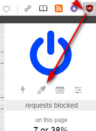
7. Finally you use the popular UBlock addon and its Element Picker to perma-block page clutter, as it appears in the Google Search results to mess up your layout. Such as huge slabs of video suggestions, instant answers, and other distracting and often irrelevant auto-fluff. There’s a bit of an art to such blocking, but you’ll get the hang of it. Just keep at it until all you’re getting is what you want — just the actual search results.
8. Here’s what my Google Search looks like on a desktop PC, with this setup.

Google Search. Everything ‘at a glance’, suited to a desktop widescreen, and with all URLs and controls clearly visible. Only the Google Books switch-through link is behind a dropdown menu, but at some point I’ll find a fix to replace “Shopping” with “Books” on the menu.
Nothing seems to budge Google News, in terms of getting results into columns, unfortunately. GoogleMonkeyR used to do that, but it no longer works and the new fix doesn’t do it. Nothing else seems to work on it.
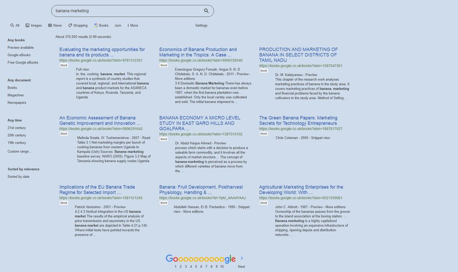
As you’ll see above I use the UserScript “Google Search Sidebar” to get the neat sidebar, JURN in a UserScript to inject a quick search-query passing link into the Google menu. I also use uBlock to block the distracting book-cover thumbnails on Google Books.
I also run Google HitHider by Domain. Which in some cases means results look like this…
The spaces are results from blocked domains, being elegant replaced with a blank block where the result would have appeared, and thus not spoiling the layout.

