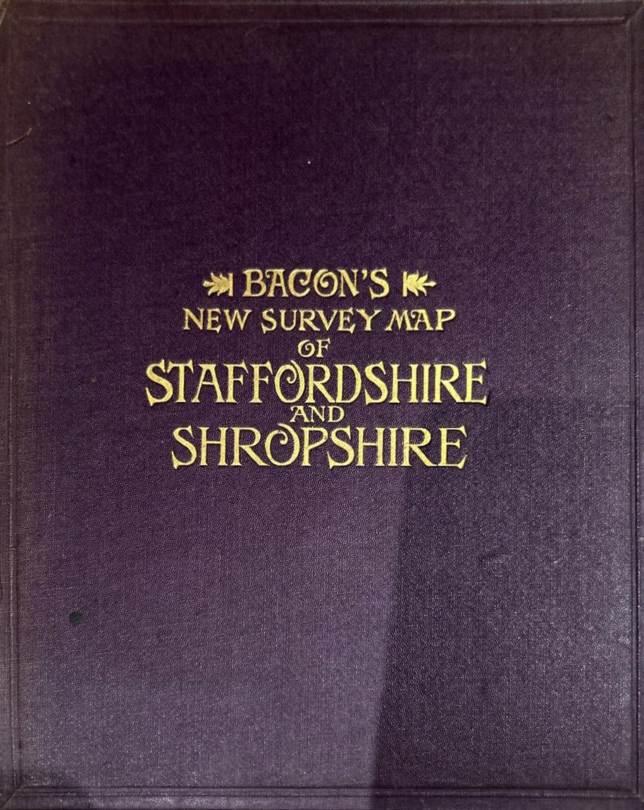
A number of fonts come to mind but this feels like hand-embossed work. The “O” is way too expressive AND changes from line to line (just like the “S”) for it to be a readily available font for a typesetter to use.
They will have done a plate for the front page to do larger number of copies but that will not have been a _single_ font, I presume.
Thanks. Yes I was thinking that, too. If one were to create a digital font from this, there would have to be variant letters and then a way to mix them as the user typed. Font designers call these ‘alterative glyphs’, I think.
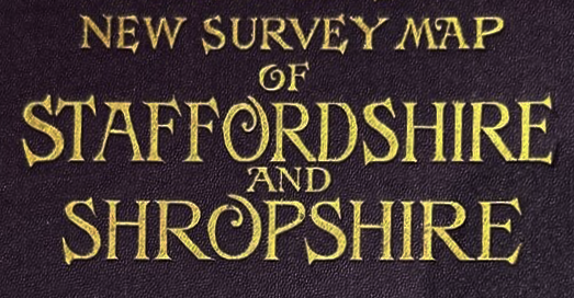