Tolkien Gleanings #168.
* Catholic World Report has a new article offering “Tolkien’s lessons for Hollywood’s failures”. Specifically, the lessons to be learned from Tolkien’s rewrites of his LoTR drafts. Freely available online.
* MultiLingual, the trade magazine for the languages industry, profiles Tolkien’s invented languages in “J.R.R. Tolkien’s Life in Languages: inventing and adapting the lexicons of Middle-earth”. Freely available online.
* Newly added to the latest Journal of Tolkien Research, a review of Thomas Honegger’s new book Tweaking Things a Little. I now see that Kristine Larsen also reviewed the book in Mallorn #64 (Winter 2023). Though neither review picks up Honegger on his earendel section.
* Newly free on Academia.edu, ““Leaf by Niggle” – The Artist and the Art” a chapter from Revisiting and Reimagining the Works of J.R.R. Tolkien (2022). If you’re not signed up to Academia.edu you can still get the PDF by searching for it on Google Scholar.
* A nice surprise, on my at last joining the Tolkien Society. I find I also have access to PDFs of a new publication called Vingilot, which sits somewhere between the Society’s Mallorn and Amon Hen. So far there are two issues, and it seems to be for longer linguistic or similarly technically-complex essays, while at the same time also soaking up some of the poetry being submitted.
* In the latest Amon Hen I see what appears to be a ‘wider Midlands and Wales’ informal meet-up event, the ‘Three Farthing Stone Smial’. The last meeting was way down in Moreton-in-Marsh (below Stratford-upon-Avon, in the Cotswolds), but for Spring 2024 they have the Midland Hotel in the centre of Birmingham pencilled in.
* Also, it’s good to see an October 2023 ad for a graphic designer for Amon Hen. One might hope for a new two-column layout, at least, which would offer a huge improvement in readability. In the meatime, it’s down to technology. There are a half-dozen ‘two-column to one-column’ solutions for scientific journal PDFs. But none the other way around. Thus the temporary ‘one-column to two-column’ DIY readability solution, at least for those with a 10″ tablet such as a Kindle Fire, is this:
1. Convert the fixed-text .PDF to a reflowable-text .ePUB with Calibre (free) or ePubor ($30).
2. Send the .ePub to the Kindle.
3. Open and read with the Librera Pro reader app.
4. Librera Pro settings: font size at 32-point, text alignment left, no hyphenation, line-spacing at 13, paragraph spacing at 3. This emulates a column.
5. Finally, select your font. The Times New Roman font is fine for me, but Librera also bundles some dedicated ebook fonts.
Of course in converting to .ePUB you jettison the page layout, though not the graphics. The solution to that is to also load the .PDF to the Kindle, browse pleasurably through it and admire the layout and design, read the short bits, and choose your longer articles. Then switch over to the .ePUB for actual close ‘columnised’ reading of selected articles.
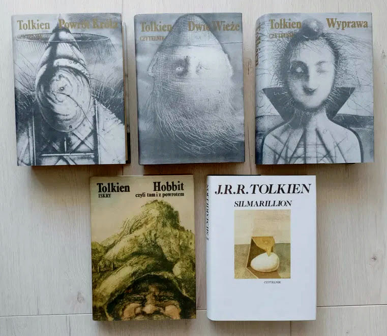
* And finally, some Polish Tolkien book covers. And there I was thinking that the 1980s German ‘green’ covers were the most bizarre…